After the Equinox there is an update of the vital forces and a repositioning of all the elements that move nature. Around the equinox (aequi+nox-night) the sun shines directly on the equator and consequently day and night have an approximate length all over the Earth. Due to this new event, Spring is born, we must sing at a different tune and think a little more clearly.
Last year I discovered a felt artist who I invited to my show. I fell in love with the art of felting. Wet felting is an ancient method of fusing together silk and natural wool from which scarves, shawls, lightweight garments, and even jewellery can be made. The process requires the use of olive oil soap, warm water and the motion of the skilled artist’s hands that will produce original, delicate, one-of-a-kind creations. The application of heat, moisture and friction causes the wool to felt.

Nuno Felting or Laminated Felting is a more modern technique in fabric manipulation that produces highly textural textiles, lightweight, visually appealing and fun to wear, says Nadia Bevegni, felt artist.
I sent one of my tulip photos to the artist and she reproduced it onto a piece of silk. It was an easy process, at least it was for me, and we communicated well. I like it when that happens, people in the art business seem to be much more relaxed than in any other business.
I added to my collection of scarves a beautiful, warm piece made by a real human with her hands. Here are a few of her creations. Find the artist Nadia Bevegni here https://itfelt.wordpress.com/


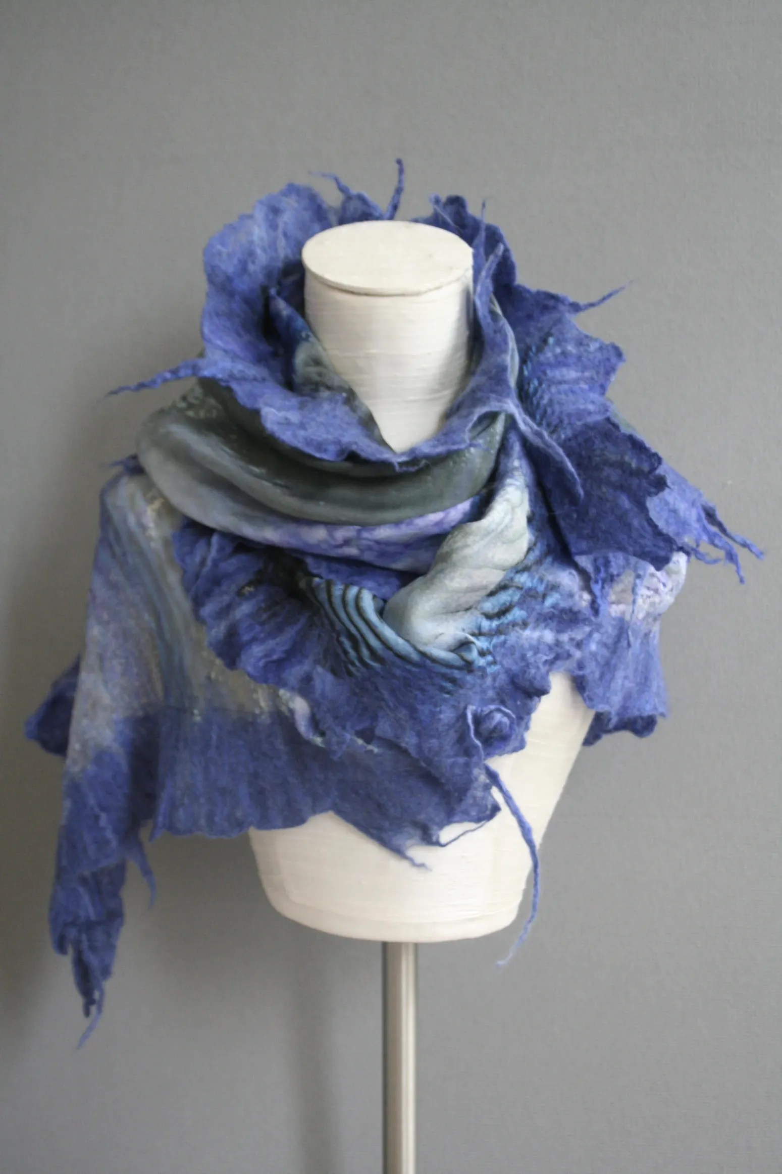
Photos by Nadia Bevegni.
On this first day of April, open the door to new possibilities, colours and all the energy colours can bring.
In my book RED -A Voyage Into Colors, Second Edition one can find a variety of information on how colours affect us in life.
Ciao,
Valentina
Copyright © 2023 Valentina Cirasola, All Rights Reserved
Valentina Cirasola is an interior-fashion consultant, author of 6 published books, a storyteller, and a blogger of many years. Her books are non-fictional practical ideas to apply in the home, fashion, cooking and travel.
Get a copy of her books here: Amazon and Barnes&Noble