Doing colors for a restaurant is not the same as doing colors for the home. A restaurant is a place people spend money to eat, want to be jovial, want to be treated right and feel good in the environment they are paying for.
Colors must be inviting, pleasant, easy on the eye and meet everybody’s taste. In the home we can get away with blue and grey, not in a restaurant, unless the décor of the restaurant is done purposely in high-tech, contemporary, with exposed steel beams, glass, then it calls for cool industrial colors. If that is the case, lighting will be extraordinary to counter balance the office-type colors.
If food is good but people leave reviews about the lack of ambience, most likely it has to do with colors and décor. It was the case of this restaurant. The owner painted walls/ceiling grey and black, added black tables and grey chairs thinking the modern, clean look, linear design would be suiting to people, but the space originally was not planned to be an industrial style. Apparently, their customers did not like it a bit, thus the owner called me, the Queen of colors, to find solutions for this place that looks more an office for geeks, than a restaurant.
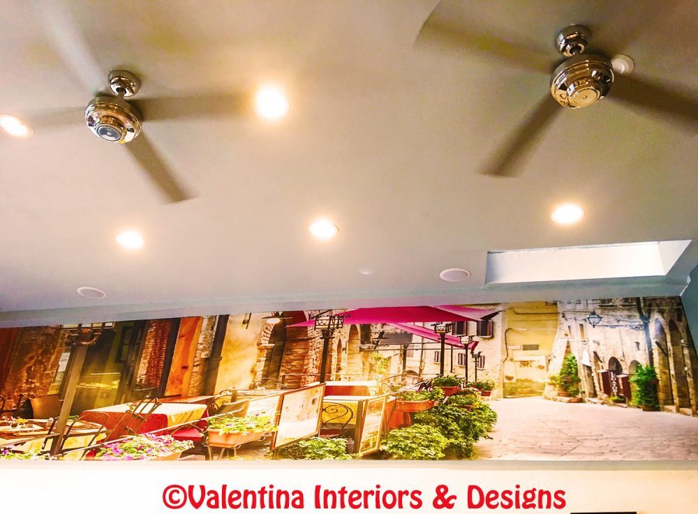
The first thing I want to git rid of is the black fascia at the ceiling line, it makes the place really heavy like a hood. I substituted it with a view of a street lined up with restaurants scene. At least it is a colorful and happy scene, people sitting across from that wall, will have something interesting to look at, instead of a black wall.
Colors of the entire establishment will change to sunny colors. I think eating in a public place is an experience that engages all the senses, not just the papillæ buds. One wants to look at beautiful décor, soak in the ambience to feel relaxed, enjoy the fire if there is one, taste wines that will encourage conversation, be under a beautiful lighting that enhances the food and gives a glow to people’s faces. A successful restaurant must think of all these elements as one more thing to offer with good food. Why people would spend money to go out to eat, if the restaurant is less attractive than the ambience at home?
Below is the previous black wall, now decorated with a scene on panel printed digitally.
(Click on each photo to view it larger).
This is the previous black wall and grey ceiling as it was.

These are the colors I have chosen, with other décor to beautify the place. The look I am trying to achieve is a shimmering effect of seeing and not seeing through mirrors and transparencies. I want mirrors on the walls with colorful mosaic frames. Illuminated glass turtle for a funky décor, will appear as if the turtles are walking the walls. Travertino stacked stones and glass blocks will decorate an area to hide workers in the kitchen. Wood panels (in my drawing) with mirror insets will divide a few areas in the dining room. The holes with the mirrors are large, medium, small for a playful game and will reflect various areas and not just faces.

The work will be done in stages, due to the foot traffic the restaurant has every day. I hope to see the work finished in no time. Ciao,
Valentina
http://www.valentinadesigns.com
Copyright © 2018 Valentina Cirasola, All Rights Reserved
 Valentina Cirasola transforms and creates spaces realizing people’s dreams in homes, offices, interiors and exteriors. She infuses your everyday living with a certain luxury without taking away a comfortable living. Valentina is well-known for bringing originality on any project and for thinking outside the box. Her interiors are not made with cookie cutters, only follow client’s inspiration, lifestyle and personality. She offers on-line design consultations through Skype and the traditional in-house consultations, helping people with their design challenge anywhere in the world. She is the author of three books, all-available on
Amazon: http://goo.gl/qNxXrB
Barnes&Nobles: http://goo.gl/q7dQ3w