
I was on stage yesterday talking “colorfully” before a group of over 30 gentlewomen. I want to thank the Berkeley Italian Section Club for hosting my event. I enjoyed everyone of the participants and the tasty lunch.
The topic was: “Color Your World”.

©Valentina Cirasola
They all responded well to colors, in fact the audience came dressed in colorful clothes. It was surprisingly pleasant for me to see the wonderful expression of colors in their outfits, usually, I don’t get to see that many colors in an audience. I explained why colors inspire us and why we should wear them, throwing an arrow against certain colors I consider “boring” but useful nonetheless, in that all colors are beautiful and important in their functions.


The focus of my talk was to explain why certain colors are not at all good to use alone. Beige, for instance, in the interior as well as in fashion, can act as a stabilizer when it is used with hot colors, like orange, red or yellow. Black can act as a grounding agent when a room is decorated in total white or beige and a total black outfit will come alive with small colored accents, such as a colorful pair of shoes.
The eye needs to rest on some colors to feel relaxed. If a room is decorated in a monochromatic color there is no relief and the eye wanders around, therefore even though monochromatic schemes are beautiful in their character, always need some other colors as company. If wearing a total beige outfit, it is necessary to distract the eye of the viewers from the dullness of a total beige scheme.
Many women came up to me at the end of my conversation on colors to tell me how entertaining and informative my talk was. I never expect everybody to agree with me in these presentations. My knowledge comes from my long years of studies and most importantly from my 25 years of work experience in the design field. One woman talked to me about how good she feels in her total beige home with large windows through which she receives a ton of natural light and is able to see the nature outside. She feels relaxed and at ease with her neutrals, if she would color the walls she would feel overwhelmed ~ she said and I agree. If neutral tones are the preference, by all means, use neutrals. I just reminded her that nature has made all colors and perhaps it wouldn’t be a bad thing to add small accent colors in the accessories.
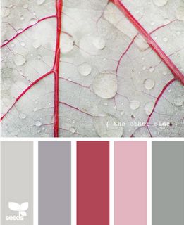
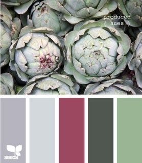
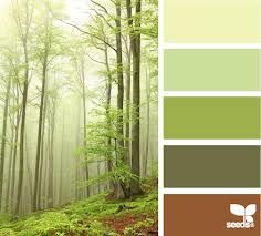
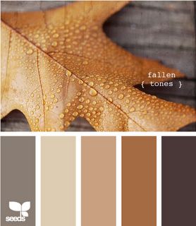
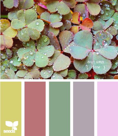
(All photos by Seeds found via Pinterest).
Visit my Pinterest boards. https://www.pinterest.com/vcvalentina

Neutral tones found in nature are beautiful and they are far from being all beige and dull, as you can see from my photos. They are delicate, soothing, relaxing and lively. “Live in colors, change you life, change your energy”. Ciao,
Valentina
http://www.valentinadesigns.com
Copyright © 2016 Valentina Cirasola, All Rights Reserved
 Valentina Cirasola is an Italian Interior Designer working in the USA and Europe since 1990, specializing in kitchen, bath, wine cellar, and outdoor kitchen designs. Often people describe her as “the colorist” as she loves to color her clients’ world and loves to create the unusual. “Vogue” magazine and many prominent publications in California featured Valentina’s work. She also has made four appearances on T.V. Comcast Channel 15 and on RAI – Italian National TV. Author of three published books, the latest ©RED – A Voyage Into Colors is on the subject of colors.
Amazon: http://goo.gl/xUZfk0
Barnes&Nobles: http://goo.gl/q7dQ3w


