Your Aura Color | Valentina Cirasola | Designer

Welcome to my Fashion Friday.
One of my most liked fashion colors combination has been apple green with soft pink. Pink exudes feelings of caring, tenderness, self-worth and self-love. Wearing pink presents a person as peaceful and not threatening. The softer shades of pink are very feminine and give out a youthful look. Of course, with this combination in the photo, I wore a piece of jewelry in a darker shade of pink to create a feeling of order and protection from hostility. That’s what dark pink does, protects the wearer from provocations. Pink lacy poncho is my crochet creation. https://www.etsy.com/shop/ValentinaExpressions

(Click on each photo to view it larger).

If pink has a suiting effect on our behavior, green is the safe color. Green has the powerful energies of nature. It symbolizes fertility, growth and life. Egyptians wore green eyeliner, as green was considered the eyes’ healing color. The energy of green is all about the ability of sustaining changes and the freedom to pursue new ideas. I am in constant evolution, new ideas, whether possible or not fill my days, the important thing is to have them. That’s the reason I wear green often.

Both colors are very friendly and easy on the eyes of the viewers. If your natural color, texture, and skin’s appearance allows it, please wear the apple green and pink combination, you will see a change of attitude to positivity.

Everyone has a personality color. It is that particular color, which excites you when you see it and it is not the color you wear as a habit.
It is, in fact, your aura color.

If you believe in the power of gemstones, carry or spread around the home and office:
Pink gemstones to promote love, order and protection.
(Photo Pink tumbled Mangano Kalcit – Peru http://www.stengarden.com/stenar/trumladstenar/mangano-kalcit-trumlad.html)


Green gemstones to promote wealth, growth and balance.
(Photo Green – Amazonite – Russia https://crystal-cure.com/amazonite.html).

Are you debating which is  the best color for you? I am here, take advantage of my online color and fashion consultations. Ciao,
Valentina
https://valentinadesigns.com/services#fashion-services

Copyright © 2017 Valentina Cirasola, All Rights Reserved


Valentina Cirasola is an Italian Interior Designer working in the USA and Europe since 1990, specializing in interior and exterior, color analysis, kitchen, bath, wine cellar, and outdoor kitchen designs. Often people describe her as “the colorist” as she loves to color her clients’ world and loves to create the unusual. “Vogue” magazine and many prominent publications in California featured Valentina’s work. She also was seen on RAI – Italian National TV and has made four appearances on T.V. Comcast Channel 15. Author of three published books, the latest ©RED – A Voyage Into Colors is on the subject of colors.
Amazon: http://goo.gl/qNxXrB
Barnes&Nobles: http://goo.gl/q7dQ3w

I Am Up To 500 | Valentina Cirasola | Valentina Cirasola

In 2010, after I had been writing in online forums, free-lancing in newspaper and smaller publications, I decided to open my first blog column called Home Design Master”. The column was all about homes, home style, home décor and home trends. I gave out suggestions, tips, how to do things, sometimes I talked about memories on my clients’ home projects, sometimes I joked about funny situations on the job and I am sure I provided inspiration. My business of 27 years so far has given me so much to talk about. I had over 2000 followers and touched 133 foreign countries, the closest readers were from USA, Canada and United Kingdom.


In 2010,Italo-Americano newspaper published my article on the story of Italian balconies.
https://valentinaexpressions.com/2010/06/06/appear-at-the-balcony-my-love

In 2010, I created  the event “October Month Of Italian Style” to publicize only luxurious Italian products. For that occasion, I wrote a few articles on Bedroom and Bed style together with an image consultant.
https://valentinaexpressions.com/2010/10/13/style-between-the-sheets-by-valentina-cirasola-interior-designer https://valentinaexpressions.com/2010/06/02/sweet-dreams

For three years, I was a contributor with my column “The Good Life” on The PM Show by Philippe Matthew, considered the Oprah of the Internet. https://www.facebook.com/thepmshow

In March 2013 – Simon Magazine of Canada http://www.simons.ca asked me to write an article for their publication and chose to elaborate on Candlelight Magic Pollution
https://valentinaexpressions.com/2013/03/05/candlelight-magic-pollution-by-valentina-cirasola-interior-designer

From Jan 2013 to Jan 2014 – I took up a Blog Challenge “From A to Z”. For the entire year, I wrote one blog a week about the Home, the subject I know best and for which I can provide a ton of information. Each letter of the alphabet became an article. I included history of furniture, custom and habits of homes through times, brought some novelties to my readers, elaborated on new products. The first article was about a bathtub. Basically, I had fun while I brought useful information and completed the challenge on time.
I am now thinking of turning that challenge into an eBook filled with interesting subjects.

http://myatozchallenge.com/2012/02/20/welcome-to-my-a-to-z-challenge-2/

In June 2013 – I accepted Wise Décor Wall Decals as a guest blogger – They shared with my readers a few thoughts on cooking as a form of love. https://valentinaexpressions.com/2013/06/28/guest-blog-cooking-is-a-form-of-love


Through the years, I received an infinite amount of blog awards from bloggers in my blogosphere. I was very happy and grateful to have met so many new people and became friend with so many more. I learned about new topics I would have never read and about the life of some bloggers, what they eat, where they have been, their preoccupations and goals. I feel in company of someone, even when I feel lonely.  My awards are all collected in this link, or click on the pictures to view them all. https://valentinaexpressions.com/blog-awards


However, after my three books were published, I felt the need to create a website combining blog and books together and in 2014 I migrated Home Design Master blog column.
https://valentinaexpressions.com/2014/02/22/home-designs-master-has-a-new-home-valentina-cirasola-author-and-designer

Well…. the decision was good, but my followers and their comments didn’t migrate easily, WordPress couldn’t do much to fix the problem and I lost them all. I had to work harder to find new followers. I thought, why limit myself to only home design when I can offer so much more? Following that thought, The Good Life and Friday Fashion were created. Every Friday, I talk about fashion trends, fashion news, or express my thoughts on fashion like and dislike. The Good Like column is about Italian customs, travel, food, or memory of my growing up in Italy.

This week, I made 500 blogs and many more will come. Being a blogger has opened many doors for me, gave me the opportunity to turn my blogs into subjects when I am hired for public talks in groups and associations, aside from the fact that has opened the road for a new online business. Life is good. Thank you all. Ciao,
Valentina
http://www.valentinadesigns.com

Copyright © 2017 Valentina Cirasola, All Rights Reserved


As a designer in business since 1990, I am interested in helping people designing their interior and exterior spaces with an overall feeling of peace, relaxation and harmony that will draw them home eagerly. I am always looking to add that special touch with original findings to the spaces I design. Color is the focus of my business today, changing people’s energy and life force just by introducing them to colors they would have never imagined. Vogue Italia magazine, Gentry and many prominent magazines in California featured my work, I appeared on RAI, National Italian T.V. and nonetheless my story continues.
Find copies of my book on colors ©RED – A Voyage Into Colors  and  the rest of my  books
Amazon: http://goo.gl/qNxXrB
Barnes&Nobles: http://goo.gl/q7dQ3w


Yellow In The Kitchen | Valentina Cirasola | Interior Designer

A week ago, on the news, I heard some statistics on colors for homes. It was said that yellow kitchens don’t sell and blue bathrooms do, but missed to explain which blue will sell: dark blue, sky blue, aquamarine, periwinkle, turquoise, French blue, cobalt, indigo….I like to know who makes up these statics.
(Click on each photo to view it larger).

I never knew people buy homes solely based on colors leaving behind all other important features. For what I know, houses sell based on a good location, highly reputed schools and parks, vicinity to stores, convenience to reach main freeways and highways, house modern amenities, natural light infusing the home, a beautiful view, designed details, solid architecture, well maintained backyard and above all, an excellent sale price.
People will buy a home when they are ready to make that investment and will buy anything that suit them, even a fixer upper.

I bought my home with a pea green linoleum kitchen floor, a brand new medium gray carpet all over the house and an uncultivated backyard burned by the sun.  I hated all of it, the floors and the backyard, but I saw the potential of my feature home. It had all the features I mentioned above, do you think I was going to pass up a good opportunity just because I didn’t like the color of the floors? No way!!! In fact, both linoleum and carpet were the first to go and little by little I designed a small paradise in my backyard. Now, I have a stone interior floor made with ashlar pattern, the same used in old European villas.


It goes with the golden-yellow walls of my kitchen and one special wall in the dining area colored in burgundy wine, which sometimes turns aubergine in different times of the day as the sun turns.


I want to remind the people who made up that statistic, that yellow is an inviting color, it’s the color of the sun. We get in the sun because it energizes our batteries, makes us feel positive and healthy.

Yellow is the color of many foods, the first one that comes to mind is yellow grape, which gives us delicious white wines and all the bubbles we all like so much.

Yellow is the color of cantaloupe, squash, apple, pineapple, pepper, banana, lemon, potato, honey, corn, cheese, egg yolk, orange juice, starfruit, chanterelle mushrooms, mango, polenta, turmeric, tomato, beets, peaches, do you want more?
Eat these yellow foods to feel strong, energized and happy. Why wouldn’t anyone want yellow kitchen walls?
Yellow is especially an appropriate color in a gray, cold climate. In those areas, getting up and make coffee in a yellow kitchen is a blessing. It helps to start the day in a positive way.

Perhaps those people in the news should look closer at the colors they wear…..

Don’t be afraid of colors, get outside your comfort zone and experience new colors, they can only bring you renovated energy. Ciao,
Valentina
http://www.valentinadesigns.com


Copyright © 2017 Valentina Cirasola, All Rights Reserved


As a designer in business since 1990, I am interested in helping people designing their interior and exterior spaces with an overall feeling of peace, relaxation and harmony that will draw them home eagerly. I am always looking to add that special touch with original findings to the spaces I design. Color is the focus of my business today, changing people’s energy and life force just by introducing them to colors they would have never imagined. Vogue Italia magazine, Gentry and many prominent magazines in California featured my work, I appeared on RAI, National Italian T.V. and nonetheless my story continues. Find copies of my book on colors:  ©RED – A Voyage Into Colors – and  the rest of my  books Amazon: http://goo.gl/qNxXrB
Barnes&Nobles: http://goo.gl/q7dQ3w

The Bed | Valentina Cirasola | Interior Designer

The bed, the cocoon, the throne, the dream catcher, the love alcove, the resting place and even a playground, however we want to describe it, the bed throughout history has had many functions, but providing a comfortable rest has been the most important function of all and it has been the greatest invention of the human kind.

Long time ago, babies were born in beds at home and the last breath was drawn in beds before the body was taken away. The chamber room which contained only one large bed, often was the place where people met socially. It was no surprise to see grown up kids in their twenties sleeping in the same bed with the parents. The bed was the place for love-making, to produce kids, as well as discuss family problems. In the Middle Age people slept in beds that were built into the walls, set into an alcove enclosed on three sides and the opening was a curtain or shutters.

From that complete closeness, we arrive at our time, taking to bed our frenetic life and everything that has become a necessity: computers, cell phones, bills to pay, food, TV, and if there is any time left, we might think of some love. The items I just mentioned produce negative energy, the electromagnetism affect our sleep and should never be taken to bed.

How do we keep the bed and the chamber a safe heaven? The first and most important item close to our skin is the bedding set. After reading so much about bedding and how to provide a refreshing night’s sleep, I came to conclusion that comforters made of hypoallergenic eider-down are the best. The female of this duck species living in the Northern Seas of Europe, North America and Eastern Siberia has been proven to have the best quills in the breast area. The eider’s nest is built close to the sea and is lined with eider-down, plucked from the female’s breast.

(Photo Wikimedia by DAVID ILIFF. License: CC-BY-SA 3.0)

Silk fabric is best to use as covering for the filling. Silk does not allow the growth of bed mites and is resistant to bed allergies.

Sheets made of natural fibers are the best. I used to think sheets made from bamboo fabric were the best, until I touched the sheets made of beech wood fabric and fell totally in love. The feel is regal and opulent, delicate and soft, silky and cool. I am totally into it now.

Once you decide on the natural aspects of the bedding, please, please don’t match the bedding set to the curtains, the rug, the carpet, the bathroom towels, the art work and everything you wear to bed. What a mistake it would be!!! Please, refrain from doing so. The bed has one function only: to give you an exceptional sublime experience of resting and pleasure, it has nothing to do with anything else in the room, keep it special.

Consider dressing up for bed, whether you sleep with a partner or by yourself. If your bed is the means of an exceptional experience, why would you go to bed dressed in a cheap night attire, on in short pants and t-shirts with vulgar writing on, or even worse, torn? Think about it. Wouldn’t it be better to create an aura of pleasure around you? Put a few drops of your favorite scent and get dressed in a night attire that makes you feel good. Your sleep will improve and….what do you think would happen if you sleep with a partner…? Ciao,
Valentina
http://www.valentinadesigns.com

Copyright © 2017 Valentina Cirasola, All Rights Reserved

Valentina Cirasola transforms and creates spaces realizing people’s dreams in homes, offices, interiors and exteriors. She infuses your everyday living with a certain luxury without taking away a comfortable living. Valentina is well-known for bringing originality on any project and for thinking outside the box. Her interiors are not made with cookie cutters, only follow client’s inspiration, lifestyle and personality. She offers on-line design consultations through Skype and the traditional in-house consultations, helping people with their design challenge anywhere in the world. She is the author of three books, all-available on
Amazon: http://goo.gl/qNxXrB
Barnes&Nobles: http://goo.gl/q7dQ3w

Summer Of Love | Valentina Cirasola | Designer


Welcome to another episode of Friday Fashion. This is a trip in the ’60s era and what a trip it it.
(Click on each photo to view it larger).

“Turn on, tune in, drop out” a famous counterculture-era phrase popularized by Timothy Leary in 1966. He spoke at the Human Be-In, a gathering of 30,000 hippies in Golden Gate Park in San Francisco where he pronounced the famous phrase. In his album with the same title Turn On, Tune In, Drop Out, recorded in 1966, we can hear his views about the world, humanity, nature, about adopting native American Indian symbolism, the meaning of inner life, the LSD experience, about keeping peace and many other issues, which afflicted youth.

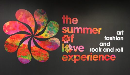
And that was the atmosphere of the ‘60s, a “trip without a ticket”. The counterculture movement led by artists, poets, writers, musicians, designers and performers was an expression of arts as much as it was a political movement. San Francisco, Haight-Ashbury district became the center of the hippie’s movement. In 1967, The Summer Of Love event attracted as many as 100,000 young people from all over the country, protesting against political and social issues, the Vietnam war, social injustice and challenged the mainstream American society.

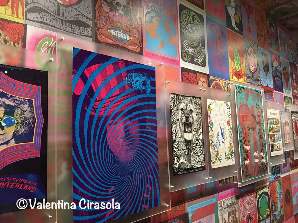
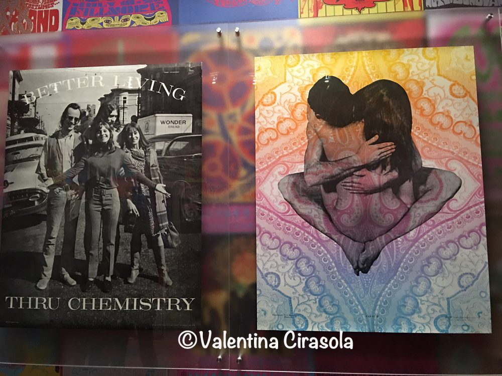
Making colorful posters with “trippy” graphics and bold colors became one of the arts of the counterculture movement in the ‘60s. Music events, gatherings, life expressions, drugs, fashion, free love, everything was publicized with posters attached from wall to ceiling in stores frequented by attentive hip crowds. DeYoung Museum did the same in this exhibition and dedicated a couple of large rooms to posters.


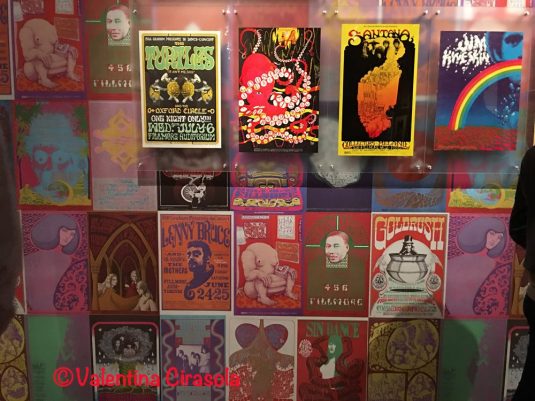
In these rooms one feels the commotion and confusion of the era. The baby boomers visiting the exhibition relived the decade as it was yesterday. I could hear some people singing along or repeating famous phrases pronounced in video clips of the era. “Sitting On The Dock of the Bay” by Otis Redding resonated throughout a few rooms and a few people danced to that tune. The psychedelic room was a “trip”. Bean bags on the floor invited to lay down and listen to music, relax and relive the Summer Of Love in full colors.

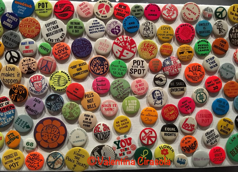
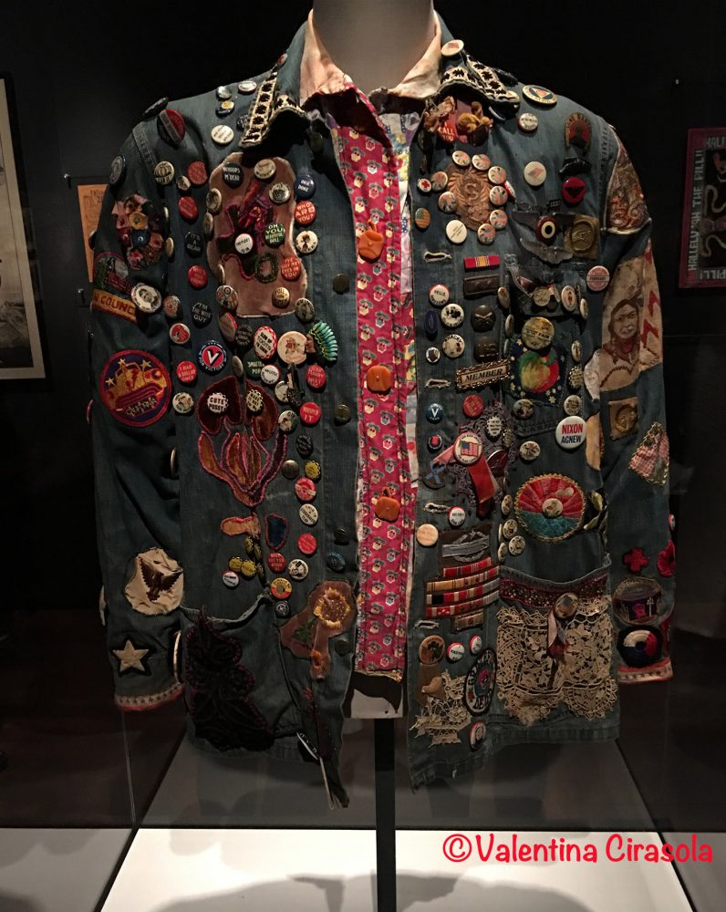
Say it with a button, or better attach as many buttons as you like on your clothes and pass on the message. Political buttons personalized the clothes of The Summer Of Love to let the bourgeoisie know how the youth felt about things they rejected and were no longer valid for that generation of the ‘60s. Messages on the buttons using satire, criticism and emphasizing the “good effect” of drugs were very clear.


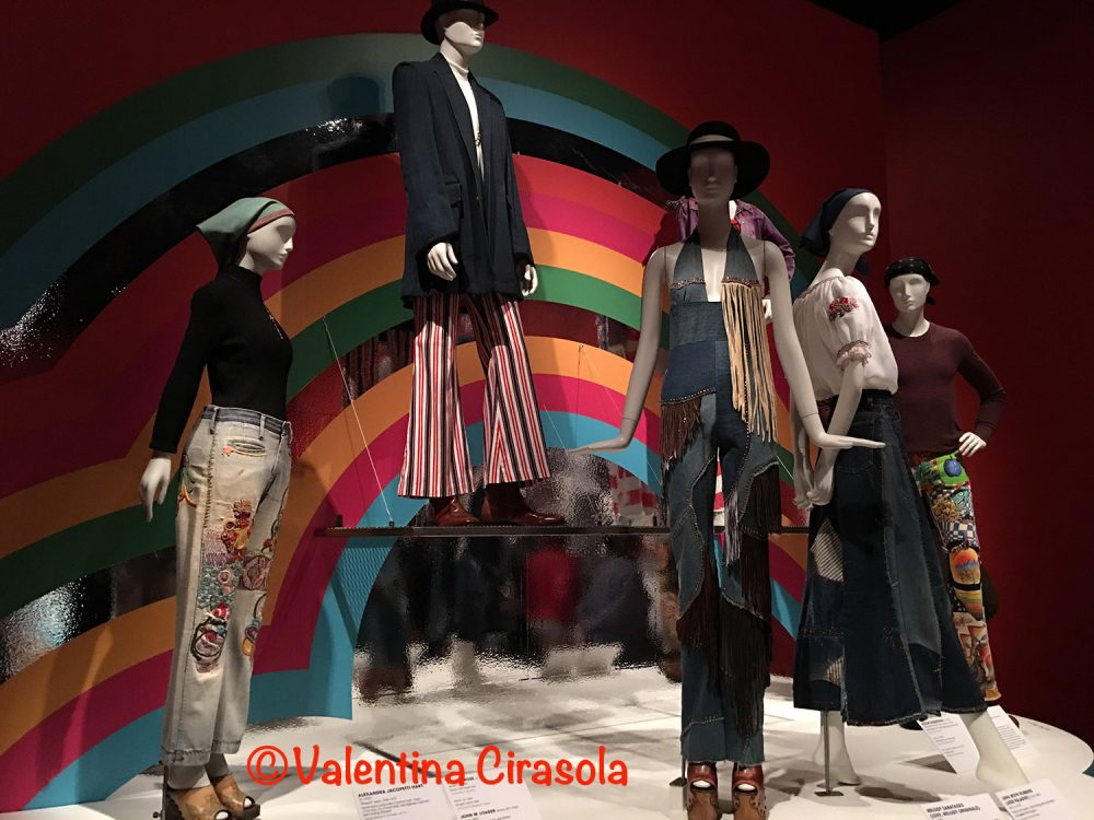
(“Big Smith” jacket, circa 1970 by Jean Stewart)

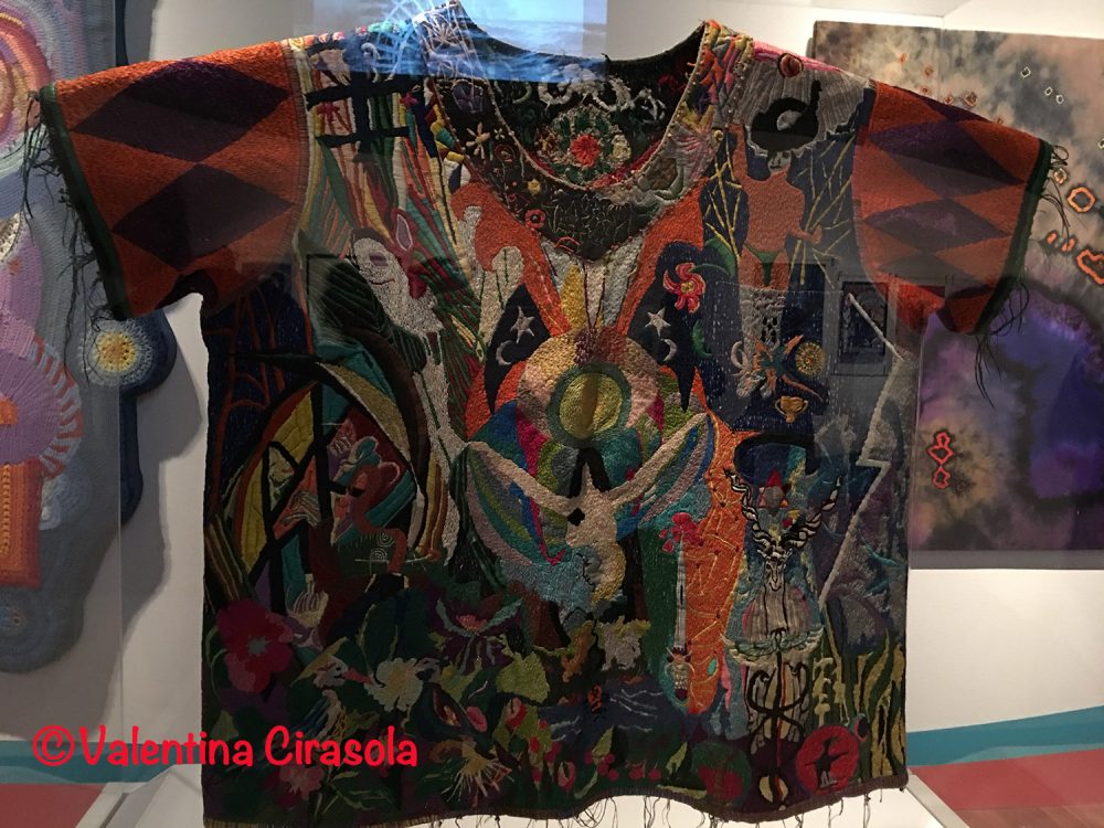
Many of the youth of the ‘60s suffered confusion, anxieties and panic attacks. Psychiatric wards saw an increased in young adults hospitalized for a “bad trip” as it was described. To cure and to keep such patients distracted from their confusion, hospitals involve them in the making of elaborated embroidered hospital scrubs. This one below is a beautiful example of the intricate work done by hospitalized youth.

(Hospital scrub – Circa 1968 – Cotton plain weave with cotton embroidery from the collection of Arthur Leeper and Cynthia Shaver).

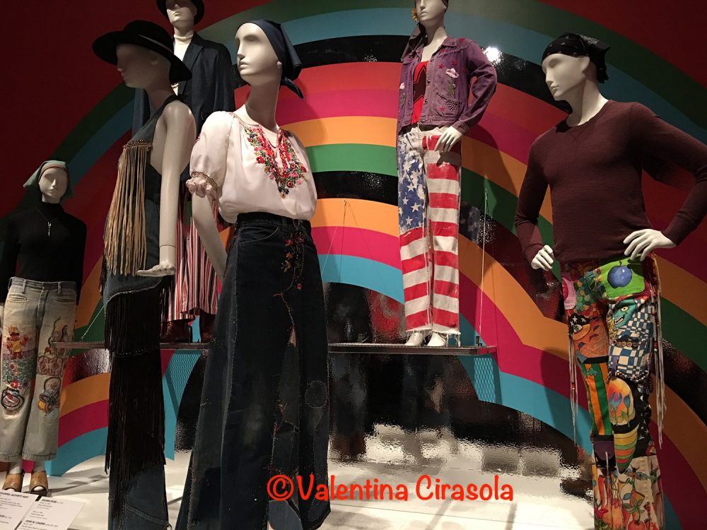
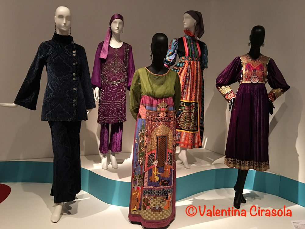
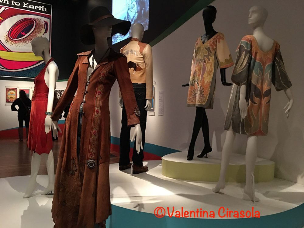
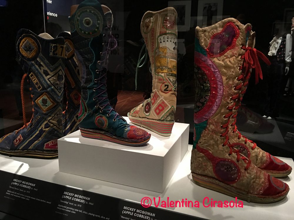
Fashion too marked the era. It was a non-conventional fashion, extravagant, colorful, geometric and free-flowing, aiming to liberate women from constriction of corsets and girdles of the previous decades. Many designers took inspiration from Bohemian life, native American Indian style and various ethnicities, adding denim to all the new natural fabrics ever used before. Denim represented the working-class fabric, it was durable, affordable and it meant rejection from the middle-class upbringing, thus denim mania became the counterculture look.

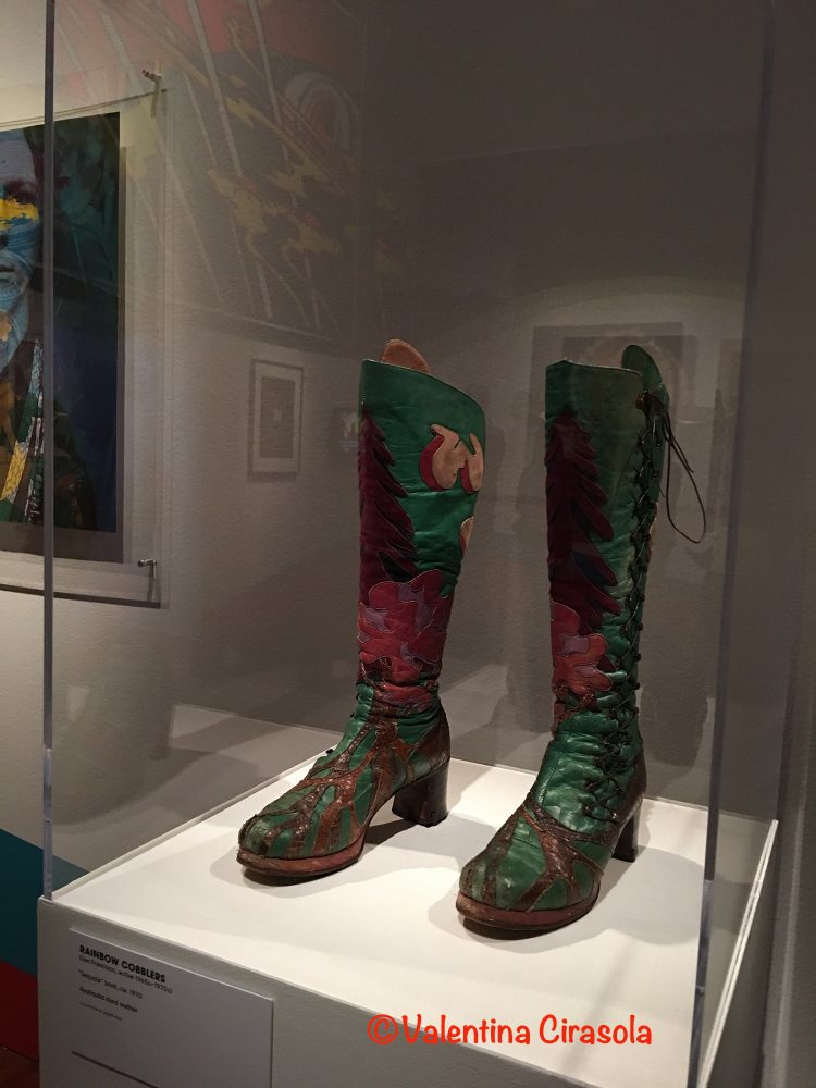
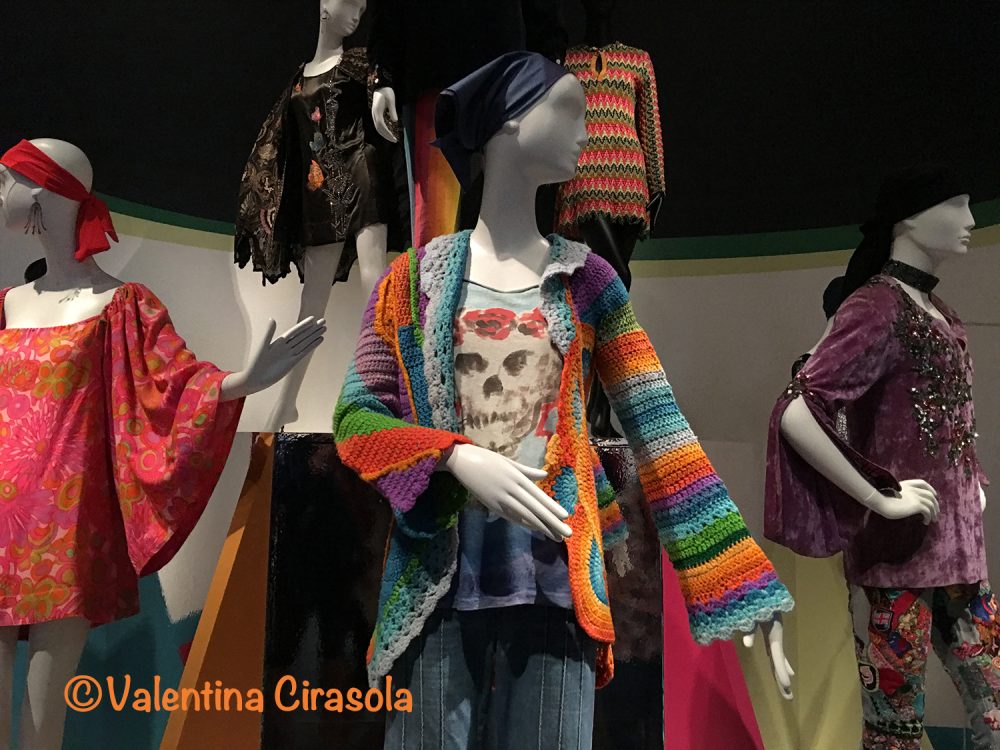
Crochet clothes returned strong from the past. Both women and men wore lace, appliquéd fabric, embroiders, fringes, tie-dye, silk screened clothes, hand painted shoes, colors and crochet garments became unisex, corroborated by button pins with messages mocking society. Everything and anything was fashionable as long as it was colorful.


(All work of art displayed are from the permanent collection of the Fine Arts Museums of San Francisco).

Not only in San Francisco. Youth of the ‘60s took upon themselves the counterculture revolution to change and transform societies all over the western world. A lot of the policies of today would have been unimaginable without the ‘60s visionaries.


(All photos taken in the De Young Museum by ©Valentina Cirasola).

However, almost sixty years later, all is to be questioned again. The kids and grandkids of that generation are still seeing wars, hatred and politicians making personal profits from their positions at the expense of people who work for the nations. Natural food so much wanted by that generation is almost inexistent, diseases related to artificial food are rampant, social injustice is still here and fashion…..well, there is nothing new, doesn’t teach individuality and it is not making any statement.

The Summer Of Love exhibition at the DeYoung Museum in San Francisco is well researched and worth the visit. It is an inspiration for the youth of today. It will be open until Aug.20, 2017 and if you are in the area, don’t miss it. Ciao,
Valentina
https://valentinadesigns.com/services#fashion-services


Copyright © 2017 Valentina Cirasola, All Rights Reserved


I am Valentina, a trained Fashion and Interior Designer, born in Italy in a family of artists. Style has surrounded me since the very beginning of my life. My many years of experience in design business led me to offer consultations in both fashion and interiors, so much so that I can remodel homes as well as personal images. I am passionate about colors and I encourage my clients to express their individual style in their homes and with the clothes they wear. I am the author of three books, one of which is a book on color theory: ©RED-A Voyage Into Colors available on
Amazon: http://goo.gl/qNxXrB
Barnes&Nobles: http://goo.gl/q7dQ3w

Order | Valentina Cirasola | Author and Designer

Recently I was in Seattle for a couple of speaking engagements. I had a few days for me to be a tourist and enjoy a city I had never seen before. My first impression of the city was the same as San Francisco, the roads go up and down, some are very steep to climb on foot or in the car and at times stop signs are placed at the very top of the hill, leaving the car in a vertical position. Weather was cold, gray, windy and the sun peeped into the clouds on and off during the day.

I have always loved the order of classical architecture, but I have discovered order in the cement jungle of the modern cities as well. (Click on each photo to view it larger).

The geometric cluster of buildings propped on the hill overlooking the Bay create a very playful skyline order.


The classical pediments at the top of this corner building, caryatides of native Indian framing windows, balustrades and dentelle work disguise the boxy modern building behind it.

The verticality of these two towers orderly lead in a downtown street of business and shops.

Modern cities must have color contrast for interest, but the order is in the windows, all the same size, where even the reflection in the glass has an order.

Light and dark in order.


Tall and short order. A very tall building shields this classical elegant building in which Banana Republic store resides. Cheap merchandise sold in a classical architecture…..

In this photo geometric order steals the scene. Glass building, brick stairs, horizontal and vertical windows, dark and light buildings, this corner has an appeal thanks for the greenery. This is the view from the rowdy Irish pub I ate. Beer and food were delicious.

Seattle is a very modern city, bustling with people, amateur musicians cheers the streets, traffic is congested, young people eat in rowdy pubs, and buildings are vertical, just like all the new cities of the Middle Age, when churches and cathedrals were built to reach God and the competition between the patrons who could pay to build the tallest church was high.

For me it’s always a good thing when I can combine work and pleasure. The trip was profitable, lovely people came to hear me speaking on the subject of Colors and sold a lot of my book: RED-A Voyage Into Colors was a hit. Ciao,
Valentina
http://www.valentinadesigns.com

Copyright © 2017 Valentina Cirasola, All Rights Reserved

Valentina Cirasola is an Italian interior designer in business since 1990. She is passionate about colors and all expressive arts. She is a “colorist”. To her, selecting art means to bring out the best energy of her clients and nourish their soul. She trots the world and loves to write travel notes, from which she draws inspiration to design home interiors of her clients .
She is the author of her book on the subject of colors: ©Red-A Voyage Into Colors available on
Amazon: http://goo.gl/xUZfk0
Barnes&Nobles: http://goo.gl/q7dQ3w


Balayage And Ombre Hair | Valentina Cirasola | Designer

Look out for new words in hair styling!
Ombre is a style, it’s a transition of a lighter shade from a darker shade. Balayage is technique. It come from the French word “to sweep”. With this technique dark pieces of hair are left at the bottom to create dimension and a natural sun-kissed look.  Both hair colorings are variegated, extravagant, luminous and an ensemble of colors never done before. It seems one color is no longer accepted. Hair stylists are getting creative combining many colors in one hair do.

Have I ever had the urge to dye my hair purple? Yes, many times and I refrained each time from doing it. I am afraid of the level of chemicals that will go in my hair and not only that, something else prevented me from doing it: matching clothes in all the colors I like to a dual or multiple hair coloring would be a real challenge. I would feel locked in a few clothes color solutions and no longer free to do as I please.

Before your hair go under a major color restyle, think about a few issues. You chose an extravagant, modern hair color, let’s say purple and silver.
Will it suit your skin coloration?
With the new hair color, how many colors must you eliminate from your wardrobe?
Is it worth to redo your wardrobe (unless your clothes are outdated) just because your new hair color doesn’t match anything you have?

(Click on each photo to view it larger).

While I am writing this post, I am looking at this ensemble of flowers left casually on the table waiting to do something with it and I am noticing the colors are very similar to a Balayage Hair Coloring, composed of purple and silver-gray (shown in my board). Hair colored this way is very attractive, but the combination of purple and gray will add years to your face, unless you wear the right color clothes. The usual black will look good, however do you want to wear only black for the duration of your dual coloring, when there are so many luminous colors to choose from? In my palette, I selected colors that will play a lively game with clothes and the gray in the dual colored hair, especially if your eyes are blue.

(Photo in my board of purple and gray hair found on http://www.haircolorsideas.com/bright-hair-colors/purple-hair/silver-purple-ombre/attachment/silver-to-purple-ombre)


Use colors to your advantage, even grays are elegant when played out right and mixed with the right colors. Ciao,
Valentina
https://valentinadesigns.com/services#fashion-services

Copyright © 2017 Valentina Cirasola, All Rights Reserved

Valentina Cirasola is a trained Fashion and Interior Designer, born in Italy in a family of artists. Style surrounded her since the beginning of her life. Her many years of experience led her to offer consultations in both specializations and now she can remodel homes as well as personal images. She is passionate about colors and encourages her clients to express their individual style in their homes and with the clothes they wear. To better help people all over the world she offers consultations online. She is the author of three books.
Get your copy of Valentina’s book on colors: ©RED-A Voyage Into Colors on
Amazon: http://goo.gl/qNxXrB
Barnes&Nobles: http://goo.gl/q7dQ3w

From Messy To Sleek | Valentina Cirasola | Interior Designer

I have my theory about Harmony in the home, it doesn’t come from any particular science, only common sense.  Three words starting with the letter D will block a good energy: Dust, Dirt and Disorder. Often, I go into homes where the mess is made of bad habits, lack of cleaning knowledge system and lack of organizational skills. As a designer, from time to time, I find myself teaching how to stay organized, how to create a method and good habits that will keep my design visible six months after the renovation is completed. It takes a long time to tech people how to live in clean spaces in order to have a clean state of mind. It takes efforts and disciplines to break out of bad habits. Living in a mess could make your life feel upside down. This picture below says it all and even though this home is not usually this bad,  it gives a sense of disordered life. This house is one of those restyling projects that keep growing, it has been a domino effect. In open spaces, the floor is common to all the rooms in the major area of the house, which means, without any doubts, that restyling one room requires restyling the next one, thus getting rid of useless stuff has been one of the main needs to allow the design to flow, to communicate with furniture, colors and finally for harmony to take over.

Back in August 2016,  I wrote about this fireplace wall to remodel – https://valentinaexpressions.com/2016/08/09/your-fire-is-an-element-valentina-cirasola-interior-designer – and how I was thinking of changing it from this  traditional and anonymous look  to a modern and sleek look.

(Click on each photo to view it larger).


It finally happened. I choose this metallic look (below), with much of my surprise, it was well received.

(sample wall finish: Gyorgy Sofalvi)

The mess is gone, the room starts to look decent. The new furniture are not there yet and I can’t show the rest of the room. A new stain went on the hardwood floor, which now doesn’t look like a butcher block anymore. Followed a new, modern, LED lighting in the ceiling and the walls have new warm colors.  I choose a palette of three colors, tone on tone, from light, medium to dark, which create a beautiful warm rhythm in he room. This living room looks so much larger and inviting and this is the result.
(Click on each photo to view it larger).


In the next projects, I will  convince my next client to get this same metallic finish in different colors, perhaps a Tuscan rustic, a watercolor effect, or even a space effect, as shown below.

Wall treatments such as these are work of art and nothing else is needed, only a striking piece of furniture, or a super theatrical light. Ciao,
Valentina
http://www.valentinadesigns.com


Copyright © 2017 Valentina Cirasola, All Rights Reserved

Valentina Cirasola transforms and creates spaces realizing people’s dreams in homes, offices, interiors and exteriors. She infuses your everyday living with a certain luxury without taking away a comfortable living. Valentina is well-known for bringing originality on any project and for thinking outside the box. Her interiors are not made with cookie cutters, only follow client’s inspiration, lifestyle and personality. She offers on-line design consultations through Skype and the traditional in-house consultations, helping people with their design challenge anywhere in the world. She is the author of three books, all-available on
Amazon: http://goo.gl/qNxXrB
Barnes&Nobles: http://goo.gl/q7dQ3w

Report In Summer Colors | Valentina Cirasola | Designer

Welcome to my Friday Fashion episode.
Which of the 2017 Pantone colors do you like to wear this summer? Primrose Yellow, Pink Yarrow, Flame, Lapis Blue or Hazelnut? These bright and bold colors will completely put you in a bright light and finally leave out the winter hibernation behind.

Soft colors, neutrals and dusty colors, Bohemian patterns and crochet garments paraded on all runways this year. It was all about the ‘70s revisited and how to wear old ideas, such as bell bottom pants in a new way. Crochet is in the spot light this year, as the new texture and even though it is an ancient art, only a few people today know how to master it. New crochet garments are versatile, feminine, wearable for many occasions, romantic and chic, as they soften the look and hide parts of the body we don’t want to show. I particularly have become attached to dusters and shoulder wraps and I have made a big production for my online Etsy store, all sold out. https://www.etsy.com/shop/ValentinaExpressions

Colors speak about you. Let’s say you create an outfit with Lapis Blue, Primrose Yellow and Hazelnut, what do these colors say about you?
Lapis Blue is linked with positivity, calmness, loyalty and peace, indicates that you’re a trustworthy person.
Primrose Yellow is a sunny, energetic, vibrant and happy color.  Not many people feel confident in yellow. I heard a few people saying yellow makes the face look like yellow jaundice. Yellow tells others that you’re confident and like to receive attention. It’s very welcoming.
Tan – show that you’re down to earth, as all the variations of brown do. It tells you are emotionally stable, grounded, dependable, trustworthy and honest.


Here is my composition of an outfit you can wear this summer using these colors. Basically, I am suggesting a couple of ways to wear this outfit and a great way to cut the clutter in the wardrobe. With one beige pants, you can wear the tank top belted or not, or in alternative with a dressier shirt. Dress the outfit up or down with peep toe shoe or loafer, with or without the crochet jacket, or a longer crochet duster. The blue bag matches the blue jewelry.
This ensemble is perfect for work or for a day of shopping. (Click on the photo to view it larger).


Find all these items in my list of sources.
Summer Crochet Jacket by Valentina – https://goo.gl/y6ziWJ
Tapered Pants – Ann Kein $79
Yellow Tank at https://www.shirtspace.com
Blue Asymmetrical Jewelry – Etsy Daniela Palatnik
Blue Belt – https://www.alwaysstyle4you.com
Peep Toe Shoes – Kate Spade $298
Yellow top with volantes – http://www.debenhams.com
Blue Bag – Chloé Marcie Bag
Bohemian Belt by Valentina – https://goo.gl/OVioGh
Yellow Loafer – Aerosole DSW $60

Look sharp even when is hot, but keep in mind your skin tone. If your hair is brown, dark brown, or red and your skin has a warm tone, choose all the warm colors including red, yellow and orange. If your hair is blonde, black, or ash and your skin is light, or pinkish, choose al the cool tone colors including blue, green and purple. Look sharp even when is hot. Ciao,
Valentina
https://valentinadesigns.com/services#fashion-services


Copyright © 2017 Valentina Cirasola, All Rights Reserved


I am Valentina, a trained Fashion and Interior Designer, born in Italy in a family of artists. Style has surrounded me since the very beginning of my life. My many years of experience in design business led me to offer consultations in both fashion and interiors, so much so that I can remodel homes as well as personal images. I am passionate about colors and I encourage my clients to express their individual style in their homes and with the clothes they wear. I am the author of three books, one of which is a book on color theory: ©RED-A Voyage Into Colors available on
Amazon: http://goo.gl/qNxXrB
Barnes&Nobles: http://goo.gl/q7dQ3w

Gold, A Treasure Color | Valentina Cirasola | Interior Designer

It seems gold has taken over this year, I find it in home décor stores and in fashion stores. Gold used in an unbridled way could be annoying and pretentious, used sensibly increases a sense of wellbeing. Gold resides in the center of our body between the orange sacral center and the yellow solar plexus. Being surrounded by gold is a good thing, as gold represents the treasure of our being and the deepest of our soul. (Click on each photo to view it larger).

In color therapy, applying gold in our living strengthens our worth and the unique treasure we bring to the world. Colors vibrations work wonders on our chakras, but only if they are the right colors. Gold might bring a gut feeling of knowing a situation is right for you in a certain moment, that’s the power it has, but when gold is unbalanced in out body, it will bring a sense of worthlessness and disconnection from the soul. What to do then? Let’s start from the colors of the interior rooms used the most and then we should rethink some gold colors in our clothes. To balance gold, take any chakra chart and refer to the green heart chakra located above the yellow solar plexus.

Green will put gold back in balance, as it represents the heart and the vital force in your chest. Green is the companion color to gold, when decorating with gold color. Turn to green to assure your décor is peaceful and centered in the sense that feels good, just as we feel peaceful in the green colors of nature. Adjust the combination of gold and green with a tangerine color to give the room a vibrant vitality and add some glass with golden details in it. Glass or crystals will pick up and reflect all the hues and colors in the vicinity creating a great burst of color energy. I found these twisted glass bottles with gold trims at Z Gallery home décor store.


(Above photos taken inside Z Gallery with a permission granted)


(photo above: Salmon Bay Pebbles http://www.patagoniabuildingsupplies.com)

To introduce tangerine in a décor with gold and green, simply use either tangerine flower arrangements, a bowl full of tangerines fruit, a display of beautiful mixed salmon-orange bay pebbles (photo above), or paint a tangerine wall as a detail. I love everything about this corner below, it encapsulated everything I talked about and I would make it my private corner.

(Photo below found on http://hadeda-tiles.com)


I hope you will try some gold décor this year. I would like to know how it makes you feel. Ciao,
Valentina
http://www.valentinadesigns.com

Copyright © 2017 Valentina Cirasola, All Rights Reserved

As a designer in business since 1990, I am interested in helping people designing their interior and exterior spaces with an overall feeling of peace, relaxation and harmony that will draw them home eagerly. I am always looking to add that special touch with original findings to the spaces I design. Color is the focus of my business today, changing people’s energy and life force just by introducing them to colors they would have never imagined. Vogue Italia magazine, Gentry and many prominent magazines in California featured my work, I appeared on RAI, National Italian T.V. and nonetheless my story continues. Find copies of my book on colors ©RED – A Voyage Into Colors  and  the rest of my  books
Amazon: http://goo.gl/qNxXrB
Barnes&Nobles: http://goo.gl/q7dQ3w

Previous Older Entries Next Newer Entries

No Facilities

Random thoughts, life lessons, hopes and dreams

Graffiti Lux Art & More

Luxuriating in the Arts - Art Remembers Us

AI Automation & Business Solutions - AI Trends | AI Insights

AI News & Insights - Artificial Intelligence Trends | Technology

Before Sundown

remember what made you smile

James J. Cudney

Best Selling Author of Family Drama & Mystery Fiction

Robbie's inspiration

Ideas on writing and baking

The Write Stuff

"Writers Helping Writers" with Marcia Meara & Friends

Jacquie Biggar-USA Today Best-selling author

Read. Write. Love. 💕💕💕

Banter Republic

It's just banter

Stevie Turner

Author of Realistic Fiction

Warning:Curves Ahead

reasonably photogenic and relatively stylish

Sue Vincent's Daily Echo

Echoes of Life, Love and Laughter

London Life With Liz

A lifestyle blog with a little bit of everything.

Janaline's world journey

My sometimes Strange, but usually Wonderful Experiences and Adventures as I Travel through this amazing World we live in.

Dancer Attitude

"Shoot for the top"

Modern Tropical

Welcome! Immerse yourself in the colorful world of Modern Tropical, an eclectic lifestyle brand for people who love the retro-modern beach aesthetic. It is produced by independent award-winning artist Kristian Gallagher.

Smorgasbord Blog Magazine

Blog magazine for lovers of health, food, books, music, humour and life in general

Jean's Writing

Jean M. Cogdell, Author-Writing something worth reading, one word at a time in easy to swallow bite size portions.

Sisi Hidupku

My Mobile Diary

Valentina Expressions

Luxury for Comfortable Living and Good Life Through Designs, Style, Travel, Food

Cindy Knoke

Photography, Birds and Travel