Layered | Valentina Cirasola | Interior Designer

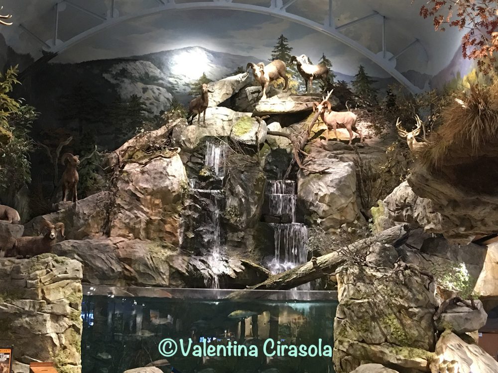
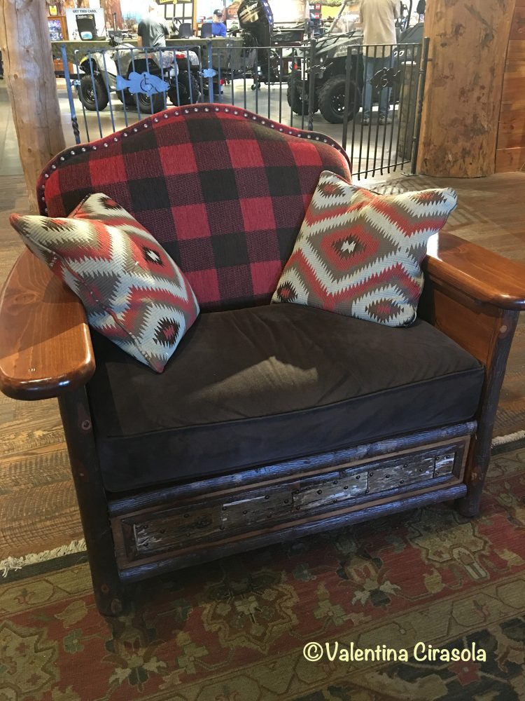
Season is changing. Time for coziness, fireplace, hot cacao, and earthy food is coming. If I had a winter chalet in the mountain, I would decorate it just like this place with only small variations.
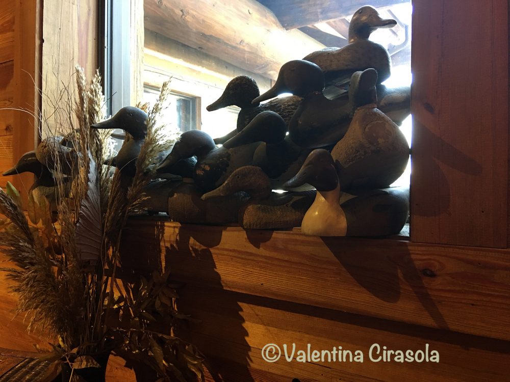
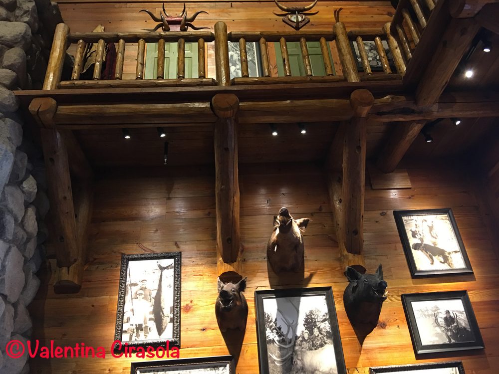
I would layer walls with images and objects of mountains and lakes, games and fish. The décor of the room would be layered with leather, plaid fabrics and Kilim rugs.

(Click on each photo to view it larger).


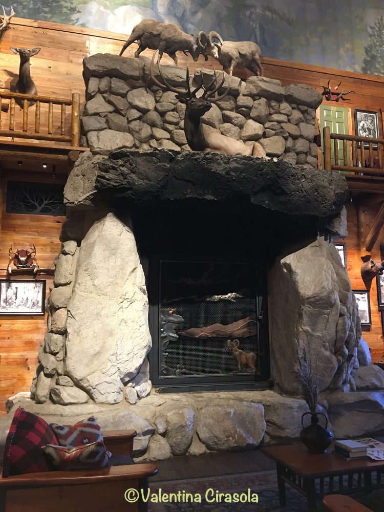
I would design a massive fireplace layered with stones and wrought irons.

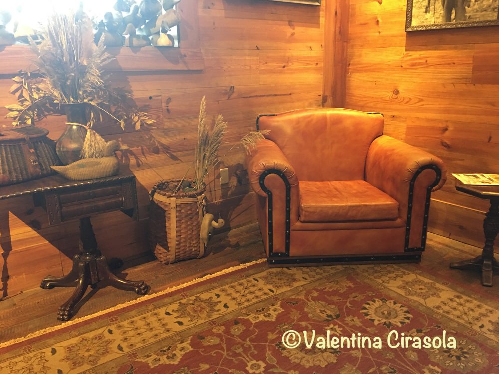
My chairs would be very comfortable and spacious. I would want them made of rawhide, wood and heavy decorative nailheads.


All the interior floor would be rough distressed wood, layered with stenciled images of nature.

I would want an interior cascade ending in a pool where to relax with a colorful cocktail and a game room in the same area.

The entry door, of course, would be decorated with a heavy wood handles.


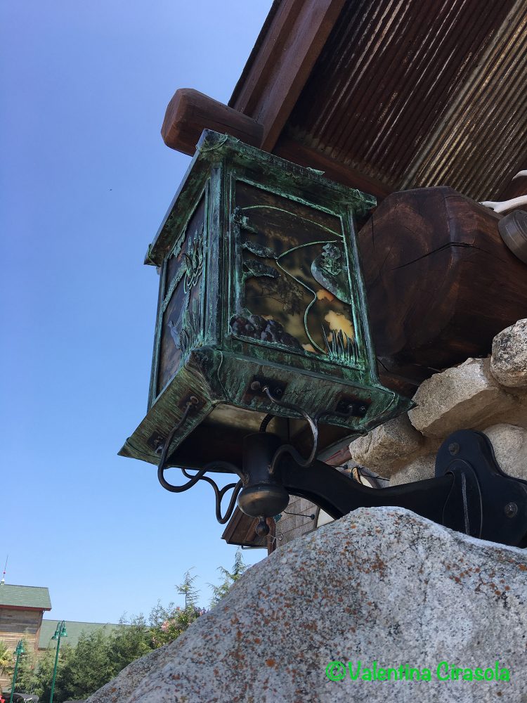
The exterior of the chalet would be layered with the suffuse light of lanterns and the ground would be layered with bright and cheerful beds of  black-eyed Susan.


But this is not my chalet, it’s one of Bass stores and I fell in love the first time I visited it. I thought, If I will ever own a chalet, I would decorate it just like it, warm and cozy. Ciao,
Valentina
http://www.valentinadesigns.com


Valentina Cirasola transforms and creates spaces realizing people’s dreams in homes, offices, interiors and exteriors. She infuses your everyday living with a certain luxury without taking away a comfortable living. Valentina is well-known for bringing originality on any project and for thinking outside the box. Her interiors are not made with cookie cutters, only follow client’s inspiration, lifestyle and personality. She offers on-line design consultations through Skype and the traditional in-house consultations, helping people with their design challenge anywhere in the world.  She is the author of three books, all-available on
Amazon: http://goo.gl/qNxXrB
Barnes&Nobles: http://goo.gl/q7dQ3w


Torrid, Plus, Plump and Happy | Valentina Cirasola | Designer

Welcome to Friday Fashion.
For a long time, fashion designers have refused to design for Plus Size women. After so many efforts and countless hours spent at the gym, the population of women out there is not getting any smaller and fashion designers had to take notice of that. I don’t really know the reason we must be subject to accept the cheap and deceiving sizes coming from China.  I am sure shopping for clothes it is hell for women size over 12. Sometimes the number is right, but the clothes don’t fit, because the Chinese industry cut patterns based on the sizes of their population, not based on the size of people in the Western world. They want to sell us their clothes but do nothing to improve the sizes that fit our bodies.

I am size 12 and I have a tough time finding the right clothes as it is. I spend hours and hours in stores trying on various pieces of clothes and regularly leave without buying anything.  Those few times I do find something that fits,  I can’t match it to anything else I own, thus the search to match items becomes endless.  I can’t imagine how difficult it is for bigger size women.

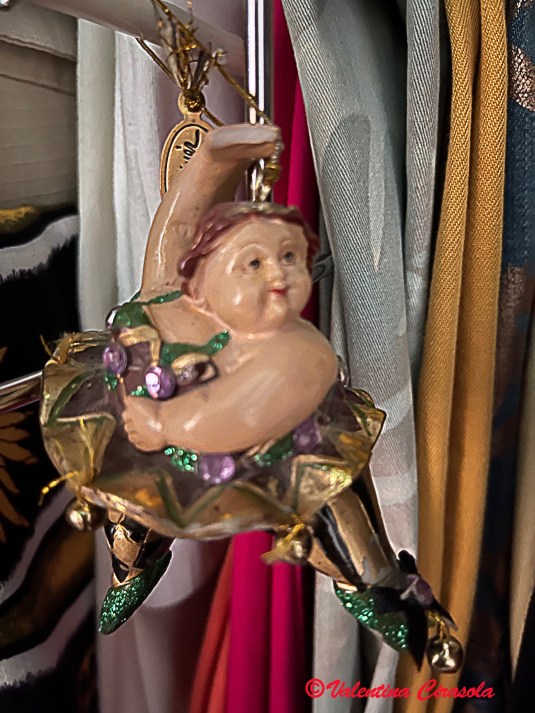
Cirsu Fat Lady-2

(Many of these fat ladies hang in my closets, on bookshelves and on kitchen cabinet doors, just as a reminder to stay healthy and exercising. They are part of a collection by Katherimer I bought many years ago).

Watching the European news this week, I am pleased to have learned that a fashion company called Torrid finally showed its line for Plus Size women at New York Fashion Week. Apparently, Torrid is not the first fashion company showing Plus Size for the first time, as they claim. In 2013, designer Eden Miller of Cabiria showed her first collection of Plus Sizes at the Fashion Institute.

I like how designers of Plus Sizes have conceived healthy curvy women. In their collections, there is nothing dumpy, dowdy, mumsy, or boxy. It’s OK to show off the curves instead of covering up with oversized clothes. The new lines look very shapely and embrace the body. Now, even large women can show cleavage, can wear corsets and leather jackets. They have choices of dresses with high slits, sheer fabric attached at the end of a short dress and flowing Bohemian dresses. They can have fun with flare sleeves and puffy sleeves on jackets and shirts. They can pair cigarette pants or short pencil skirts with longer blazers. Designers of Plus Sizes did not turn away from colors, flowers, and patterns. They want large women to have fun, life is too short for not looking good. Ciao,
Valentina
https://valentinadesigns.com/services#fashion-services

Copyright © 2017 Valentina Cirasola, All Rights Reserved

I am Valentina, a trained Fashion and Interior Designer, born in Italy in a family of artists. Style has surrounded me since the very beginning of my life. My many years of experience in design business led me to offer consultations in both fashion and interiors, so much so that I can remodel homes as well as personal images. I am passionate about colors and I encourage my clients to express their individual style in their homes and with the clothes they wear. I am the author of three books, one of which is a book on color theory: ©RED-A Voyage Into Colors available on
Amazon: http://goo.gl/qNxXrB
Barnes&Nobles: http://goo.gl/q7dQ3w

In Company Of Aura House | Valentina Cirasola | Interior Designer

In September, a few years ago, Eleyne-Mari Sharp interviewed me on her
Color Healing Radio and we spend a pleasant 30 minutes on a video call talking about colors and my new book: RED-A Voyage Into Colors.

(Click on each photo to view it larger).

©RED – A Voyage Into Colors- Author Valentina Cirasola

(Above: Eleyne-Mari Sharp – Author).

Eleyne-Mari is an author, a certified color therapist, the director of Aura House School of Color and Light, founder of Color Therapy Month, the “Rainbow Writing” method and she organizes courses to become Color Expert. http://www.aurahouse.com  –   www.colortherapyschool.com


Eleyne-Mari can teach how to write and shout our feelings to the full moon; she is a Lightworker and through her podcast series, she “celebrates conscious writers who are actively using their words to elevate the vibration of the planet”, in her words.

As a spiritual person, she teaches self-love, forgiveness and how to rise above difficulties. Using color therapy or crystal bed therapy, she promotes clarity and healing.

Just like myself, she loves water and says: “I am drawn to the energy of water and have always found it difficult to leave a bath, a pool or an ocean for some alternate playground.  Water is transforming.  It stirs up the inner waves of my emotions. It cleanses my angst”. I cannot agree more with her.

Her radio programs include: Colors for Meditations, Sunday Colors, Color Angels, Heart Day and Full Moon Color Healing Circles, Color Calendar and many others, which can be found here:  http://www.aurahouse.com/color-healing-radio

Our conversation started with telling the experience of my years in the fashion industry as a designer and owner of my fashion company. Through the video call, she could see the color palette I was wearing and, of course, she asked me if I gravitate around those colors. It was a mix of aqua-blue, light-dark blue, light grey and a very small amount of white. The palette is very soothing and I wore it for the interview on purpose, to stay calm and collected. It is also a great palette for a blond with blue eyes. Knowing the power of colors will put us in a better attitude and better situations.

She went on asking me about my colorful interior design career. She wasn’t surprise to learn I use colors to my advantage when I want to be seen or disappear in the background, when I want to be cheerful and bring optimism in my clients’ homes, or when I want them to make decisions. Every color has a purpose.

Eleyne-Mari lived in Italy some time ago, where she admired the freshness of food and, most of all, how important it is for Italian to have colorful food on the table. She was curious to know about my experience with food and if it had anything to do with me writing two cookbooks. Aside from the fact that colorful food is joyous to see, its colors help balancing and nourishing the chakras, I said. Passion has its own color, without it, life has no spice. Being passionate about food and loving my native land of Puglia were two reasons I wrote two cookbooks.

Here is the link of that fun 30 minutes colorful interview:
http://www.blogtalkradio.com/colortherapy/2014/09/01/the-color-calendar

Eleyne-Mari closes all her communications by saying a “Rainbow Blessings”. I say, let nature inspire you, be in tune with its glorious colors and just copy it.

I love to remember events, situations and people my life brought me, great people, colorful people, each with a message. Thank you Eleyne-Mari. Ciao,
Valentina
http://www.valentinadesigns.com


Copyright © 2017 Valentina Cirasola, All Rights Reserved


Valentina Cirasola is an Italian Interior Designer working in the USA and Europe since 1990, specializing in interior and exterior, color analysis, kitchen, bath, wine cellar, and outdoor kitchen designs. Often people describe her as “the colorist” as she loves to color her clients’ world and loves to create the unusual. “Vogue” magazine and many prominent publications in California featured Valentina’s work. She also was seen on RAI – Italian National TV and has made four appearances on T.V. Comcast Channel 15. Author of three published books, the latest ©RED – A Voyage Into Colors is on the subject of colors.
Amazon: http://goo.gl/qNxXrB
Barnes&Nobles: http://goo.gl/q7dQ3w

It’s Called Playful Intricacy | Valentina Cirasola | Interior Designer

Everybody knows I love yellow in all the tints and tones. However yellow is not a well-liked color by many. This is one of the comment I hear often: “I feel jaundice in yellow”, or “For me, yellow has been the color of high-visibility rain jackets for construction, directing traffic…” My answer is: “don’t overlook the energy of yellow”. Yellow brings the sunlight in grey, rainy days, it’s inviting and uplifting when one is sad and slaps the depression away. Combining yellow and green, pushes out even more negative comments as: “I feel potted”. Ok, everyone has an excuse for not wearing this or that color. The problem I see is only one: once we settle for a comfortable color, we are not willing to experiment with other colors and often takes courage to go out of that comfort zone.

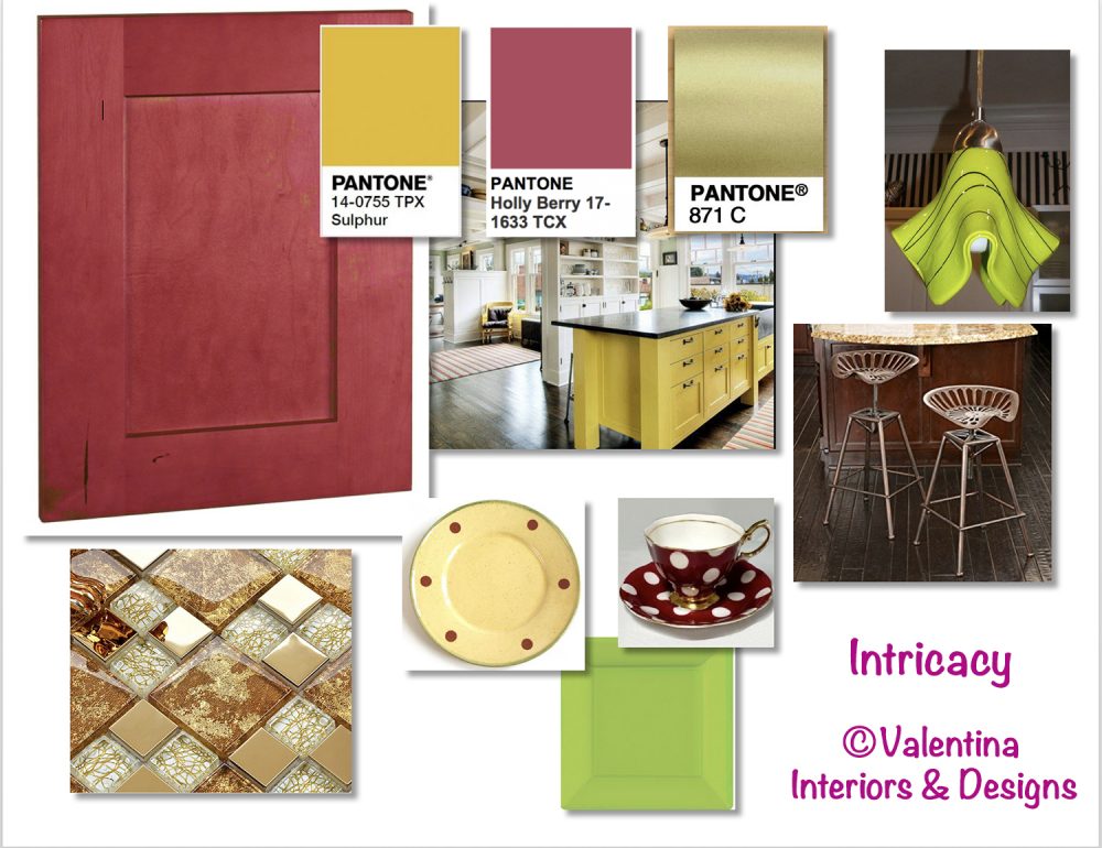
Next year 2018 Pantone, Institute of Colors, declared Playful and Intricacy two colors palettes of the year. They both contain yellow and gold tones, with the addition of green. Yellow and green have been around almost a decade in various combinations with other colors. I find similarity in Playful and Intricacy palettes, thus I am encouraged to use them together with my own twist. First, let’s see how I conceived one of my client’s dining and kitchen spaces using three colors, a sweet yellow pear, a beautiful jewel tone of berry and a light green-yellow. The kitchen cabinets in a blond type of wood and the walls painted in a green-yellow meet the berry color at the banquette seat under the window, which continues in the dining room, where I matched a sweet pear yellow. Then, the cove lighting in the dining room assured a warm ambience.

(Click on each photo to view it larger).


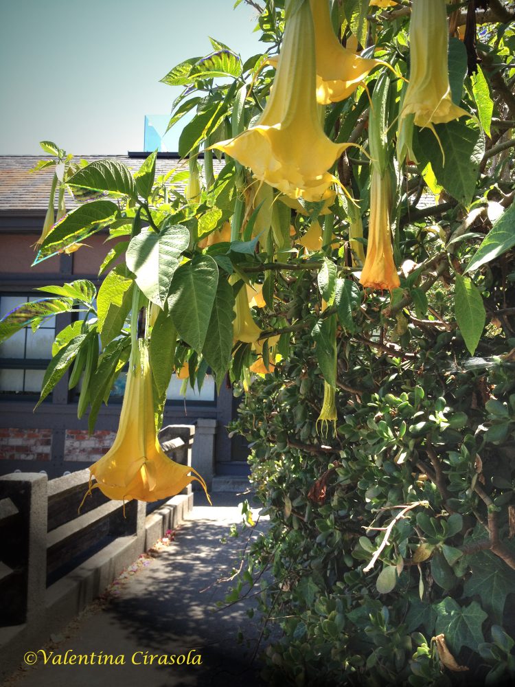
Let’s design a kitchen using each Pantone palettes. My inspiration came from my photograph taken in Napier Lane, in San Francisco. Yellow and Green look so nice in nature, one more reason to bring it in the house, or wear it.

Solution #1 – Playful Palette:
Make all the kitchen cabinets of maple wood with a toffee stain. Decorate the backsplash with glass corbeau tiles in a mix of yellow, green, gold and toffee colors. Turn on the under-cabinet lights and the glass tiles will add luminosity to the counter. Incorporate a green credenza close to one of the greens in my color concept. Paint all kitchen walls in yellow and accent one wall in the same green of the credenza. Make a playful breakfast counter with berry and green stools, coordinate with berry dome lights hanging from above to finish the counter picture. Mirrors, in the kitchen to me are important to double the image of food. Mix antique and modern golden frame mirrors, place them strategically to reflect interesting views of the kitchen and the tasty food you will prepare.

Sources:
CorbeauTiles-www.glasstileoasis.com
Green Credenza: Overstock
Berry dome hanging light: http://www.Houzz.com
Counter stools: JCPennies
Antique sunburst gold mirror: www.notonthehighstreet.com


Solution #2 – Intricacy Palette:
Make all the kitchen cabinets of maple wood with a berry stain. Decorate the backsplash with glass tiles with a metal and gold background. The under-cabinet lights shining on these glass tiles will make the backsplash look like jewelry. Incorporate a yellow Sulphur island. Paint all kitchen walls in yellow Sulphur. For the kitchen counter use golden metal stools, coordinate with extravagant lime green pendant lights to finish the counter picture. Arrange an intricate table setting with square and round plates, in all the colors of this palette, berry, yellow Sulphur, gold and green.


Sources:
Sulphur island: J.A.S.Design-Build-Houzz
Metal gold tile backsplash: http://www.hominter.com
Metal gold counter stool: Amazon
Green pendant lights: Creative Home Decoration
Yellow plates: emiliaceramics.com
Lime square plates: http://www.partywedding.com
Polka dots cup & saucer: http://www.royalalbertpatterns.com


Use golden flatware for both palettes.  From: http://www.shophorne.com

My suggestion: yellow or green by themselves might be bright and discouraging colors, for some people even difficult to combine. Look at the opportunity to tame these two colors by doing something out of the ordinary and boost your creativity. Ciao,
Valentina
http://www.valentinadesigns.com


Copyright © 2017 Valentina Cirasola, All Rights Reserved


Valentina Cirasola is an Italian Interior Designer working in the USA and Europe since 1990, specializing in interior and exterior, color analysis, kitchen, bath, wine cellar, and outdoor kitchen designs. Often people describe her as “the colorist” as she loves to color her clients’ world and loves to create the unusual. “Vogue” magazine and many prominent publications in California featured Valentina’s work. She also was seen on RAI – Italian National TV and has made four appearances on T.V. Comcast Channel 15. Author of three published books, the latest ©RED – A Voyage Into Colors is on the subject of colors.
Amazon: http://goo.gl/qNxXrB
Barnes&Nobles: http://goo.gl/q7dQ3w

Structure | Valentina Cirasola | Author and Designer

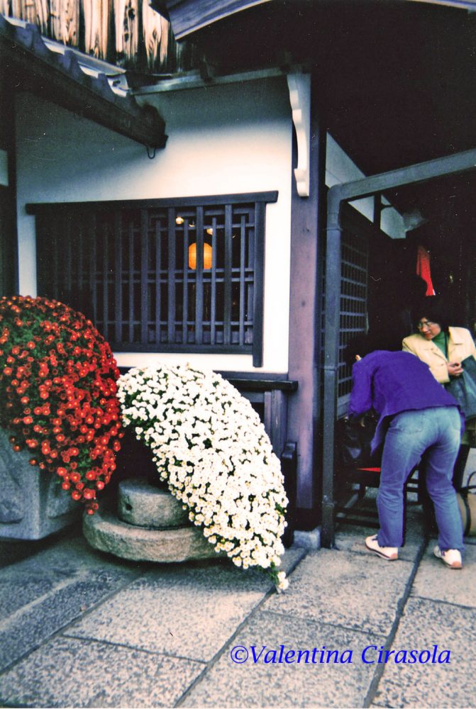
During my travels, I carry a note pad to write about anything that strikes my fancy and that is different from things I see every day in the places I live normally. Most of the time, when I visit foreign countries, I walk around with my head  turned up to discover things above me. I take notes of building structures and architecture details. I note people face, gestures and the way they dress. I am interested in learning how foreign cultures structure vegetation and arrange flowers, then upon my return to my base, I am able to offer a new knowledge to my clients.
In America, city vegetation is tightly structured together in an array of colors and shapes composition, so very different from the arrangements of European countries.
(Click on each photo to view it larger).

I remember in Japan, flower arrangements outside shops, are made only of one color composition, very subtle and structured into cascading effect.

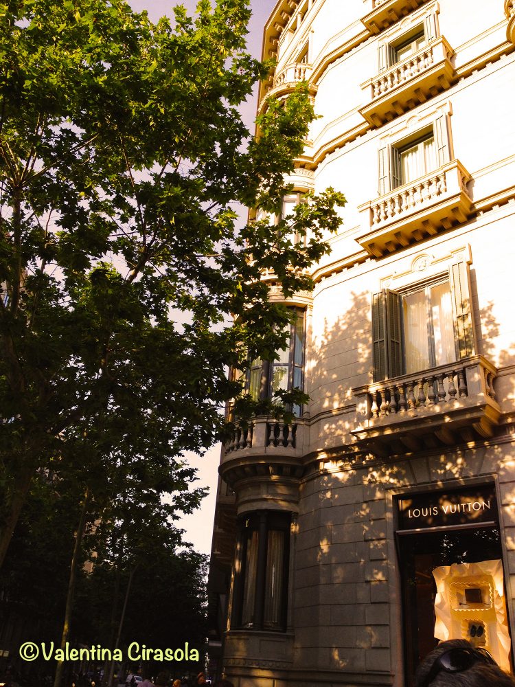
In Barcelona, Spain, I noticed something new. In most city intersections, buildings are squared off or rounded off, in such a way that the intersections look friendlier, more open and inviting, instead of the typical 90º angle buildings all looking at the center of the intersection.


Corner balconies in those squared off buildings are beautifully structured and decorated to add interesting architectural details, visible in all sides of the intersection.


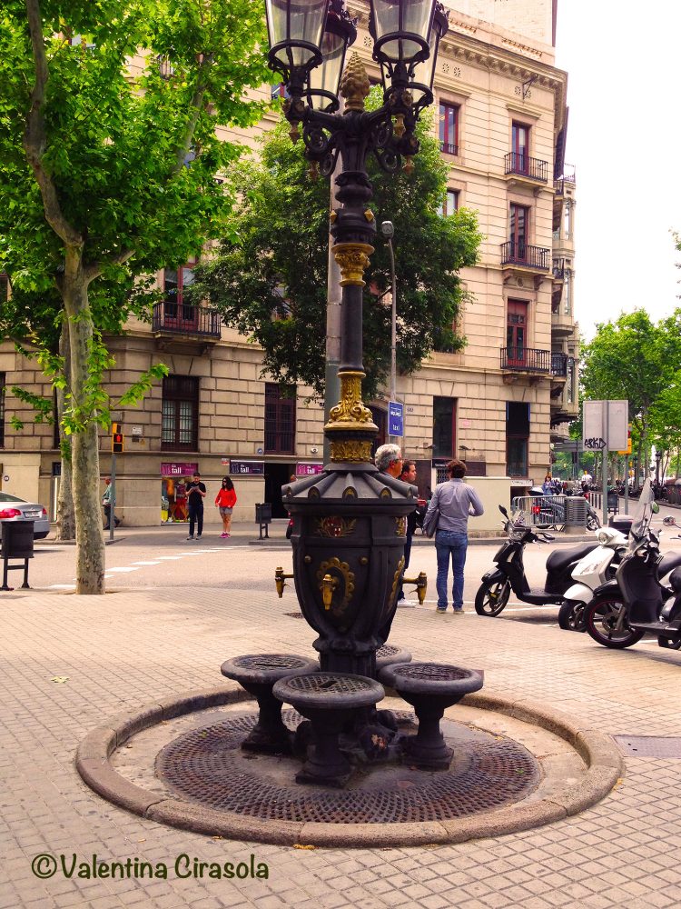
Fountains in European cities, set in the middle of the piazza, had two utilitarian functions in the past. Usually, women went to the fountain to fill up their buckets with clean running water, walked back to their home, used that water in cooking and bathing. Next day they repeated the chore. The second function was to provide cool drinking water to people strolling in the piazza at leisure.

That water is still amazingly cool and so much-needed under the scorching Summer heat, when nothing works but water. Street fountains in Europe are charming, some are historical, many are anonymous, yet, everybody knows them and some have witnessed many love stories.
It’s common to say: “Meet me at that fountain….in Piazza……” they are still structured as a point of social gathering.

“The world is a book, and those who don’t travel only read one page.” ― Augustine of Hippo.
What is your quirk when you travel? Ciao,
Valentina
http://www.valentinadesigns.com

Copyright © 2017 Valentina Cirasola, All Rights Reserved


Valentina Cirasola is an Italian interior designer in business since 1990. She is passionate about colors and all expressive arts. She is a “colorist”. To her, selecting art means to bring out the best energy of her clients and nourish their soul. She trots the world and loves to write travel notes, from which she draws inspiration to design home interiors of her clients .
She is the author of her book on the subject of colors: ©Red-A Voyage Into Colors available on
Amazon: http://goo.gl/xUZfk0
Barnes&Nobles: http://goo.gl/q7dQ3w


La Modiste and Le Trottin | Valentina Cirasola | Designer

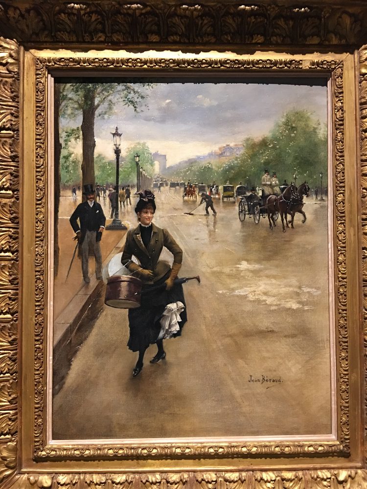
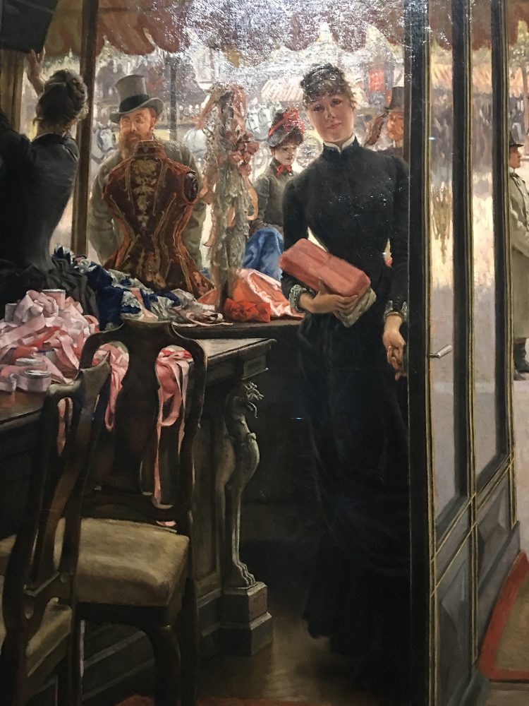
My mom, in her life as a fashion designer/tailor, often used a Modiste (stylist) for her client’s special requests and employed a Trottin (errand girl) the same as the girl on the Champs Élysée painted by Jean Béraud (below). The woman in the painting is as flirtatious as Carlina, the errand girl working in my mom’s tailor shop. Carlina took that time to run errands as her own playful time to flirt and act coquettish with the guys. Often, she returned to the shop out of tune, with her head in the clouds. My mom used to say she had taken too much sun on her head while she was out. Blessed youth!
(Click on each photo to view it larger).


Degas had the deepest admiration for the creative work of young shop girls. In the painting The Millinery Shop (below), Degas is clearly absorbed in the Modiste’s gestures working with colors, textures, silk fabrics combined with straw hats and the gentle touch she puts on each hat decoration. Degas focuses also on the environment in millinery where ribbons, plumes and artificial flowers are laying around in the shop.

(Below: The Shop Girl by James Tissot-French)

In this visit to the Legion of Honor Museum, where Degas, Impressionism and Paris Millinery Trade was showing, I have learned the names of what I wear on my head these days:
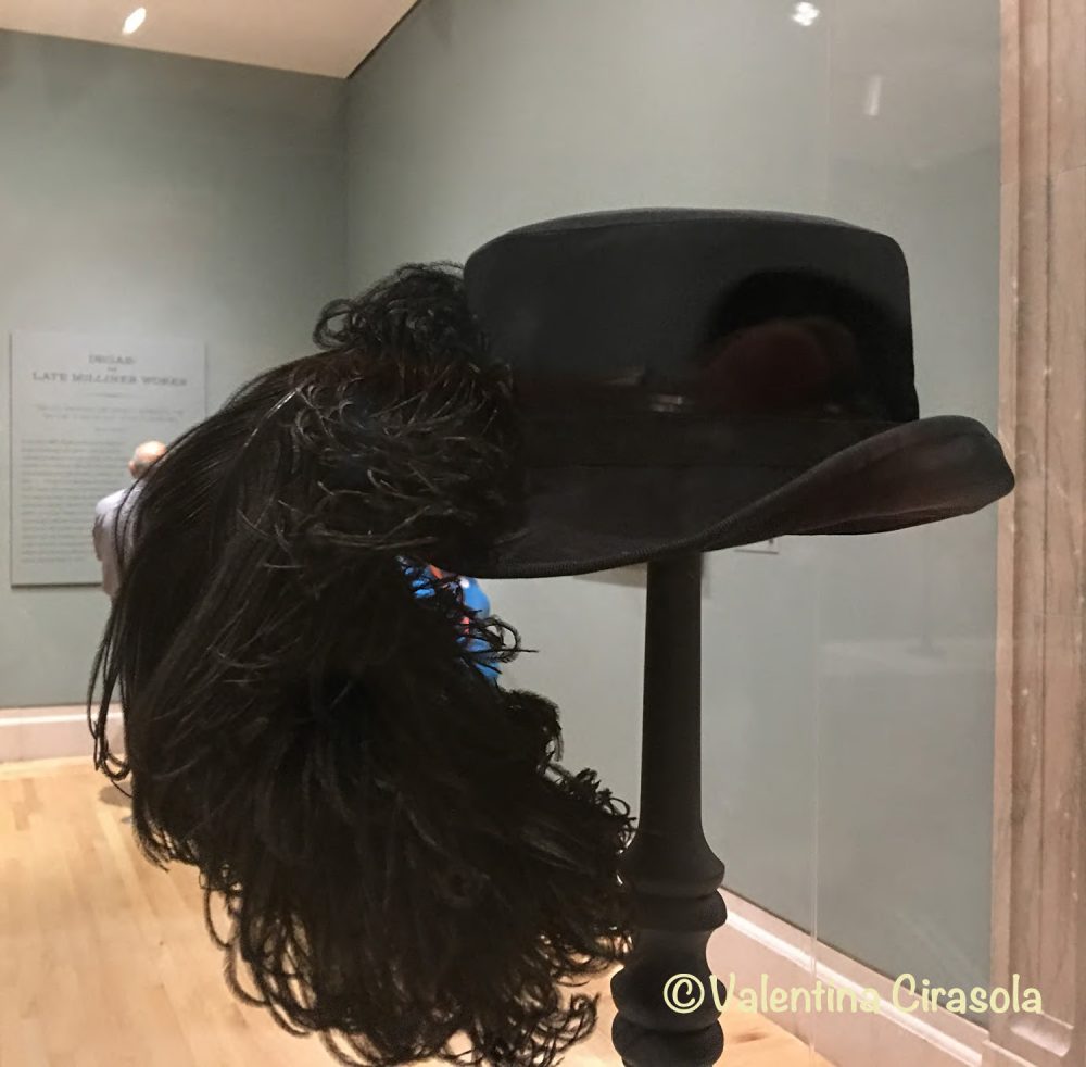
Boaters, Boudoir caps, Bowlers, Bonnets, Capots, Peach Basket hats, Gainsborough or Picture hats, Touring hats, Riding hats, Fascinators, are some of the names given to various women’s hat styles in the 1800s. I am not surprised to see many of those hats have passed the test of time and are still being made in our third millennium. Of course, today we wear them for fun and not because they are required to complete an outfit.


(Above: Tall Hat from Musèe des Art Décoratifs, Paris – UFAC Collection)


In the latest works, Degas placed his attention on skilled women working in milliners under difficult or hazardous conditions, their creativity and hard labor, he depicted their working life. Having reached a certain wealth and not having the pressure to paint for a living, Degas painted millinery scenes for his own enjoyment and never sold his latest work, which was found in his studio when he died 1917.

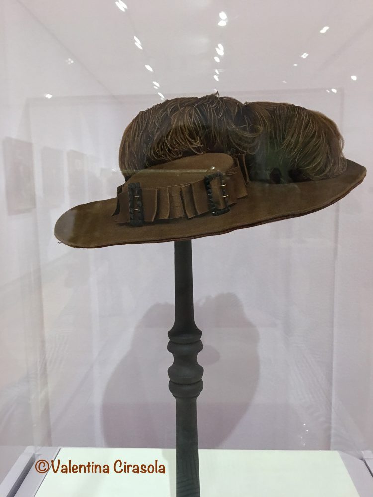
(Above: hat with a dead awl)

Birds of Paradise, Purple Tangaras with black tail, Septicolor with shimmering breasts and ostrich were some of the tropical birds imported to Paris from France’s African colonies. Parisian hat industry supported a massive trade in exotic feathers from South America and Asia as well. Feather, stuffed birds, wings or bird heads were popular ornaments. To stop decomposition, milliners used arsenic, a new toxic substance unknown to be toxic and dangerous for the workers. Mercury, used to soften animal hair and felting of animal fur, was another hazardous material present in millinery work.


At the same time, the artificial flowers became indispensable accessories on chapeau de paille (straw hats) and that industry employed thousands of women. Maison Virot successfully created seasonal hats with intricate flowers even dyed in new colors and hats with velvet fabrics embellished with plumes.


(Above: Capot and Bonnets Hats: Philadelphia Museum of Art – Gift of Mr. and Mrs. George K. Rodgers)

Purple dye color, especially mauve, extracted from mollusks, appealed to the wealthy and soon was established as the color for royals, power and wealth. The use of purple has continued through time. Men’s hats took a small space in this exhibition, even though men, just like women, were not completely dressed without a hat.

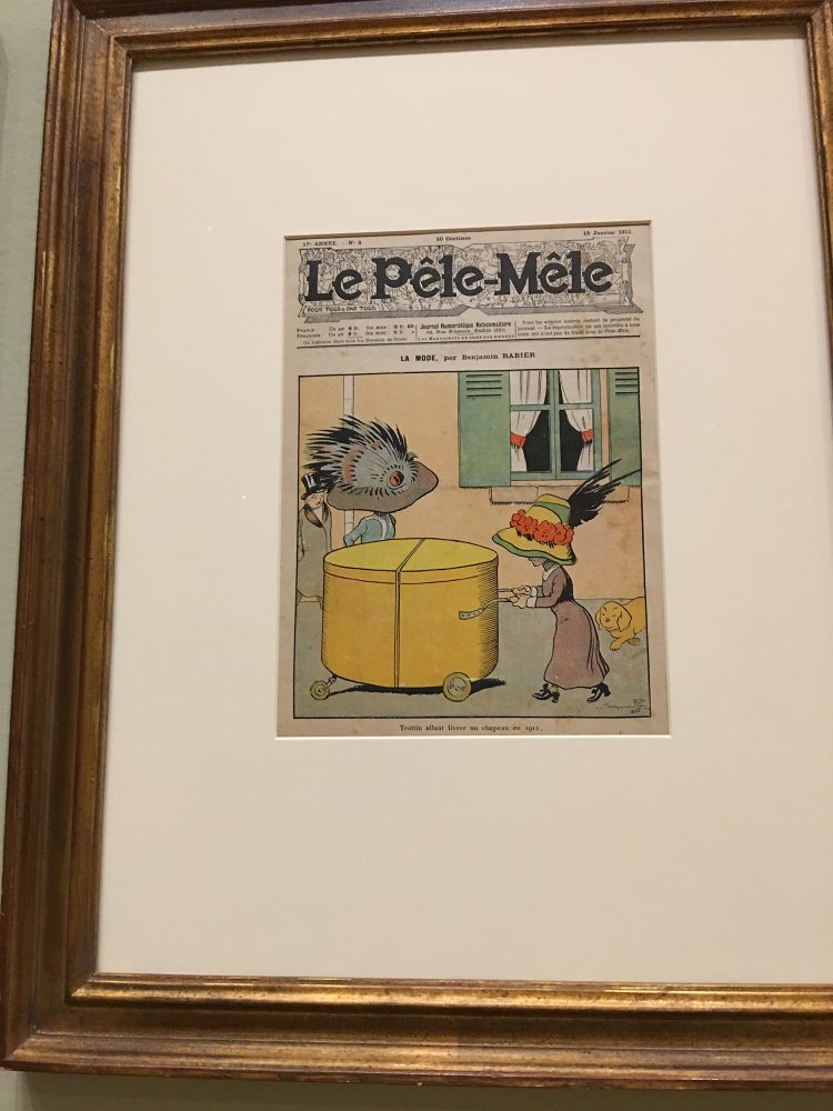
The caricatures, just like in any era, makes us laugh and ponder on the futility of our customs.

It is a small exhibition and would have liked to learn more, as the 1800s were a time of novelties, inventions and preparation for modernity. If you have a chance to visit this exhibition, it’s well worth and it includes a few famous impressionists of the era. It will be on until Sept.24, 2017. Ciao,
Valentina
https://valentinadesigns.com/services#fashion-services


Copyright © 2017 Valentina Cirasola, All Rights Reserved

Valentina Cirasola is a trained Fashion and Interior Designer, born in Italy in a family of artists. Style surrounded her since the beginning of her life. Her many years of experience led her to offer consultations in both specializations and now she can remodel homes as well as personal images. She is passionate about colors and encourages her clients to express their individual style in their homes and with the clothes they wear. To better help people all over the world she offers consultations online. She is the author of three books. Get your copy of Valentina’s book on colors: ©RED-A Voyage Into Colors on
Amazon: http://goo.gl/qNxXrB
Barnes&Nobles: http://goo.gl/q7dQ3w

 

Don’t Worry About The Small Room | Valentina Cirasola | Interior Designer

Are you challenged by a small room in your house? Don’t be! Consider a small room as the jewel box you will create,  think of the  fun you will have decorating and planning a functional space.
Small rooms teach us how to stay organized and how to save money as well, because you will only buy the necessary items. In a small space every inch counts and every piece of furniture must have a double function for storage and living tasks. Before starting a decorating fun, it is important to assess the room. Take out of the room all the items, edit them heavily, donate, sell or throw away the items not needed anymore and start fresh. There is a great feeling of freedom in doing a complete de-cluttering. You will see the actual size of the small space for the functionality and purpose you want to assign to it. You will know how much storage and shelving are needed. Yes, even small rooms can have a multiple purpose.

(Click on each photo to view it larger).


Furniture – must have many functionalities and be adaptable to any situation. Choose seating that have storage, cabinets that hide a retractable table or shelves, compartmentalized drawers to have everything in plain view. Use decorative boxes, trunks, luggage or ottomans as side tables and coffee table that can be used as extra storage. Choose a sofa for the daytime that easily turns into a bed at night. European furniture makers are masters of small spaces, they have created an array of items for small European homes. Heavy and dark furniture make a small space seem even smaller. One way to trick the eyes is to incorporate glass items and furniture with legs instead of boxy furniture. Seeing open spaces under the furniture will improve the room look bigger, at least visually.

Lighting – Layer heavily. It doesn’t matter if recessed lights are already in place inside the ceiling. To create an ambience and a sculpting atmosphere, scatter around the room, tall and small lamps with different colors and styles. Don’t try to match.

Scale – Trick the eyes with large pattern wallpaper design, large artwork and large decorative items.

Color – Bold colors go well with large scale items, together will make the room look expensive and, no, dark or bold colors don’t make the room smaller, it’s a myth! Have fun painting horizontal stripes if you want a room to look longer, or vertical stripes if you want a visually taller room.


Mirrors – Will open the space, especially if they are placed across or near a window. The bigger the better and if they have details is even more playful, will add interest to the décor.


Natural Light – It’s always welcome, along with the sun energy. If privacy or the view outside are not an issue, don’t cover windows with curtains, let the outside in. The room will benefit from natural light and everything will look more luminous. Otherwise, hang curtains as high as possible, and from wall to wall, outside the window frame to give the window wall a larger appearance.

Hidden Storages – People tend to use the space under the bed to store shoes and seasonal items. A positive energy must flow freely in the room to impact positively your sleep or your quiet hours, if boxes occupy the space under the bed, that positive energy and natural flow of air circulation will be blocked. This is where saving money comes into play. Buy only the necessary clothes, shoes and accessories to keep at a minimum the need for storage. You will win the clutter!

Rules are made to be broken, allow your fantasy to go where it wants to go.
I am happy to help you anytime, online design consultations are available. Ciao,
Valentina
http://www.valentinadesigns.com


Copyright © 2017 Valentina Cirasola, All Rights Reserved

It’s my hope that through my writing and my stories I am enriching your aesthetic sensibility towards design, style and inspiring you to live in beauty. I have loved my profession as an interior-fashion designer since 1990. I am here ready to offer consultations on-line if you need. Check out my latest book on the subject of colors ©RED-A Voyage Into Colors
Amazon: http://goo.gl/qNxXrB
Barnes&Nobles: http://goo.gl/q7dQ3w
Let’s Fix This Room, Shall We? | Valentina Cirasola | Interior Designer

At times, my home projects with clients fly by at the speed of light without even knowing how they happened. Other times, they come to a halt due to vacation time, kids interrupting schedules, hectic daily life, disagreement between husband and wife or for no reason at all. This is one of those cases. We started this room somewhere around February of this year and here we are, in the middle of August, with an unfinished, unwelcoming room.

I had to wait for walls to be painted, electrical system to be completed and the floor to be restained. The floor now is an attractive distressed, warm greige and a very elegant floor, so different from the previous butcher block floor. After all of that necessary work was done, it was time to choose furniture and sometimes that process can take a long, long time, depending on how clients react to ideas, style and colors, or how fast they take decisions. The secret of making fast decisions when choosing furniture is about answering three questions:
Prices – can you afford it?
Colors – do you like it?
Sizes – does it fit?
However, for people is never so cut and dry as it is for someone like me, trained not to waste time.

(Click on each photo to view it larger).

(Above: the unfinished room as it is now)

So far, we have a red sofa, a laguna color Coletta chair, a rustic credenza with metal profiles and a beige cuddle chair. These pieces look disjointed in the room, the element that will function as trait-d’union between all the colors is missing and the project is not moving forward. I had envisioned a colorful room, a space vibrating with interesting and whimsy elements.The room has been dull for so long and that would have been a good enough reason to fix it fast. Ouch, I must wait to see my vision realized and work at people’s pace.  🙃

Many times, I must deal with people’s fear of colors and their preconceived ideas that colors will tire them and the room. The result is a fight with their emotions.
How can anyone get tired of colors?
My role as your designer is to calm souls, emotions and to convince that colors can only help them get out of the boredom of vanilla living.


(Above: my proposed concept of furniture)

The room needs a punch with a golden-yellow element to pull the golden tones of the walls together with furniture (a yellow chair). I want to add warm wood elements to contrast the subdued distressed floors (side tables, floor lamp) and warm elegant metals to elevate the metal of the credenza (lamp metals, coffee table).

(Above: my proposed pillows)

To complete the picture, I would like to see colorful pillows in yellow, red, orange and bluish to blend everything, just like a tasty cocktail. How can anyone get tired of this moderately colored room?
If it looks good on paper, it will look good in the room. Shall we fix and finish this room? Ciao,
Valentina
http://www.valentinadesigns.com

Copyright © 2017 Valentina Cirasola, All Rights Reserved


It’s my hope that through my writing and my stories I am enriching your aesthetic sensibility towards design, style and inspiring you to live in beauty. I have loved my profession as an interior-fashion designer since 1990. I am here ready to offer consultations on-line if you need. Check out my latest book on the subject of colors, available on
Amazon: http://goo.gl/qNxXrB
Barnes&Nobles: http://goo.gl/q7dQ3w
Chartreuse Mix Inspiration | Valentina Cirasola | Designer

Welcome to my Friday Fashion episode.
This year, I have written many times about green and gold colors, alone or with other colors and I haven’t yet exhausted all the possibilities. Think about it? Green represents the lawn, the grass, the leaves, gold represents the sunlight. We feel good under the sunlight that energizes us. If we sit on a green lawn and greenery surrounds us, we feel infused with peaceful relax, just by simply looking at it. Green and gold are perfect together for our emotions and wellbeing. Nature does it, we can too.

(Click on each photo to view it larger).


I take inspiration mostly from my food to make up an outfit. Strange as it sounds, going to a grocery shop for me is more about taking photos of food first, thinking of exciting ways to use those colors in my various life expressions and manipulating photos to feed my creativity, than the banal act of buying food. I put those photos together when I need to come up with original outfits. It’s so much fun!
People stress so much about getting dressed, complaining of not having anything to wear and the wardrobe is full of clothes they might not even be aware of having. I don’t think much when I put together my outfits, nature provides me with all the colors I need to make excellent combinations. If it looks good in nature, it will look good on me and my food photography helps me immensely.

I feel good in any green colors, better if it is a yellow-green, Chartreuse, or blue-green. I use any green tone as a daytime color, as well as for evening dressing up. I hear people saying green will make them feel “potted”. Green and golden tone skins are a perfect match, but green-bluish tone color works well on people with pinkish skin tone. That’s the secret.

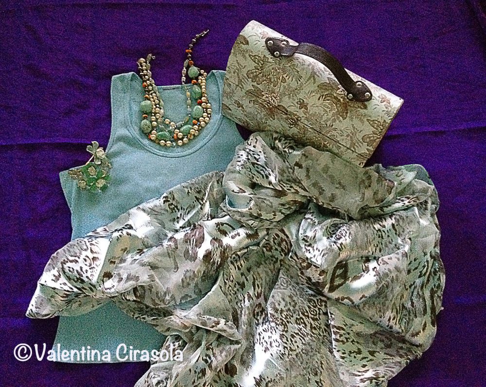
For this time, I am having a close encounter with Chartreuse (my purse and necklace), arugula green (my pants) and gray mushrooms (my top). I have a great ability to mix jewelry metals and manage to make them look attractive together. I wear gold and silver together without inhibitions. A small touch of pearls won’t hurt either. The detail, which makes this ensemble more interesting, is the tapestry sabot shoes by Steve Madden.
There you go, as I often say, don’t be afraid of colors. If you do it right and tasteful, color will change your life. Ciao,
Valentina
https://valentinadesigns.com/services#fashion-services


Copyright © 2017 Valentina Cirasola, All Rights Reserved


As a designer in business since 1990, I am interested in helping people designing their interior and exterior spaces with an overall feeling of peace, relaxation and harmony that will draw them home eagerly. I am always looking to add that special touch with original findings to the spaces I design. Color is the focus of my business today, changing people’s energy and life force just by introducing them to colors they would have never imagined. Vogue Italia magazine, Gentry and many prominent magazines in California featured my work, I appeared on RAI, National Italian T.V. and nonetheless my story continues. Find copies of my book on colors ©RED – A Voyage Into Colors , and  the rest of my  books on
Amazon: http://goo.gl/qNxXrB
Barnes&Nobles: http://goo.gl/q7dQ3w
Elemental | Valentina Cirasola | Author and Designer

Northern California skies are hardly an interesting elemental nature, they are always flat blue, rarely have any clouds, it doesn’t rain for years, in fact we suffer severe drought, nature is mostly yellow-brown even though colorful flowers embroider it. Palm trees and odorous eucalyptus compete with the blue skies.
I love California weather, it is always Spring-like, windy and mild, the perfect weather for work days and now, I am spoiled.

(Click on each photo to view it larger).


It isn’t all perfect, however. There isn’t much change of seasons. We wear the same clothes all year around and often I see people in short pants in the middle of December and January, when the temperature goes down a little. They look awkward and confused in their perception that, here, in California is always summer.

On the other hand, summer is a real surprise for tourists. They expect to find a summer warmth, instead July and August cold and grayness greet them. As Mark Twain said: “The coldest winter I ever spent was a summer in San Francisco”. Blue skies, sunny days and palms are deceiving when summer temperature ranges around mid 50 to low 60 F.

The land is rugged, ideal element for hiking and discovering driftwood sculptures.


The fog is the characteristic elemental nature of this area. People seem to think fog is magic and mystical. In the early afternoon, it rolls in like a huge cotton ball, even thought it might be still sunny.


Although, I am used to this mild weather, I must say, not having a change of seasons and having the same weather elements just about all year around it is a bit boring to me, thus I tend to distort or manipulate the nature I see, with my vision of colors and textures.


At time, a regular pine tree, might seem to grow under a vanilla sky.


Other times a path might look like a fall path, when in reality it isn’t.

And other times, camelias take electrifying colors of its own.

If something doesn’t excite you, free your fantasy and find ways to see it differently. Ciao,
Valentina
http://www.valentinadesigns.com

Copyright © 2017 Valentina Cirasola, All Rights Reserved


Valentina Cirasola is an Italian interior designer in business since 1990. She is passionate about colors and all expressive arts. She is a “colorist”. To her, selecting art means to bring out the best energy of her clients and nourish their soul. She trots the world and loves to write travel notes, from which she draws inspiration to design home interiors of her clients .
She is the author of her book on the subject of colors: ©Red-A Voyage Into Colors available on
Amazon: http://goo.gl/xUZfk0
Barnes&Nobles: http://goo.gl/q7dQ3w  
Previous Older Entries Next Newer Entries

No Facilities

Random thoughts, life lessons, hopes and dreams

Graffiti Lux Art & More

Luxuriating in the Arts - Art Remembers Us

AI Automation & Business Solutions - AI Trends | AI Insights

AI News & Insights - Artificial Intelligence Trends | Technology

Before Sundown

remember what made you smile

James J. Cudney

Best Selling Author of Family Drama & Mystery Fiction

Robbie's inspiration

Ideas on writing and baking

The Write Stuff

"Writers Helping Writers" with Marcia Meara & Friends

Jacquie Biggar-USA Today Best-selling author

Read. Write. Love. 💕💕💕

Banter Republic

It's just banter

Stevie Turner

Author of Realistic Fiction

Warning:Curves Ahead

reasonably photogenic and relatively stylish

Sue Vincent's Daily Echo

Echoes of Life, Love and Laughter

London Life With Liz
A lifestyle blog with a little bit of everything.

Janaline's world journey

My sometimes Strange, but usually Wonderful Experiences and Adventures as I Travel through this amazing World we live in.

Dancer Attitude

"Shoot for the top"

Smorgasbord Blog Magazine

Blog magazine for lovers of health, food, books, music, humour and life in general

Jean's Writing

Jean M. Cogdell, Author-Writing something worth reading, one word at a time in easy to swallow bite size portions.

Sisi Hidupku

My Mobile Diary

Valentina Expressions

Luxury for Comfortable Living and Good Life Through Designs, Style, Travel, Food

Cindy Knoke

Photography, Birds and Travel