

It seems gold has taken over this year, I find it in home décor stores and in fashion stores. Gold used in an unbridled way could be annoying and pretentious, used sensibly increases a sense of wellbeing. Gold resides in the center of our body between the orange sacral center and the yellow solar plexus. Being surrounded by gold is a good thing, as gold represents the treasure of our being and the deepest of our soul. (Click on each photo to view it larger).
In color therapy, applying gold in our living strengthens our worth and the unique treasure we bring to the world. Colors vibrations work wonders on our chakras, but only if they are the right colors. Gold might bring a gut feeling of knowing a situation is right for you in a certain moment, that’s the power it has, but when gold is unbalanced in out body, it will bring a sense of worthlessness and disconnection from the soul. What to do then? Let’s start from the colors of the interior rooms used the most and then we should rethink some gold colors in our clothes. To balance gold, take any chakra chart and refer to the green heart chakra located above the yellow solar plexus.
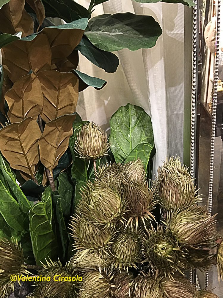
Green will put gold back in balance, as it represents the heart and the vital force in your chest. Green is the companion color to gold, when decorating with gold color. Turn to green to assure your décor is peaceful and centered in the sense that feels good, just as we feel peaceful in the green colors of nature. Adjust the combination of gold and green with a tangerine color to give the room a vibrant vitality and add some glass with golden details in it. Glass or crystals will pick up and reflect all the hues and colors in the vicinity creating a great burst of color energy. I found these twisted glass bottles with gold trims at Z Gallery home décor store.

(Above photos taken inside Z Gallery with a permission granted)
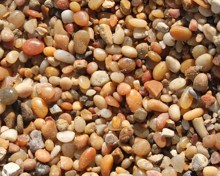
(photo above: Salmon Bay Pebbles http://www.patagoniabuildingsupplies.com)
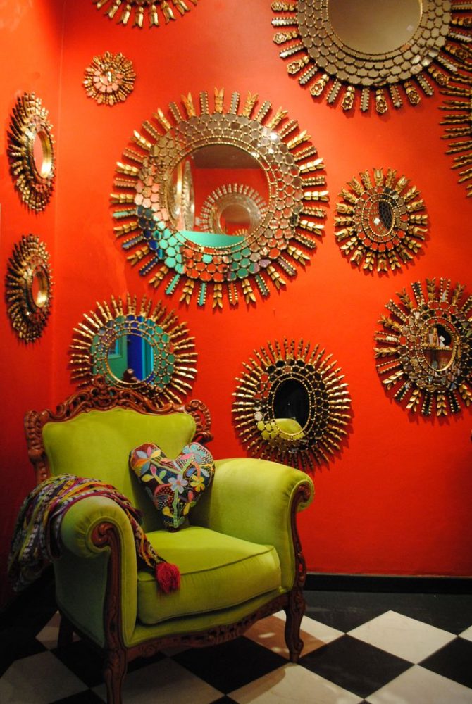
To introduce tangerine in a décor with gold and green, simply use either tangerine flower arrangements, a bowl full of tangerines fruit, a display of beautiful mixed salmon-orange bay pebbles (photo above), or paint a tangerine wall as a detail. I love everything about this corner below, it encapsulated everything I talked about and I would make it my private corner.
(Photo below found on http://hadeda-tiles.com)
I hope you will try some gold décor this year. I would like to know how it makes you feel. Ciao,
Valentina
http://www.valentinadesigns.com
Copyright © 2017 Valentina Cirasola, All Rights Reserved
 As a designer in business since 1990, I am interested in helping people designing their interior and exterior spaces with an overall feeling of peace, relaxation and harmony that will draw them home eagerly. I am always looking to add that special touch with original findings to the spaces I design. Color is the focus of my business today, changing people’s energy and life force just by introducing them to colors they would have never imagined. Vogue Italia magazine, Gentry and many prominent magazines in California featured my work, I appeared on RAI, National Italian T.V. and nonetheless my story continues. Find copies of my book on colors ©RED – A Voyage Into Colors and the rest of my books
Amazon: http://goo.gl/qNxXrB
Barnes&Nobles: http://goo.gl/q7dQ3w


May 17, 2017 @ 13:40:40
Gorgeous images, Valentina. Gold is a lovely warm color, and almost as happy as yellow. Hugs.
LikeLiked by 1 person
May 17, 2017 @ 15:30:53
In fact it is, Teagan, thanks for the comment. 😀
LikeLiked by 1 person