April Light | Valentina Cirasola | Designer

Light is delicate, the air is fizzy, flowers are in bloom, nature is crisp, I am pondering light thoughts and seeing dreams. This is April in a whole new light.

In Europe, in April we exchanged the wardrobe, lighter weight clothes came down from the top of the wardrobe and we put winter clothes back in boxes well cleaned and ironed, ready for the next season.
In April we wore pastels and lighter color clothes, we wanted to blend in with the fresh nature. We wore layers of clothes to fight cold winters and slowly, by the time April rolled in, we shed a few layers. Shedding layers of clothes happened before global warming, when all seasons followed each other punctually to the dates established by nature itself. Now, living in California, the clothes I wear are the same winter and summer, seasons do not exist anymore. With the exception of a few rainy days, it is always Spring-like here, even in the winter. Summer time might turn windy and cold one week and suddenly the next week the temperature becomes torrid and unbearable.  I don’t complain about sunny days all year round, I should complain more about the price we pay for living here in a sunny region.

April is the first month of the year I get rid of things in my wardrobe, then in September again.
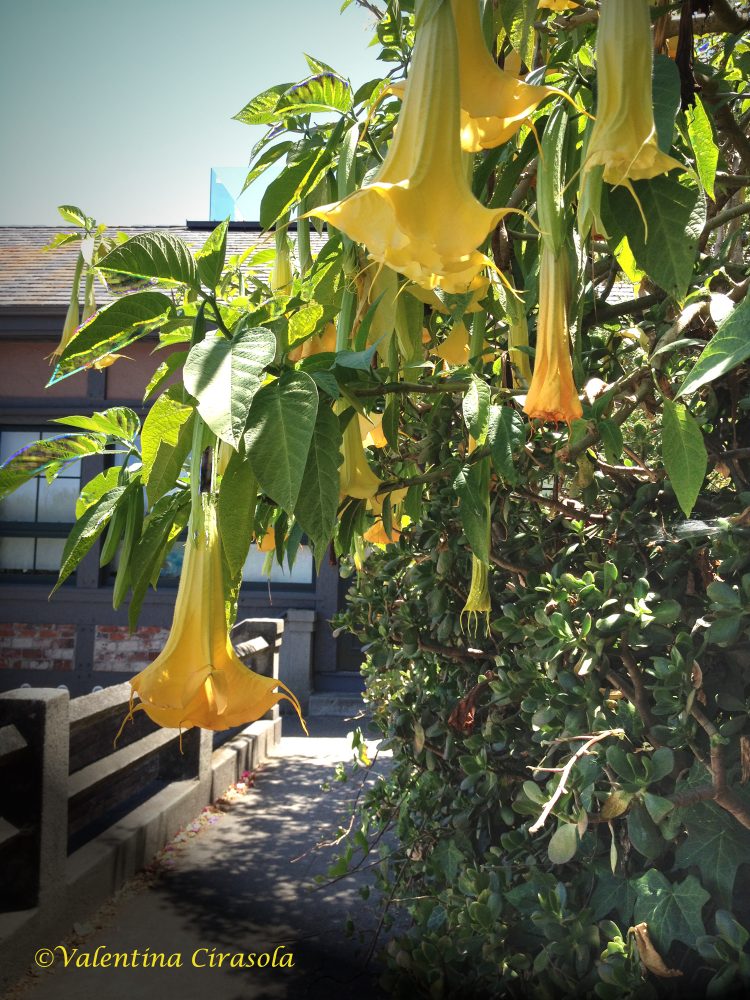
In April I open the windows to possibilities and keep my studio window open to let in the scent of my orange blossoms. I am blessed to work around blooming fruit trees, while somewhere else the world might be still under snow.
In April must free the body from winter toxins, make new friends and prepare to expat for a while from the routine.

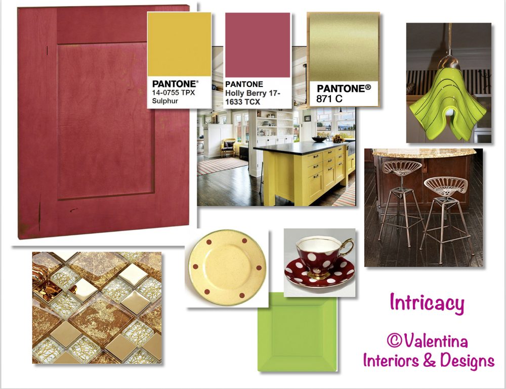
April is the month of two zodiac signs, Aries and Taurus, both passionate about the light of their birthstones.
Aries rules with the warm light of yellow diamond, opal and sapphire on the cool side of the spectrum; Taurus dominates with its warm light from topaz, jasper, amber, coral, garnet, with turquoise and emerald on the cool side. If you want to wear yellow, combine it with all these jewel colors I just mentioned.

(Click on each photo to view them larger).

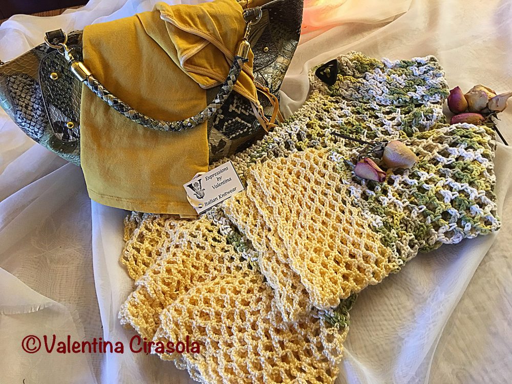
My April light comes from yellow. I made these two sweaters, one with cool blue rosettes and the other with avocado green threads intertwined with pale yellow. Pardon me, if every so often I shamelessly advertise them, they are in my Etsy store: https://www.etsy.com/shop/ValentinaExpressions

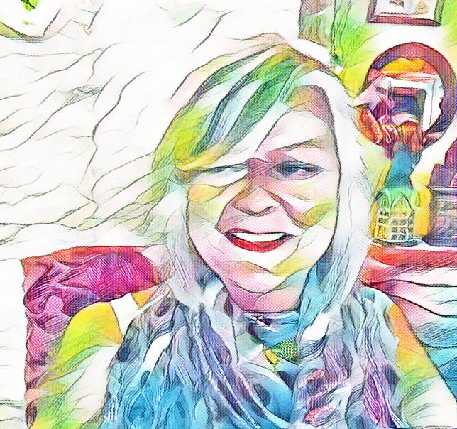
Yes, I am blond and wear a lot of yellow, it makes me feel kissed by the sun. Often, I hear women saying they can’t wear this or that color because it blends too much with the color of their hair. What about women with dark hair wearing dark colors? Doesn’t that blend with the hair? So, it’s a myth. If you like something and looks good, wear it.  Ciao,
Valentina
https://valentinadesigns.com/services#fashion-services


Copyright © 2018 Valentina Cirasola, All Rights Reserved


Valentina Cirasola is a trained Fashion and Interior Designer, born in Italy in a family of artists. Style surrounded her since the beginning of her life. Her many years of experience led her to offer consultations in both specializations and now she can remodel homes as well as personal images. She is passionate about colors and encourages her clients to express their individual style in their homes and with the clothes they wear. To better help people all over the world she offers consultations online. She is the author of three books.
Get your copy of Valentina’s book on colors: ©RED-A Voyage Into Colors on

Barnes&Nobles: http://goo.gl/q7dQ3w

Advertisement

It’s Called Playful Intricacy | Valentina Cirasola | Interior Designer

Everybody knows I love yellow in all the tints and tones. However yellow is not a well-liked color by many. This is one of the comment I hear often: “I feel jaundice in yellow”, or “For me, yellow has been the color of high-visibility rain jackets for construction, directing traffic…” My answer is: “don’t overlook the energy of yellow”. Yellow brings the sunlight in grey, rainy days, it’s inviting and uplifting when one is sad and slaps the depression away. Combining yellow and green, pushes out even more negative comments as: “I feel potted”. Ok, everyone has an excuse for not wearing this or that color. The problem I see is only one: once we settle for a comfortable color, we are not willing to experiment with other colors and often takes courage to go out of that comfort zone.

Next year 2018 Pantone, Institute of Colors, declared Playful and Intricacy two colors palettes of the year. They both contain yellow and gold tones, with the addition of green. Yellow and green have been around almost a decade in various combinations with other colors. I find similarity in Playful and Intricacy palettes, thus I am encouraged to use them together with my own twist. First, let’s see how I conceived one of my client’s dining and kitchen spaces using three colors, a sweet yellow pear, a beautiful jewel tone of berry and a light green-yellow. The kitchen cabinets in a blond type of wood and the walls painted in a green-yellow meet the berry color at the banquette seat under the window, which continues in the dining room, where I matched a sweet pear yellow. Then, the cove lighting in the dining room assured a warm ambience.

(Click on each photo to view it larger).


Let’s design a kitchen using each Pantone palettes. My inspiration came from my photograph taken in Napier Lane, in San Francisco. Yellow and Green look so nice in nature, one more reason to bring it in the house, or wear it.

Solution #1 – Playful Palette:
Make all the kitchen cabinets of maple wood with a toffee stain. Decorate the backsplash with glass corbeau tiles in a mix of yellow, green, gold and toffee colors. Turn on the under-cabinet lights and the glass tiles will add luminosity to the counter. Incorporate a green credenza close to one of the greens in my color concept. Paint all kitchen walls in yellow and accent one wall in the same green of the credenza. Make a playful breakfast counter with berry and green stools, coordinate with berry dome lights hanging from above to finish the counter picture. Mirrors, in the kitchen to me are important to double the image of food. Mix antique and modern golden frame mirrors, place them strategically to reflect interesting views of the kitchen and the tasty food you will prepare.

Sources:
CorbeauTiles-www.glasstileoasis.com
Green Credenza: Overstock
Berry dome hanging light: http://www.Houzz.com
Counter stools: JCPennies
Antique sunburst gold mirror: www.notonthehighstreet.com


Solution #2 – Intricacy Palette:
Make all the kitchen cabinets of maple wood with a berry stain. Decorate the backsplash with glass tiles with a metal and gold background. The under-cabinet lights shining on these glass tiles will make the backsplash look like jewelry. Incorporate a yellow Sulphur island. Paint all kitchen walls in yellow Sulphur. For the kitchen counter use golden metal stools, coordinate with extravagant lime green pendant lights to finish the counter picture. Arrange an intricate table setting with square and round plates, in all the colors of this palette, berry, yellow Sulphur, gold and green.


Sources:
Sulphur island: J.A.S.Design-Build-Houzz
Metal gold tile backsplash: http://www.hominter.com
Metal gold counter stool: Amazon
Green pendant lights: Creative Home Decoration
Yellow plates: emiliaceramics.com
Lime square plates: http://www.partywedding.com
Polka dots cup & saucer: http://www.royalalbertpatterns.com


Use golden flatware for both palettes.  From: http://www.shophorne.com

My suggestion: yellow or green by themselves might be bright and discouraging colors, for some people even difficult to combine. Look at the opportunity to tame these two colors by doing something out of the ordinary and boost your creativity. Ciao,
Valentina
http://www.valentinadesigns.com


Copyright © 2017 Valentina Cirasola, All Rights Reserved


Valentina Cirasola is an Italian Interior Designer working in the USA and Europe since 1990, specializing in interior and exterior, color analysis, kitchen, bath, wine cellar, and outdoor kitchen designs. Often people describe her as “the colorist” as she loves to color her clients’ world and loves to create the unusual. “Vogue” magazine and many prominent publications in California featured Valentina’s work. She also was seen on RAI – Italian National TV and has made four appearances on T.V. Comcast Channel 15. Author of three published books, the latest ©RED – A Voyage Into Colors is on the subject of colors.
Amazon: http://goo.gl/qNxXrB
Barnes&Nobles: http://goo.gl/q7dQ3w

No Facilities

Random thoughts, life lessons, hopes and dreams

Graffiti Lux Art & More

Luxuriating in the Arts

Inspiration you need

Inspiration is our vision as it is the key to success. This page is about Personality Development, SEO, Amazon Affiliate Marketing, Blog ideas, and photography.

Electric Eclectic's Blog

All Things Bookish and more...

Before Sundown

remember what made you smile

James J. Cudney

Best Selling Author of Family Drama & Mystery Fiction

Robbie's inspiration

Ideas on writing and baking

The Write Stuff

"Writers Helping Writers" with Marcia Meara & Friends

Jacquie Biggar-USA Today Best-selling author

Read. Write. Love. 💕💕💕

Banter Republic

It's just banter

Watching the Daisies

Life Lessons on the Importance of Slow

Stevie Turner

Realist, writer, reader, reviewer and rocker.

This Is My Truth Now

Author, Inspirational Blogger, Book Reviewer & Promoter (James J. Cudney)

Warning:Curves Ahead

reasonably photogenic and relatively stylish

Sue Vincent's Daily Echo

Echoes of Life, Love and Laughter

London Life With Liz

A lifestyle blog with a little bit of everything.

Inspired Motivation

Get your daily motivation fix right here!

Janaline's world journey

My sometimes Strange, but usually Wonderful Experiences and Adventures as I Travel through this amazing World we live in.

From my guardaviñas / Desde mi guardaviñas

Sharing ideas. Photos, travels, music, History, stories, feelings, thoughts,...

Dancer Attitude

"Shoot for the top"

Modern Tropical

Art + Decor by Kristian Gallagher

For The Love Of Ligh

APK Photography Blog

A Dash of Words with Loleta Abi Romance Author

Love, Family, and the Journey Home

Smorgasbord Blog Magazine

Blog magazine for lovers of health, food, books, music, humour and life in general

Jean's Writing

Jean M. Cogdell, Author-Writing something worth reading, one word at a time in easy to swallow bite size portions.

Valentina Expressions

Luxury for Comfortable Living and Good Life Through Designs, Style, Travel, Food

%d bloggers like this: