
Everybody knows I love yellow in all the tints and tones. However yellow is not a well-liked color by many. This is one of the comment I hear often: “I feel jaundice in yellow”, or “For me, yellow has been the color of high-visibility rain jackets for construction, directing traffic…” My answer is: “don’t overlook the energy of yellow”. Yellow brings the sunlight in grey, rainy days, it’s inviting and uplifting when one is sad and slaps the depression away. Combining yellow and green, pushes out even more negative comments as: “I feel potted”. Ok, everyone has an excuse for not wearing this or that color. The problem I see is only one: once we settle for a comfortable color, we are not willing to experiment with other colors and often takes courage to go out of that comfort zone.
Next year 2018 Pantone, Institute of Colors, declared Playful and Intricacy two colors palettes of the year. They both contain yellow and gold tones, with the addition of green. Yellow and green have been around almost a decade in various combinations with other colors. I find similarity in Playful and Intricacy palettes, thus I am encouraged to use them together with my own twist. First, let’s see how I conceived one of my client’s dining and kitchen spaces using three colors, a sweet yellow pear, a beautiful jewel tone of berry and a light green-yellow. The kitchen cabinets in a blond type of wood and the walls painted in a green-yellow meet the berry color at the banquette seat under the window, which continues in the dining room, where I matched a sweet pear yellow. Then, the cove lighting in the dining room assured a warm ambience.
(Click on each photo to view it larger).


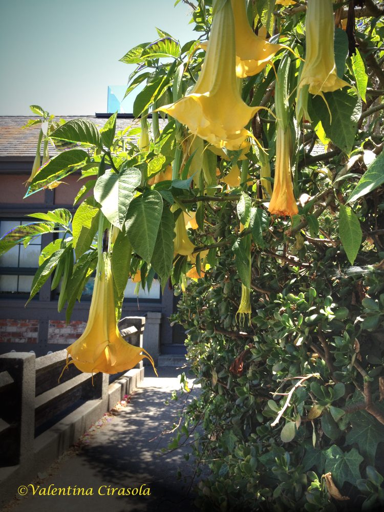
Let’s design a kitchen using each Pantone palettes. My inspiration came from my photograph taken in Napier Lane, in San Francisco. Yellow and Green look so nice in nature, one more reason to bring it in the house, or wear it.
Solution #1 – Playful Palette:
Make all the kitchen cabinets of maple wood with a toffee stain. Decorate the backsplash with glass corbeau tiles in a mix of yellow, green, gold and toffee colors. Turn on the under-cabinet lights and the glass tiles will add luminosity to the counter. Incorporate a green credenza close to one of the greens in my color concept. Paint all kitchen walls in yellow and accent one wall in the same green of the credenza. Make a playful breakfast counter with berry and green stools, coordinate with berry dome lights hanging from above to finish the counter picture. Mirrors, in the kitchen to me are important to double the image of food. Mix antique and modern golden frame mirrors, place them strategically to reflect interesting views of the kitchen and the tasty food you will prepare.

Sources:
CorbeauTiles-www.glasstileoasis.com
Green Credenza: Overstock
Berry dome hanging light: http://www.Houzz.com
Counter stools: JCPennies
Antique sunburst gold mirror: www.notonthehighstreet.com
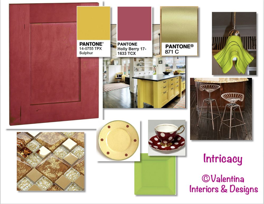
Solution #2 – Intricacy Palette:
Make all the kitchen cabinets of maple wood with a berry stain. Decorate the backsplash with glass tiles with a metal and gold background. The under-cabinet lights shining on these glass tiles will make the backsplash look like jewelry. Incorporate a yellow Sulphur island. Paint all kitchen walls in yellow Sulphur. For the kitchen counter use golden metal stools, coordinate with extravagant lime green pendant lights to finish the counter picture. Arrange an intricate table setting with square and round plates, in all the colors of this palette, berry, yellow Sulphur, gold and green.
Sources:
Sulphur island: J.A.S.Design-Build-Houzz
Metal gold tile backsplash: http://www.hominter.com
Metal gold counter stool: Amazon
Green pendant lights: Creative Home Decoration
Yellow plates: emiliaceramics.com
Lime square plates: http://www.partywedding.com
Polka dots cup & saucer: http://www.royalalbertpatterns.com

Use golden flatware for both palettes. From: http://www.shophorne.com
My suggestion: yellow or green by themselves might be bright and discouraging colors, for some people even difficult to combine. Look at the opportunity to tame these two colors by doing something out of the ordinary and boost your creativity. Ciao,
Valentina
http://www.valentinadesigns.com
Copyright © 2017 Valentina Cirasola, All Rights Reserved
 Valentina Cirasola is an Italian Interior Designer working in the USA and Europe since 1990, specializing in interior and exterior, color analysis, kitchen, bath, wine cellar, and outdoor kitchen designs. Often people describe her as “the colorist” as she loves to color her clients’ world and loves to create the unusual. “Vogue” magazine and many prominent publications in California featured Valentina’s work. She also was seen on RAI – Italian National TV and has made four appearances on T.V. Comcast Channel 15. Author of three published books, the latest ©RED – A Voyage Into Colors is on the subject of colors.
Amazon: http://goo.gl/qNxXrB
Barnes&Nobles: http://goo.gl/q7dQ3w


