Arrow To The Front Door | Valentina Cirasola | Interior Designer

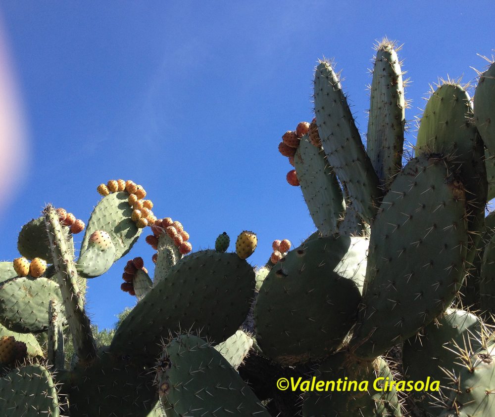
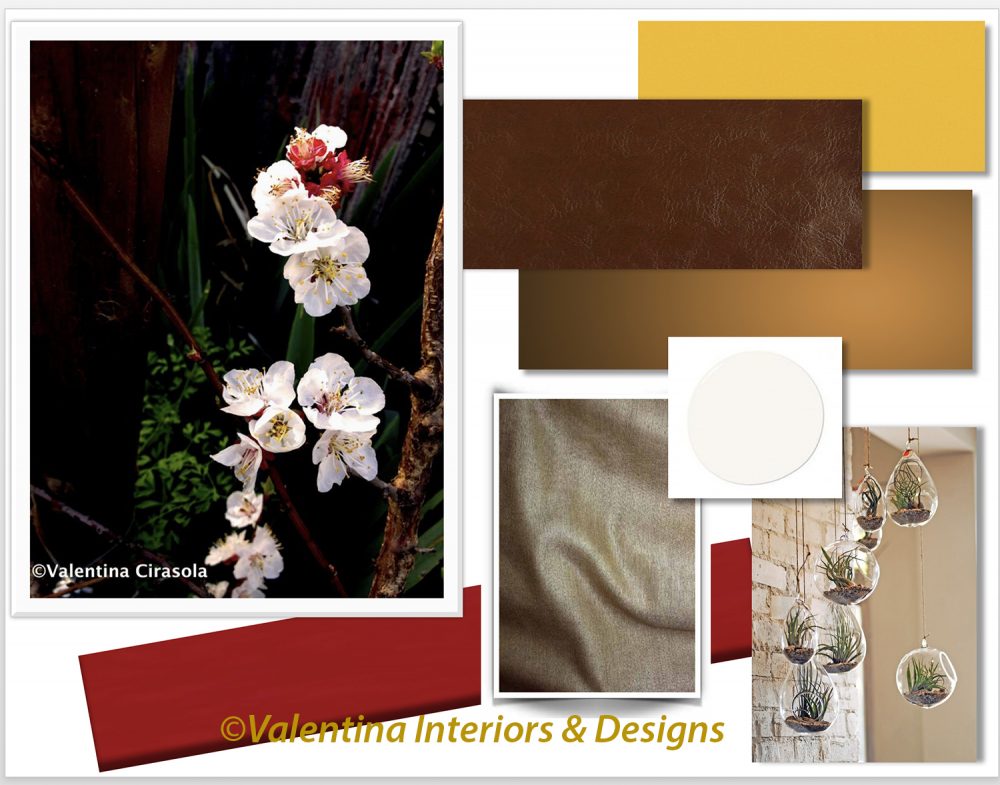
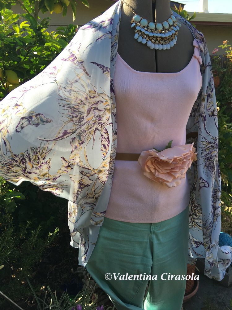
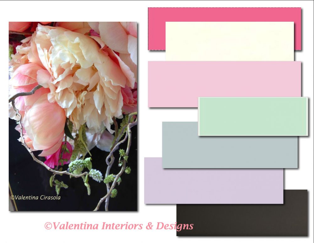
Choosing a design for an interior space, a garden or outdoor space for some people is an overwhelming task. To get ideas a long process of collecting things starts: photos from magazines, roll millions of Pinterest and Instagram images, color chips, textures and hard material. Some people put those pictures in folders, some create visual boards, some other scatter them all over tables, on the floors, stick them on the walls, fill up their computer, get confused and make the task more difficult than anticipated. If all the ideas are there, why is it so difficult to choose colors, style, appearance of a room, or create a nice corner in the garden? The reason is simple. Each design has its distinctive style, if the designer’s work has been done correctly, each room we see in magazines and online reflects the customers’ personality. Trying to compose a puzzle with a color from one picture, a detail from another picture and a style of furniture from one more picture will never work. Designing to follow own personality and lifestyle is the way to go to assure a successful design. (Click on each photo to view it larger).

EntireView(Before) 

This project was developed online, I knew nothing about the virtual client, but soon everything became clear during our conversations online. She mentioned the existing driveway was too straight and long, too gray, too much concrete, too much grass and no harmony or colors in the vegetation. To her eyes the driveway seemed more like a spear shooting straight to her front door. I also kept hearing themes of mysticism and Feng Shui in her conversation with me. Right there I had her answer. I thought of adding games of lights between plants, running water and create a moon garden with plants that would shimmer silver highlights under the moonlight.
exist.cond(Before)

Her house is a contemporary Mediterranean style, in fact the area where she lives is called “Tuscan Hills”. It is located in a newly built development area, clinging to the hill where weeds grew freely and now huge houses propped in clusters take over the hill.  All the houses resemble large cubes missing the true elements of Tuscan Hills and especially missing the Tuscan personality.

©CortileSolut1
First, I tackled the small courtyard at the entry by adding flag stone on the pavement, travertine quoin stones around the door, round travertine landing steps with step lights, window sills and a colorful mosaic fountain with lights. A gazing globe and two larger planters with tall plants would close the vignette. I got rid of the dolphins jumping in the air without water in sight. In a beach house dolphins would have been perfect in a running fountain.

©DrivewaySolut1a

For the driveway I choose an “S” shape designs to avoid that feeling of a straight arrow going directly into to the entry door. Nice colorful pavers would substitute the grey concrete with inserts of medallions in contrasting color pavers forming designs of the sun, moon and star. If she wanted to keep the driveway in a straight line, the view of the second concept offers a harmonious vignette to look at while driving on the long driveway.

DrivewaySolut2a

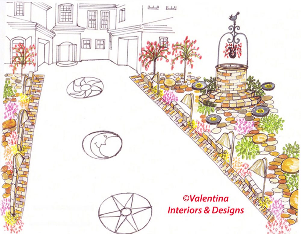
The two design concepts I submitted to the client are self-explanatory. I played with colors and architectural balance. As the eyes follow the “S” shaped driveway, they will also go the up and down the tall and short plants, stop at the roundness of the rocks and feel joyous looking at the variety of colors. At night the moon will illuminate the silvery plants and in the daytime the sun will touch all the other colorful plants making them even more cheerful.
At this time all flowers and plants are in bloom, this is the time to redo a front yard, landscape, or your outdoor rooms. Ciao,
Valentina
http://www.valentinadesigns.com

Copyright © 2016 Valentina Cirasola, All Rights Reserved

Val in ParadiseAs a designer in business since 1990, I am interested in helping people designing their interior and exterior spaces with an overall feeling of peace, relaxation and harmony that will draw them home eagerly. I am always looking to add that special touch with original findings to the spaces I design. Featured on Vogue Italia magazine, Gentry and many prominent magazines in California, appeared on RAI, National Italian T.V., my story as a designer continues. Find copies of my three books on
Amazon: http://goo.gl/xUZfk0
Barnes&Nobles: http://goo.gl/q7dQ3w

I Rather Be The Good Wine In The Small Barrel | Valentina Cirasola | Designer

Girl-Pink-Green-1aWelcome to a new episode of Friday Fashion.

I know many women who are not as tall as they would like to be. The mirror test in the shopping hours is the moment of complain: “If I were a little taller I could wear this and that….” Well, we are what we are. We can alter our exterior look with colors, with the right shapes, or with plastic surgery, but we cannot alter the height, matter as well accept our body without hesitation, regret or envy and make the best of it.

There are tricks to adopt to make us appear taller, as there are tricks to make bags under the eye disappear or make teeth whiter. It is easy when it comes to fashion to lapse into the ridiculous. Ridiculous for me are violent prints and overlapping fashion in elements which lead to great confusion; excess of vulgarity, inconsistencies of certain combinations; wearing shoes that makes the ankle coarse or a skirt that cannot be wore due to physical conformation.

High Waist Saylor Style(Photo: DressLily)

To rejuvenate is very important, it will affect soul and spirit. Anyone wants to feel younger in a younger style and lines, however to rejuvenate with an aggressive look is not a winning move. Who cares what everybody wears, be different from others, find your personal style and learn not to blend in. With the right proportions, the right outfit, and the right colors, the goal is to feel good in the interior and exterior with what nature has gifted us.

I am a short person too. I should have suffered the missing inches as most of my friends are taller, but I didn’t,  I have learned to hide my small defects and to exalt my virtues.

(Below photo unknown – Credit given to the author or maker).

Wedge and Plateau

To look taller follow these basic rules and go on with life:

  1. Avoid long skirts with a lot of fabric flapping between the legs. If you must wear something long wear a pencil long skirt or dress. However short skirts on a short person are a better choice.
  2. Avoid bell bottom pants and low-cut waist pants or shirt. Pencil bottom pants are better and high waist pants and skirts are also a better choice.
  3. Avoid long oversize jackets. It will swallow a short person.
  4. Avoid a ton of print, use vertical stripes or monochrome color scheme.
  5. Avoid hats with large brims and large bags.
  6. Avoid flat shoes and high heel above 5” including wedges, but never give up the right heels. In addition to the height, a short woman in high heels will gain a more feminine sexier walking style.
  7. Whenever possible wear shoes of the same color of the pants. It will help elongate the figure at least visually.
  8. Avoid long hair unless they are collected and tied above. A short dynamic cut is better for a short woman.
  9. Avoid long nails.

Dynamite comes in small packages and I rather be the good wine in the small barrels.

I am here to help if you need to rejuvenate your look. Ciao,
Valentina
https://valentinadesigns.com/services#fashion-services

Copyright © 2016 Valentina Cirasola, All Rights Reserved

Cappello GialloValentina Cirasola is a trained Fashion and Interior Designer, born in Italy in a family of artists. Style surrounded her since the beginning of her life. Her many years of experience led her to offer consultations in both specializations and now she can remodel homes as well as personal images. To better help people in the world she offers consultations online. She is the author of three books. Get your copy of Valentina’s book on colors: ©RED-A Voyage Into Colors on
Amazon: http://goo.gl/qNxXrB
Barnes&Nobles: http://goo.gl/q7dQ3w

Curve | Valentina Cirasola | Interior Designer

“If it doesn’t exist in the market, I will design and build it”. It has been my mantra and my way to resolve the challenge of filling up spaces with container furniture that are functional and beautiful as well. I will add some pleasant curves to increase the beauty. Built-ins today are very straight and boxy with a lot of opens shelves. If you ask me, I will tell you they are unattractive and whenever possible I will suggest to build your own. If you do have that opportunity, make it a masterpiece.
(Click on each photo to view it larger).


The inspiration for this curvy built-in media unit came from the conversation between my clients, a young couple in their 30s, a couple who is into DIY. The room was an addition to the house, an empty box waiting to be beautified.

Material Board
While I was designing the interior of this family room, I was designing also the landscape outside the window. The wife’s desire was to have an old world European room, with an antique flooring, droopy window treatment with a rich puddle and a faux finish on the wall. They had a very traditional taste, nothing I could not handle. I brought a Renaissance pattern to a tile maker and he reproduced it beautifully on the tiles that now surround the fireplace.

PomeleSapele


While all the workers looked busy bees, I was searching for the right furniture-accessories and overseeing all the workers. I love when everybody is working in unison and I hear the painter singing at the walls creating his faux finish (painters usually sing while they paint), tile setter creating the floor pattern, the fireplace was in construction mode and the man of the house followed my design to the teeth to produce the built-in with curves. That wood is Pommele Sapele, not extinct, only a precious species. It makes waves and ripples of water pattern, very pretty to look at. Three months later everyone reached the goal and the room came alive.

PomeleSapeleCurve
Curtains were the only thing not done. With the curvy landscape wrapping around the front of the house and framing the family room window so well, there was no need for the curtains anymore. Let the nature in. Ciao, Valentina
http://www.valentinadesigns.com

Copyright © 2016 Valentina Cirasola, All Rights Reserved

ValHatCelesteStampAs a designer in business since 1990, I am interested in helping people designing their interior and exterior spaces with an overall feeling of peace, relaxation and harmony that will draw them home eagerly. I am always looking to add that special touch with original findings to the spaces I design. Featured on Vogue Italia magazine, Gentry and many prominent magazines in California, appeared on RAI, National Italian T.V., my stories continues. Find copies of my three books on
Amazon: http://goo.gl/xUZfk0
Barnes&Nobles: http://goo.gl/q7dQ3w

Wear A Hat Like A Duchess | Valentina Cirasola | Designer

Girl-Pink-Green-1aWelcome to my Friday Fashion
Catherine, Duchess of Cambridge looks always impeccable with her hats. With the bevy of fashion advisers buzzing around her, why wouldn’t she be perfect?

What we see in the street it’s another story, not everyone is a duchess and not everybody has a face made for a hat. Out there we see a confused mixture of things and fashion faux pas. People wear everything in the latest fashion regardless of rules. To me the choice always lays only on what looks good on me.

Wearing a hat is not as easy as buying one and propping it on the head. One must understand the proportion
between face shape, body shape, shoulders and size of hat, how color of the hat affects the face and how to behave when wearing a hat. Let’s see what some hat shapes really do for us.

The latest fashionable Panama hat with a small brim everybody wears looks good on tall and not so tall women as long as the face is oval. This is not a hat for a round face. The Borsalino, a hat similar to a Panama with a larger brim fits better a round face.
(Click on each photo to view it larger).

J.Crew-Panama-Women(J.Crew-Panama-Women)

The floppy hat will swallow a small face on a short person. This hat is perfect for a tall woman with a wide open face or with an oval face and broad shoulders. The floppy hat must not be too droopy to the point of covering the face and it is not very becoming. Is there something to hide under there?  That is what I would think.

Urban Outfitter Floppy Hat(Urban Outfitter Floppy Hat)

A hat with wide soft brim should be contained within the shoulders as this one from French Connection below.

French Connection Wide Brim
French Connection

A wide turned up brim hat is not for women with a round face either, as it enhances the roundness of the face, but a turned down brim hat will disguise a wide face, it is perfect for oval faces and women with a short forehead. A forehead is considered short if the distance between hairline and eyebrows is less than 3” – thus this person should wear hats more towards the back of the head and not over the forehead.

My Hats

The face is the most important feature. We wear hats as a protection from the sun, to make an outfit original, to look stylish, to accent an outfit and to enhance the face not to suppress it. Colors will reverberate on the face. If the hat is black and the skin pale, the face will look even more pale with the reflection of the black color on the skin. If the skin has a pink tone stay away from yellow color hats. Shoulders come into this play as well. If shoulders are too wide and the hat is small, the person will be out of proportion and vice versa.
Fashion is all about proportions, we need to know how to build them.

Ball caps are for men and this is my opinion. Women wear them for a bad hair day, to a football game, shopping for groceries, or to stroll a baby in the park. Ball caps do absolutely nothing to improve a woman’s beauty.  I would suggest to leave them to the men and relegate the sweat suit to the gym only.

Hats determine the way we behave and walk. Have you ever tried on a hat in the store? Suddenly you feel different, suddenly you see yourself in a different light.
A hat almost imposes us to adopt a style that makes us feel special and completes our character.

Women have stopped wearing hats on an everyday basis in the name of freedom from frills and I am all for that, we all have a hectic life. What I don’t understand is why women have adopted a careless way to cover the body with clothes that often are not suitable for who they are. The way famous women dressed a long time ago still appeals to us and we are still admiring their style, why is it….? What are we unconsciously missing…? Maybe it is time to change. Ciao,
Valentina
https://valentinadesigns.com/services#fashion-services

Copyright © 2016 Valentina Cirasola, All Rights Reserved

Cappello GialloValentina Cirasola is a trained Fashion and Interior Designer, born in Italy in a family of artists. Style surrounded her since the beginning of her life. Her many years of experience led her to offer consultations in both specializations and now she can remodel homes as well as personal images. To better help people in the world she offers consultations online. She is the author of three books. Get your copy of Valentina’s book on colors: ©RED-A Voyage Into Colors on
Amazon: http://goo.gl/qNxXrB
Barnes&Nobles: http://goo.gl/q7dQ3w

Bring Nature In: Flirtatious Mix | Valentina Cirasola | Interior Designer

Roses have thorns and yet we plant them all over gardens. The type of cactus in the photo might not be the prettiest plant to place in the garden, but I looked beyond the thorns and purchased it anyway despite of the cashier’s disgusted face. Prickly pear is the colorful fruit this plant produces in the summer. It is sweet, full of Vitamin C and refreshing to beat the summer heat. The burst of orange, red and yellow of the oval-shaped pears is just a delight to admire against a blue sky in the background.
(Click on each photo to view it larger).

Cacti-PricklyPears
Cactus plant has many healthy properties and if used as a beauty treatment can be applied on hair and skin. To nourishes the hair cut the large flat leaves in small pieces, put them in a bowl full of water and soak overnight to soften the pulp. Apply the pulp on hair and keep it on for 20-30 minutes or longer if you can stand it. Rinse with warm water and wash hair with your favorite shampoo.
The slimy interior part of a cactus function as emollient on irritated skin, bruises and cuts as well as a facial masque.
In the south of Italy we use the large flat leaves of this type of cacti as rustic plates to eat salads off of it, without the thorns of course.

FlirtatiousMixColor

Looking at this cactus in my garden I see how green, lavender, beige and dusty rose create a flirtatious mix of feminine colors. A sitting room made for a woman comes to mind, a room where she wants to sit with a friend or a sister to talk about life issues, or a place where to read in peace. The colors of this cactus are hard to classify because the green area is not really green, but a mix of sage and sea-foam, the rose color of the redwood fence in the background could be called dusty rose, dirty rose, or even light red-purple, while the red tone of the thorns could be crimson, burgundy or maybe maroon.

Colors appear very different from one person to another because, it depends on how our eyes filter the light. Some people see more yellow tone, some see more red or blue tones and some are color blind with certain colors, thus we tend to name colors as our eyes see them. Knowing the difference is the designer‘s job, we rely on the fan deck of colors ready to use as shown on the chip. However, one other tricky aspect of obtaining the right color is to observe how the light shines on a particular color. The same color will look very different in the morning and in the night, or under an incandescent bulb or L.E.D light.

One of my clients painted a large living room in dark green and although it looked sharp in the morning with her beige seating arrangement and white window trims, at night that dark green on the walls looked dark grey and made the room very uninviting. The trees outside the windows were not illuminated and created the dark cave effect inside. We changed the walls to a golden caramel color which gave the room a sweet, bon-bon like character, we illuminated the trees closer to the windows to extend the room visually and thus eliminated visually the boundaries of walls. The exterior and the interior became one whole entity.

We need to study the environment and understand why when we paint that color we liked so much, it doesn’t look as good on the wall as it does on the color chip. Everything outside will reverberate inside, bounce off walls and furniture, then cast a color reflection inside, that’s why my cactus looks a bit lavender at the top of the buds. The distressed redwood fence in a sunny early afternoon day is casting its pinkish tone.

Since this is a feminine color palette, the décor of the room should include some lilac Amnesia Roses, rosy sheer window treatment and a couple natural stones:
1. One stone in green tone such as a jade to give you mental clarity and protecting heart, visions and stomach.
2. One stone in pink-lilac color as a Kunzite (named after mineralogist George Frederick Kunz who discovered it in 1902) to bring a calming, peaceful effect in the room. Kunzite stimulates connection between heart and brain.
Both stones will clean and activate the Heart Chakra.

I hope you get to experiment with some of my color palette suggestions, when in doubt you can always contact me. Ciao,
Valentina
http://www.valentinadesigns.com

Copyright © 2016 Valentina Cirasola, All Rights Reserved

ValHatCelesteStampAs a designer in business since 1990, I am interested in helping people designing their interior and exterior spaces with an overall feeling of peace, relaxation and harmony that will draw them home eagerly. I am always looking to add that special touch with original findings to the spaces I design. Featured on Vogue Italia magazine, Gentry and many prominent magazines in California, appeared on RAI, National Italian T.V., my stories continues. Find copies of my three books on
Amazon: http://goo.gl/qNxXrB
Barnes&Nobles: http://goo.gl/q7dQ3w

Bring Nature In: Bloom in Apricot Color | Valentina Cirasola | Interior Designer

Welcome to a new episode of Bring Nature In. Twice a week for the next thirty days a will write about new décor solutions inspired by nature.

You would think growing an apricot tree is a very hard task, not at all, it’s the easiest thing in the world. Apricot trees resist moderate period of drought. The well-established trees only need to be watered in extreme conditions.

A few years ago for the entire season of the apricots, I ate organic apricots bought at a regular market, threw the pits in the same spot in my garden, water it regularly with the rest of plants and forgot it. Next spring the first apricot tree was born, then I tried it again and two more trees were born. Today, I don’t need to buy apricots at the store, they are abundant in my backyard, I eat them off the trees and make marmalade out of them. Pruning is necessary at the end of the apricot season to get an abundant production in the next year, especially must eliminate the damaged branches and those growing close together. (Click on each photo to view it larger).

MyApricots (Apricots grown in my garden from pits)

Apricots have antioxidant properties, thus considered a fountain of youth. If you have a tree, eat them fresh as they mature, and dry the rest to eat through the winter. The beta-carotene in the apricots prevents the degeneration of retina cells and the iron in them is suitable for treatment of anemia. The potassium in fresh and dried apricots prevents fluid retention in the body, helping people control their weight and hypertension. In between meals, fresh apricots suppress hunger and provide carbohydrates in the form of a good source of sugar.

Apricot blooms smell sweet, the small flowers are very delicate, transparent, almost paper like, the color is generally white-pinkish, with an occasional burst of dark pink and yellow pistil shoots. This is a perfect color palette for a bedroom.

Apricot Color Board
Let’s start with a dark wood or brown leather headboard to ground and disintegrate all the electromagnetism in the bedroom: TV, alarm clock, computer, iPhone and more and more, we like to bring all that stuff into bedroom. For warmth add a lush, rich color hardwood floor that will also absorb all the electricity around you.
Paint apricot orange the wall behind the bed headboard. That rich apricot color will soften the leather or wood headboard and will positively energized you when you get up in the morning. Paint the rest of the room in Off White. To add a touch of elegance, try pure silk sheets on the bed and will never return to anything else, promised. Mix a few lush apricot throw pillows mixed with red or dark pink pillows.

With a leather headboard and silk sheets, this representation looks very much a contemporary décor, thus I envision a white leather or white upholstered bench at the feet of the bed and a modern, sculpted white dresser. The left corner of a room is the wealth corner, Feng Shui theory says so. This is where you should finish the décor with hanging baubles holding cacti or air plant, or a plant that doesn’t require much care and water.

ApricotOrangeWhite
How you want to bloom every day is up to you, just remember that a touch of a bold color will change your day’s energy. Ciao,
Valentina
http://www.valentinadesigns.com

Copyright © 2016 Valentina Cirasola, All Rights Reserved

ValHatCelesteStampAs a designer in business since 1990, I am interested in helping people designing their interior and exterior spaces with an overall feeling of peace, relaxation and harmony that will draw them home eagerly. I am always looking to add that special touch with original findings to the spaces I design. Featured on Vogue Italia magazine, Gentry and many prominent magazines in California, appeared on RAI-National Italian T.V., my stories continues. Find copies of my three books on
Amazon: http://goo.gl/qNxXrB
Barnes&Nobles: http://goo.gl/q7dQ3w

Feeling Cool In Cool Fashion Colors | Valentina Cirasola | Designer

Girl-Pink-Green-1aWelcome to a new episode of my Friday Fashion.
All the pastel spring/summer colors of this year are creeping up in my wardrobe and I am letting them for the first time. Men and women will wear pastel colors indifferently as pink (Quartz) is a new color for men and light blue (Serenity) for women, or both together to create a hipster combination for both sexes. It is a symbolic color combination that represents what is going on in our culture. (Click on each photo to view it larger).

Pink for men seems a new extravagance to mark the duality of society, so it has been said, but those of us who have studied History of Costume know that in 1500-1700 men wore pink ruffled shirts under a jerkin and women wore intricate embroidered light blue dresses. These two unisex pastels were the most common of the pastels gamma that men and women used in that era interchangeably.

Pink Jerkin(Pink Jerkin – circa 1700s)

I am balancing and calming my year with pastel colors compatible with my skin tone that will also care for my wellness and tranquility. Rose Quartz is a gentle tone, Blue Serenity echoes a serene sky, Lint or green tone brings a closer attachment to earth.

RoseSerenityDisplay
(My new fashion ensembles)

RoseQuart

RoseQuartSerenity

Swet Flower Bag(DressLily.com)

The light colors of 2016 challenge traditional perceptions of color association, which I would have not done in the past. I will try anything and challenge my thoughts before saying: “It’s not for me” and after realizing I might not like it much, at least I will feel cooler  in cool colors this spring and summer. The floral capelet is lightweight and versatile, the two layers allow it to wear as a large scarf, as a shoulder wrap. The large flower in the waist turns into a belt and a necklace, as necessity occurs. The sweet flower bag is new, just arrived and matches well with the new color scheme.

Just remember that your personal colors need to be revised every couple of years, as we add texture, new coloration and age to our skin.
Enjoy a cool summer in cool colors. Ciao,
Valentina
https://valentinadesigns.com/services#fashion-services

Copyright © 2016 Valentina Cirasola, All Rights Reserved

ValHatCelesteStampValentina Cirasola is a trained Fashion and Interior Designer, born in Italy in a family of artists. Style surrounded her since the beginning of her life. Her many years of experience led her to offer consultations in both specializations and now she can remodel homes as well as personal images. To better help people in the world she offers consultations online. She is the author of three books. Get your copy of Valentina’s book on colors: ©RED-A Voyage Into Colors on
Amazon: http://goo.gl/qNxXrB
Barnes&Nobles: http://goo.gl/q7dQ3w

Bring Nature In: Purple Wisdom | Valentina Cirasola | Interior Designer

Legend says the name for the Iris flower came from a Greek Goddess who rode the rainbow. Love the legend and I love how this flower as delicate as it might look, it’s a hardy plant, perennial, easy to plant, easy to care for and very reliable. It attracts butterflies and hummingbirds, something you want to see roaming in your garden. Place the Iris in partly shaded area or morning sun area, never in a scorching full sun and they will grow luxuriant.
Among the 300 Iris species available Birded Iris is the easiest to grow, it blooms in late spring after tulips, daffodils, peonies and poppies. Bearded Iris likes to be divided every few years and from the rhizome (root bulb) after blooming is over, otherwise its blade-like leaves will not bloom into flowers much. Iris flowers come in a wide variety and hybrids. Water Iris likes to live near a pond or a water source, but doesn’t like to be planted directly in the water.

Water the Iris not so often especially if the ground is covered with mulch, bark chips or stone pebbles all moisture retaining materials. Feeding and fertilizing a perennial is just as easy. Nitrogen, Phosphorus and Potassium are the basic element of their food and in that order are represented on the bag with numbers, for ex. 5-10-10 or 5-10-5 or 10-10-10, thus choose a fertilizer with the middle number no lower than the other two. Basically you want the Phosphorus to be the highest number. Now that you have planted a beautiful patch of Iris, bring those colors in.

I have my patch of Iris across from kitchen door leading to the kitchen spice garden (all the spices I need for cooking). Inside, in my eating area, I have an attractive purple wall that at night creates beautiful atmospheres according to the type of lights I turn on. That’s right a dark color wall requires games of lights. (Click on each photo to view it larger).

PurpleCombo
My color board is self-explanatory, however to add a more natural environment in your home décor with this color palette and to soften the purple boldness, consider using a grasscloth wallpaper on three walls (see it in my board background) and one wall in purple, with the rest of the colors in this scheme used on furniture and accessories.

11

In your purple wisdom décor, add some purple amethyst stone to carry the energy of fire, passion, creativity and spirituality into your space wherever you will have this purple palette. Purple amethyst is a semi-precious stone highly esteemed for its legendary powers to stimulate and soothe mind-emotions. Purple amethyst is part of the Quartz family considered as precious as diamonds in ancient civilizations.

Another name for amethyst is “Gem of Fire” for all its passions and power to increase intelligence, even augmenting shrewdness in business matters. For this reason, purple is advisable in creative spaces and offices.

Like all the purple expressions, purple amethyst is associated with royals and religious people signifying dignity or higher status. This is a stone that protects against evil and connects to the Divine. Today we use it in meditation as a stone of spirituality to bring the mind to a quiet state and to purify a person’s aura of any negative energy. Ciao,
Valentina
http://www.valentinadesigns.com

Copyright © 2016 Valentina Cirasola, All Rights Reserved

ValHatCelesteStampAs a designer in business since 1990, I am interested in helping people designing their interior and exterior spaces with an overall feeling of peace, relaxation and harmony that will draw them home eagerly. I am always looking to add that special touch with original findings to the spaces I design. Featured on Vogue Italia magazine, Gentry and many prominent magazines in California,
appeared on RAI, National Italian T.V., my stories continues. Find copies of my three books on 
Amazon: http://goo.gl/xUZfk0
Barnes&Nobles: http://goo.gl/q7dQ3w

Bring Nature In: Rosy Palette |Valentina Cirasola | Interior Designer

Peony is the type of flower that will steal the scene with its luxurious blooms and velvety foliage. It is a type of herbaceous with a hard woody pencil like stem. It doesn’t grow more than 3-1/2 to 4 feet tall, it likes cooler climates and afternoon sun with plenty of water. It blooms in shades of lavender, pink, copper, yellow and cream. (Click on each photo to view it larger).

RosyPalette

Taking inspiration from my peony photograph, I thought its colors are perfect for a feminine interior. I see this rosy palette in a home office, a sitting room, or a girl bedroom.
Rosy colors activate brain frontal lobe activities, generally associated with reasoning, planning, decision-making and problem-solving, but rosy colors also affect the way you see yourself in a positive way. Rosy colors are calming, thus are perfect in rooms where thinking is required.

Bring your nature in and try some rosy colors in the décor. How does black enters this soft palette? Well, aside from being the natural background of my photo, that’s what my camera saw, black functions as grounding color and it can be introduced in a small amount, perhaps in the form of lampshades only.

Romazzino Crystal Collection
(Romazzino Crystal Collection)

I amuse myself with nature photography I take here and there, some are from my garden and some are not. Once a week, I will come up with a new color scheme based on my photographs of flowers and propose it for interiors. It will be a new series called Bring Nature In. If you need help in finding the right colors, I am here ready to help with my online services. Ciao,
Valentina
http://www.valentinadesigns.com

Copyright © 2016 Valentina Cirasola, All Rights Reserved

valentina-ValleMonte
Valentina Cirasola
is an Italian Interior Designer working in the USA and Europe since 1990, specializing in interior and exterior color analysis, kitchen, bath, wine cellar, and outdoor kitchen designs. Often people describe her as “the colorist” as she loves to color her clients’ world and loves to create the unusual. “Vogue” magazine and many prominent publications in California featured Valentina’s work.
She also has made four appearances on T.V. Comcast Channel 15 and on RAI – Italian National TV.

Author of three published books, the latest ©RED – A Voyage Into Colors is on the subject of colors.
Amazon: http://goo.gl/xUZfk0
Barnes&Nobles: http://goo.gl/q7dQ3w

Quartz In The Sky | Valentina Cirasola | Interior Designer

It would be nice if designers have new clients to propose new color trends every time Pantone comes out with new colors, but that’s not always the case and not always clients like the new trends.

Pantone_Color_of_the_Year_2016_shop_Pantone_Swatch_Cards

(Pantone 2016 – Rose Quartz – Serenity)

Rose Quartz and Serenity are the new colors for 2016. They look so retro and so much 1950s. The new colors are soothing, calming and bring peace in this time of so much turmoil. It’s a genderless palette that emphasizes the duality of today’s society.

However beautiful, soft and weightless they might be together, these two colors are not for everybody’s taste or skin. Some men will never live in a pink interior. It happened in one of my projects. The wife liked a lot of pink and peach on the wall, in the upholstery, in pictures and accessories, but her husband didn’t. They argued and discussed incessantly, I had to play a lot of my magic to quiet them down and bring the project to an end. I was able to add various shades of grey and earth tones to make most pink items disappear. In the kitchen he got his dark slate floor and beige cabinets with a lighter color contrast panels and she got her peach walls.

OvenArea
Living
This year I have experimented with pastel color combinations in my clothes not in my interior and I am starting to like them. Knowing myself, it isn’t just enough to follow Pantone’s suggestions, my soft color combination will always have a splash of vibrant color. Let’s see how the rest of the world is treating Rose Quartz and Serenity colors.

I think quartz and serenity (light blue) color scheme looks good with white or natural distressed wood and exposed beams, any copper textured items with quartz color feels very natural.

ceramics-amaï-saigon-(Ceramics-Amaï-Saigon)

If Rose Quartz and Serenity color combination is not for you, there are eight additional colors to choose from. Make it colorful and exciting.
2016-pantone-spring-trend-colorsCiao,
Valentina
http://www.valentinadesigns.com

Copyright © 2016 Valentina Cirasola, All Rights Reserved

valentina-ValleMonte
Valentina Cirasola
is an Italian Interior Designer working in the USA and Europe since 1990, specializing in kitchen, bath, wine cellar, and outdoor kitchen designs. Often people describe her as “the colorist” as she loves to color her clients’ world and loves to create the unusual. “Vogue” magazine and many prominent publications in California featured Valentina’s work.
She also has made four appearances on T.V. Comcast Channel 15 and on RAI – Italian National TV.
Author of three published books, the latest ©RED – A Voyage Into Colors is on the subject of colors.

Amazon: http://goo.gl/xUZfk0
Barnes&Nobles: http://goo.gl/q7dQ3w

Previous Older Entries Next Newer Entries

No Facilities

Random thoughts, life lessons, hopes and dreams

Graffiti Lux Art & More

Luxuriating in the Arts - Art Remembers Us

AI Automation & Business Solutions - AI Trends | AI Insights

AI News & Insights - Artificial Intelligence Trends | Technology

Before Sundown

remember what made you smile

James J. Cudney

Best Selling Author of Family Drama & Mystery Fiction

Robbie's inspiration

Ideas on writing and baking

The Write Stuff

"Writers Helping Writers" with Marcia Meara & Friends

Jacquie Biggar-USA Today Best-selling author

Read. Write. Love. 💕💕💕

Banter Republic

It's just banter

Stevie Turner

Author of Realistic Fiction

Warning:Curves Ahead

reasonably photogenic and relatively stylish

Sue Vincent's Daily Echo

Echoes of Life, Love and Laughter

London Life With Liz

A lifestyle blog with a little bit of everything.

Janaline's world journey

My sometimes Strange, but usually Wonderful Experiences and Adventures as I Travel through this amazing World we live in.

Dancer Attitude

"Shoot for the top"

Modern Tropical

Welcome! Immerse yourself in the colorful world of Modern Tropical, an eclectic lifestyle brand for people who love the retro-modern beach aesthetic. It is produced by independent award-winning artist Kristian Gallagher.

Smorgasbord Blog Magazine

Blog magazine for lovers of health, food, books, music, humour and life in general

Jean's Writing

Jean M. Cogdell, Author-Writing something worth reading, one word at a time in easy to swallow bite size portions.

Sisi Hidupku

My Mobile Diary

Valentina Expressions

Luxury for Comfortable Living and Good Life Through Designs, Style, Travel, Food

Cindy Knoke

Photography, Birds and Travel