
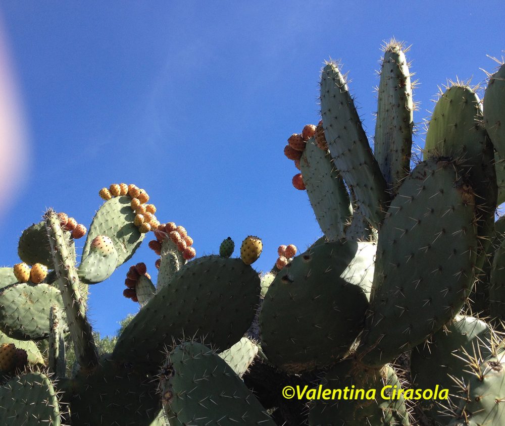
Roses have thorns and yet we plant them all over gardens. The type of cactus in the photo might not be the prettiest plant to place in the garden, but I looked beyond the thorns and purchased it anyway despite of the cashier’s disgusted face. Prickly pear is the colorful fruit this plant produces in the summer. It is sweet, full of Vitamin C and refreshing to beat the summer heat. The burst of orange, red and yellow of the oval-shaped pears is just a delight to admire against a blue sky in the background.
(Click on each photo to view it larger).
Cactus plant has many healthy properties and if used as a beauty treatment can be applied on hair and skin. To nourishes the hair cut the large flat leaves in small pieces, put them in a bowl full of water and soak overnight to soften the pulp. Apply the pulp on hair and keep it on for 20-30 minutes or longer if you can stand it. Rinse with warm water and wash hair with your favorite shampoo.
The slimy interior part of a cactus function as emollient on irritated skin, bruises and cuts as well as a facial masque.
In the south of Italy we use the large flat leaves of this type of cacti as rustic plates to eat salads off of it, without the thorns of course.

Looking at this cactus in my garden I see how green, lavender, beige and dusty rose create a flirtatious mix of feminine colors. A sitting room made for a woman comes to mind, a room where she wants to sit with a friend or a sister to talk about life issues, or a place where to read in peace. The colors of this cactus are hard to classify because the green area is not really green, but a mix of sage and sea-foam, the rose color of the redwood fence in the background could be called dusty rose, dirty rose, or even light red-purple, while the red tone of the thorns could be crimson, burgundy or maybe maroon.
Colors appear very different from one person to another because, it depends on how our eyes filter the light. Some people see more yellow tone, some see more red or blue tones and some are color blind with certain colors, thus we tend to name colors as our eyes see them. Knowing the difference is the designer‘s job, we rely on the fan deck of colors ready to use as shown on the chip. However, one other tricky aspect of obtaining the right color is to observe how the light shines on a particular color. The same color will look very different in the morning and in the night, or under an incandescent bulb or L.E.D light.
One of my clients painted a large living room in dark green and although it looked sharp in the morning with her beige seating arrangement and white window trims, at night that dark green on the walls looked dark grey and made the room very uninviting. The trees outside the windows were not illuminated and created the dark cave effect inside. We changed the walls to a golden caramel color which gave the room a sweet, bon-bon like character, we illuminated the trees closer to the windows to extend the room visually and thus eliminated visually the boundaries of walls. The exterior and the interior became one whole entity.
We need to study the environment and understand why when we paint that color we liked so much, it doesn’t look as good on the wall as it does on the color chip. Everything outside will reverberate inside, bounce off walls and furniture, then cast a color reflection inside, that’s why my cactus looks a bit lavender at the top of the buds. The distressed redwood fence in a sunny early afternoon day is casting its pinkish tone.


Since this is a feminine color palette, the décor of the room should include some lilac Amnesia Roses, rosy sheer window treatment and a couple natural stones:
1. One stone in green tone such as a jade to give you mental clarity and protecting heart, visions and stomach.
2. One stone in pink-lilac color as a Kunzite (named after mineralogist George Frederick Kunz who discovered it in 1902) to bring a calming, peaceful effect in the room. Kunzite stimulates connection between heart and brain.
Both stones will clean and activate the Heart Chakra.
I hope you get to experiment with some of my color palette suggestions, when in doubt you can always contact me. Ciao,
Valentina
http://www.valentinadesigns.com
Copyright © 2016 Valentina Cirasola, All Rights Reserved
 As a designer in business since 1990, I am interested in helping people designing their interior and exterior spaces with an overall feeling of peace, relaxation and harmony that will draw them home eagerly. I am always looking to add that special touch with original findings to the spaces I design. Featured on Vogue Italia magazine, Gentry and many prominent magazines in California, appeared on RAI, National Italian T.V., my stories continues. Find copies of my three books on
Amazon: http://goo.gl/qNxXrB
Barnes&Nobles: http://goo.gl/q7dQ3w


1 Comment (+add yours?)