Balayage And Ombre Hair | Valentina Cirasola | Designer

Look out for new words in hair styling!
Ombre is a style, it’s a transition of a lighter shade from a darker shade. Balayage is technique. It come from the French word “to sweep”. With this technique dark pieces of hair are left at the bottom to create dimension and a natural sun-kissed look.  Both hair colorings are variegated, extravagant, luminous and an ensemble of colors never done before. It seems one color is no longer accepted. Hair stylists are getting creative combining many colors in one hair do.

Have I ever had the urge to dye my hair purple? Yes, many times and I refrained each time from doing it. I am afraid of the level of chemicals that will go in my hair and not only that, something else prevented me from doing it: matching clothes in all the colors I like to a dual or multiple hair coloring would be a real challenge. I would feel locked in a few clothes color solutions and no longer free to do as I please.

Before your hair go under a major color restyle, think about a few issues. You chose an extravagant, modern hair color, let’s say purple and silver.
Will it suit your skin coloration?
With the new hair color, how many colors must you eliminate from your wardrobe?
Is it worth to redo your wardrobe (unless your clothes are outdated) just because your new hair color doesn’t match anything you have?

(Click on each photo to view it larger).

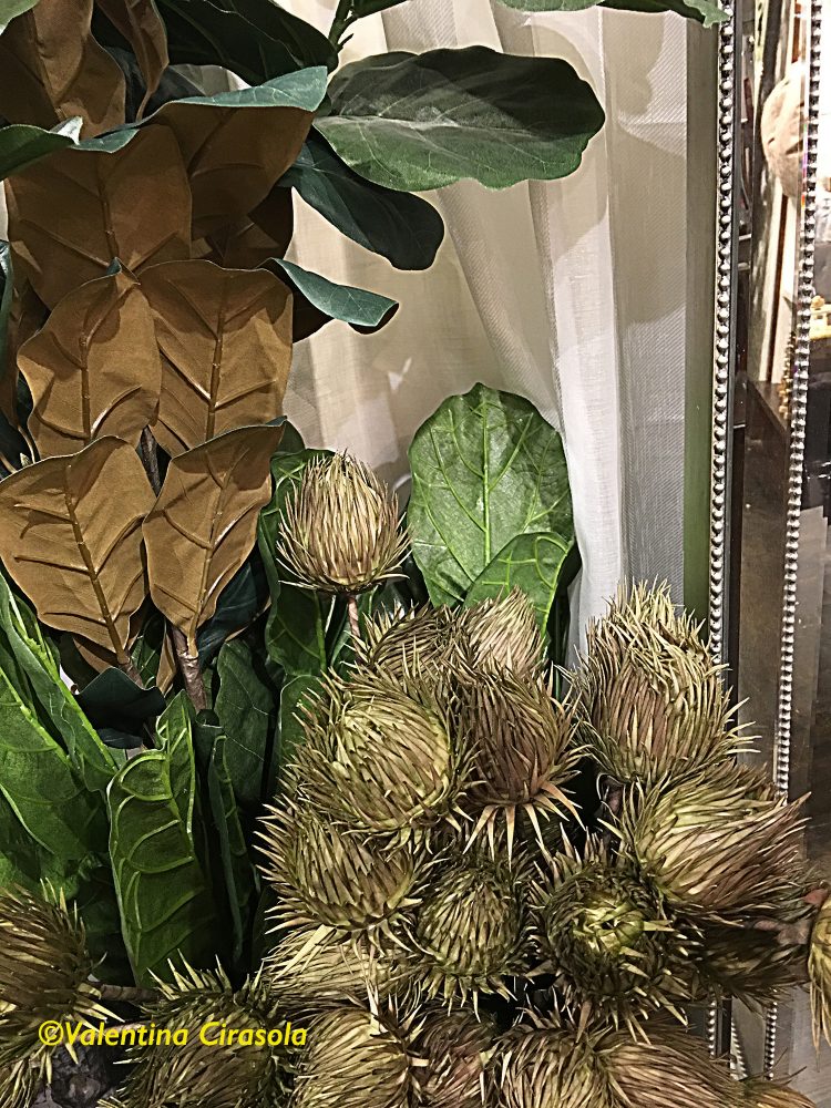
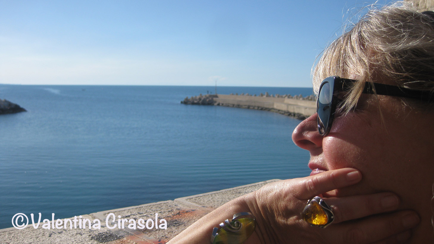
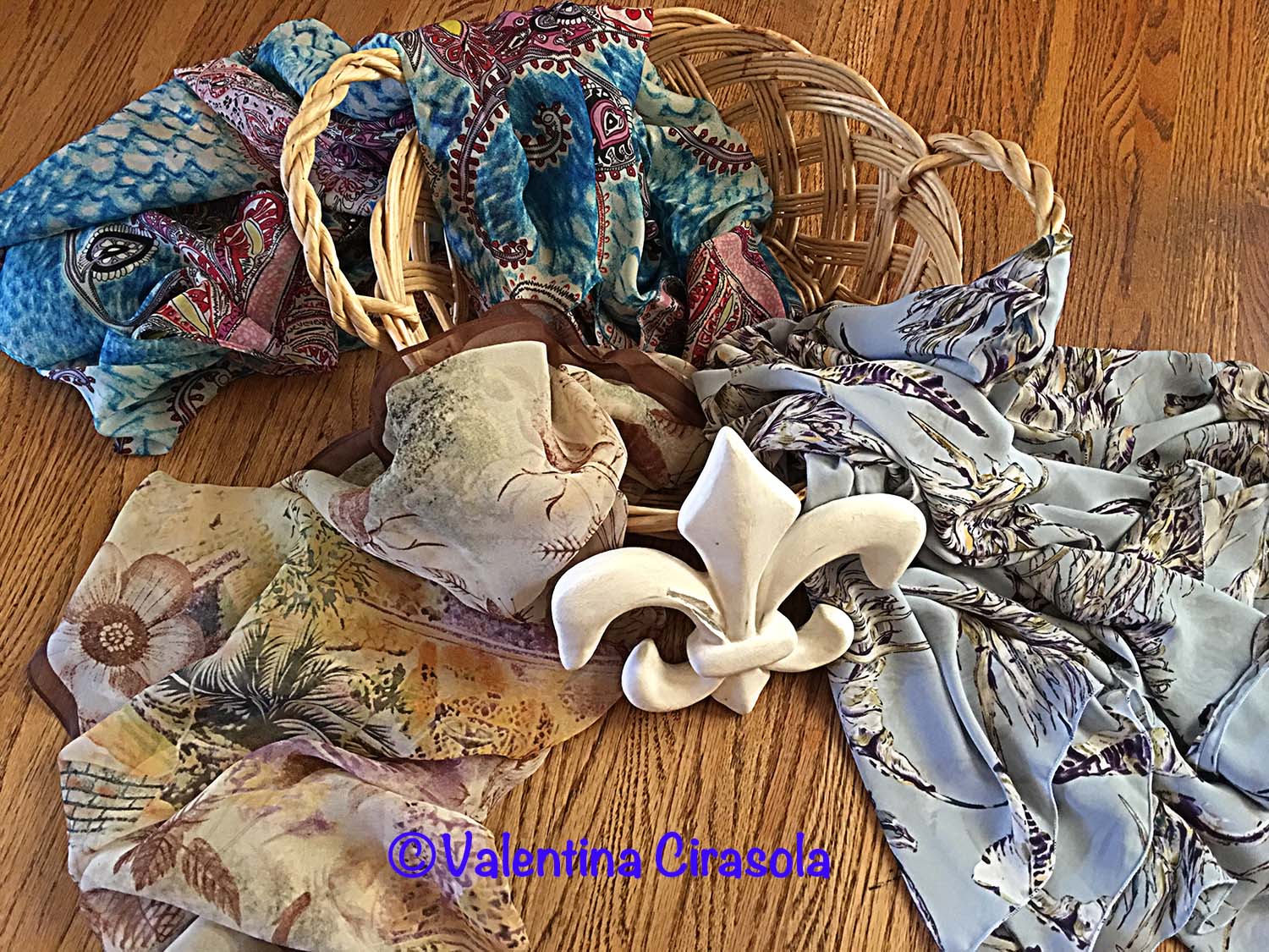
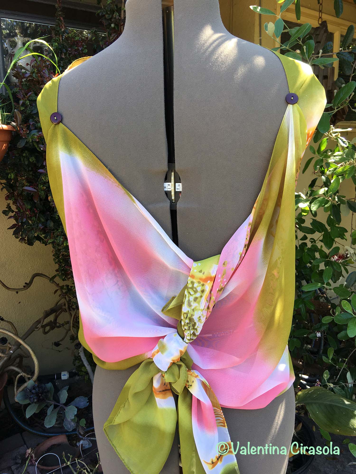
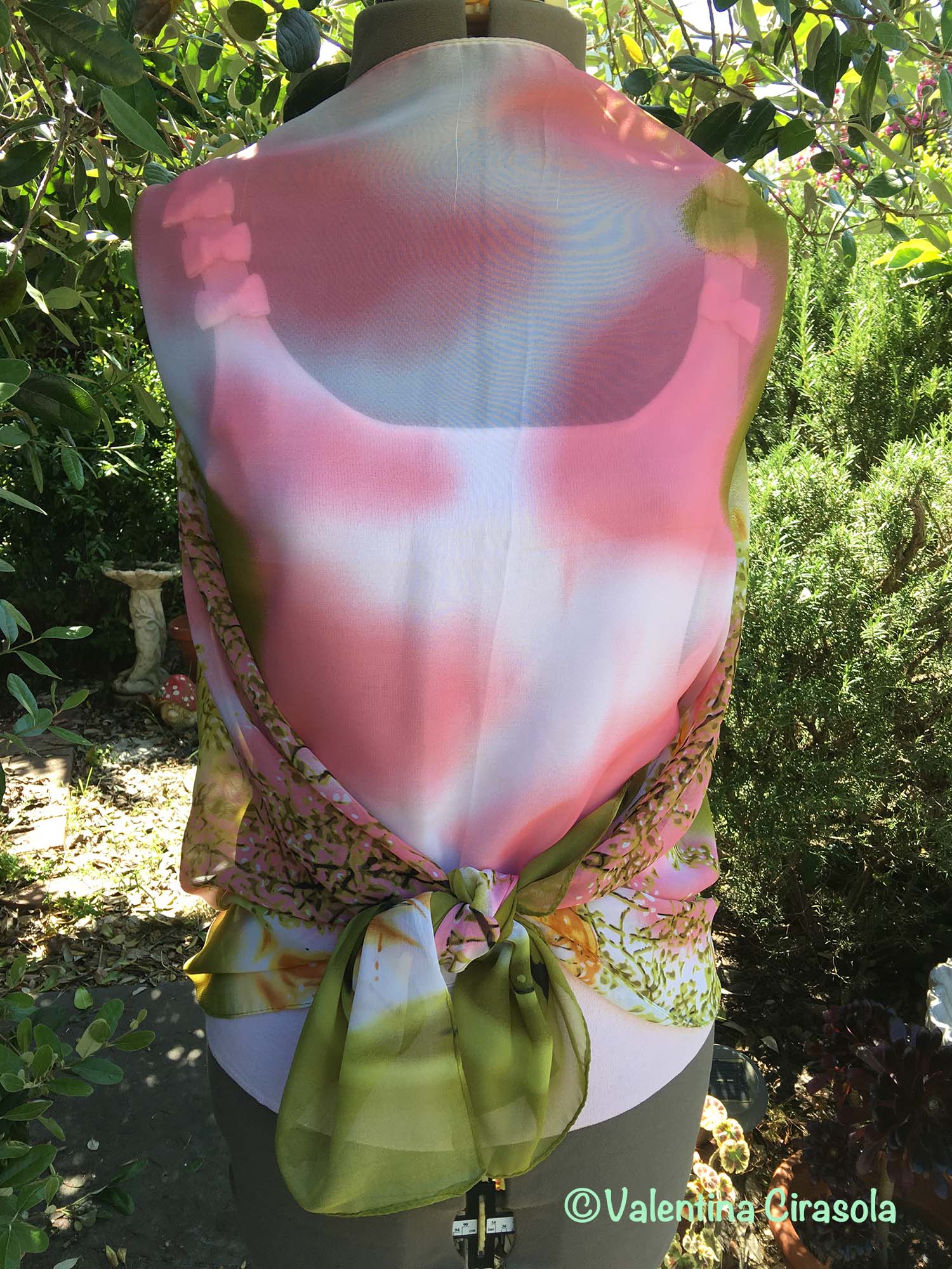
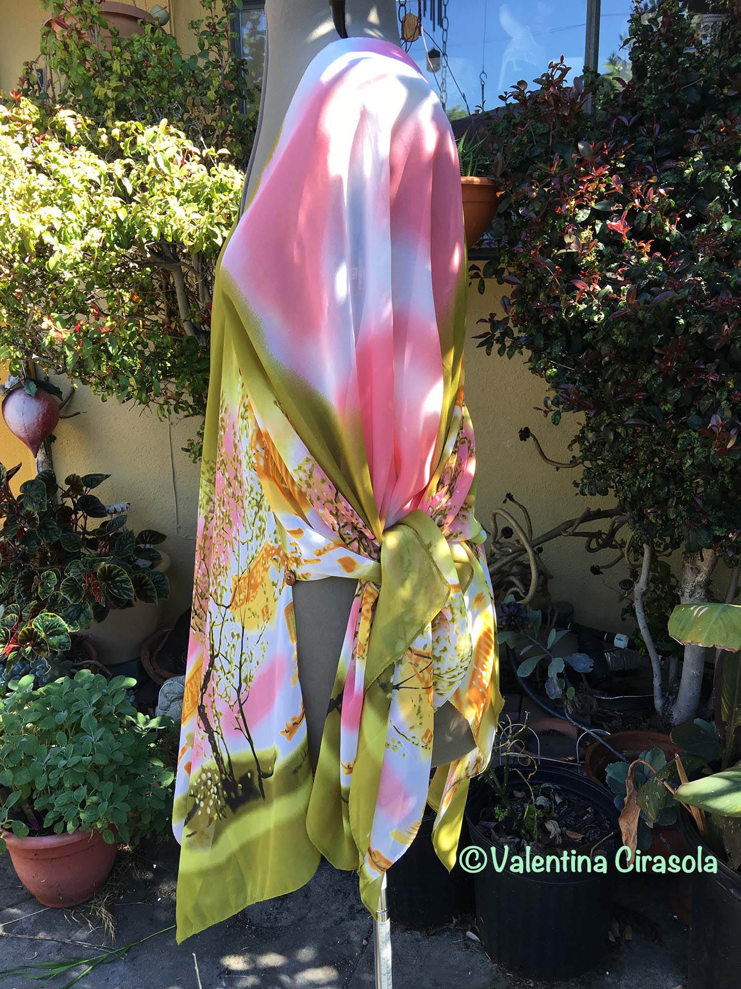
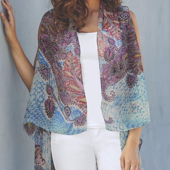
While I am writing this post, I am looking at this ensemble of flowers left casually on the table waiting to do something with it and I am noticing the colors are very similar to a Balayage Hair Coloring, composed of purple and silver-gray (shown in my board). Hair colored this way is very attractive, but the combination of purple and gray will add years to your face, unless you wear the right color clothes. The usual black will look good, however do you want to wear only black for the duration of your dual coloring, when there are so many luminous colors to choose from? In my palette, I selected colors that will play a lively game with clothes and the gray in the dual colored hair, especially if your eyes are blue.

(Photo in my board of purple and gray hair found on http://www.haircolorsideas.com/bright-hair-colors/purple-hair/silver-purple-ombre/attachment/silver-to-purple-ombre)


Use colors to your advantage, even grays are elegant when played out right and mixed with the right colors. Ciao,
Valentina
https://valentinadesigns.com/services#fashion-services

Copyright © 2017 Valentina Cirasola, All Rights Reserved

Valentina Cirasola is a trained Fashion and Interior Designer, born in Italy in a family of artists. Style surrounded her since the beginning of her life. Her many years of experience led her to offer consultations in both specializations and now she can remodel homes as well as personal images. She is passionate about colors and encourages her clients to express their individual style in their homes and with the clothes they wear. To better help people all over the world she offers consultations online. She is the author of three books.
Get your copy of Valentina’s book on colors: ©RED-A Voyage Into Colors on
Amazon: http://goo.gl/qNxXrB
Barnes&Nobles: http://goo.gl/q7dQ3w

From Messy To Sleek | Valentina Cirasola | Interior Designer

I have my theory about Harmony in the home, it doesn’t come from any particular science, only common sense.  Three words starting with the letter D will block a good energy: Dust, Dirt and Disorder. Often, I go into homes where the mess is made of bad habits, lack of cleaning knowledge system and lack of organizational skills. As a designer, from time to time, I find myself teaching how to stay organized, how to create a method and good habits that will keep my design visible six months after the renovation is completed. It takes a long time to tech people how to live in clean spaces in order to have a clean state of mind. It takes efforts and disciplines to break out of bad habits. Living in a mess could make your life feel upside down. This picture below says it all and even though this home is not usually this bad,  it gives a sense of disordered life. This house is one of those restyling projects that keep growing, it has been a domino effect. In open spaces, the floor is common to all the rooms in the major area of the house, which means, without any doubts, that restyling one room requires restyling the next one, thus getting rid of useless stuff has been one of the main needs to allow the design to flow, to communicate with furniture, colors and finally for harmony to take over.

Back in August 2016,  I wrote about this fireplace wall to remodel – https://valentinaexpressions.com/2016/08/09/your-fire-is-an-element-valentina-cirasola-interior-designer – and how I was thinking of changing it from this  traditional and anonymous look  to a modern and sleek look.

(Click on each photo to view it larger).


It finally happened. I choose this metallic look (below), with much of my surprise, it was well received.

(sample wall finish: Gyorgy Sofalvi)

The mess is gone, the room starts to look decent. The new furniture are not there yet and I can’t show the rest of the room. A new stain went on the hardwood floor, which now doesn’t look like a butcher block anymore. Followed a new, modern, LED lighting in the ceiling and the walls have new warm colors.  I choose a palette of three colors, tone on tone, from light, medium to dark, which create a beautiful warm rhythm in he room. This living room looks so much larger and inviting and this is the result.
(Click on each photo to view it larger).


In the next projects, I will  convince my next client to get this same metallic finish in different colors, perhaps a Tuscan rustic, a watercolor effect, or even a space effect, as shown below.

Wall treatments such as these are work of art and nothing else is needed, only a striking piece of furniture, or a super theatrical light. Ciao,
Valentina
http://www.valentinadesigns.com


Copyright © 2017 Valentina Cirasola, All Rights Reserved

Valentina Cirasola transforms and creates spaces realizing people’s dreams in homes, offices, interiors and exteriors. She infuses your everyday living with a certain luxury without taking away a comfortable living. Valentina is well-known for bringing originality on any project and for thinking outside the box. Her interiors are not made with cookie cutters, only follow client’s inspiration, lifestyle and personality. She offers on-line design consultations through Skype and the traditional in-house consultations, helping people with their design challenge anywhere in the world. She is the author of three books, all-available on
Amazon: http://goo.gl/qNxXrB
Barnes&Nobles: http://goo.gl/q7dQ3w

Report In Summer Colors | Valentina Cirasola | Designer

Welcome to my Friday Fashion episode.
Which of the 2017 Pantone colors do you like to wear this summer? Primrose Yellow, Pink Yarrow, Flame, Lapis Blue or Hazelnut? These bright and bold colors will completely put you in a bright light and finally leave out the winter hibernation behind.

Soft colors, neutrals and dusty colors, Bohemian patterns and crochet garments paraded on all runways this year. It was all about the ‘70s revisited and how to wear old ideas, such as bell bottom pants in a new way. Crochet is in the spot light this year, as the new texture and even though it is an ancient art, only a few people today know how to master it. New crochet garments are versatile, feminine, wearable for many occasions, romantic and chic, as they soften the look and hide parts of the body we don’t want to show. I particularly have become attached to dusters and shoulder wraps and I have made a big production for my online Etsy store, all sold out. https://www.etsy.com/shop/ValentinaExpressions

Colors speak about you. Let’s say you create an outfit with Lapis Blue, Primrose Yellow and Hazelnut, what do these colors say about you?
Lapis Blue is linked with positivity, calmness, loyalty and peace, indicates that you’re a trustworthy person.
Primrose Yellow is a sunny, energetic, vibrant and happy color.  Not many people feel confident in yellow. I heard a few people saying yellow makes the face look like yellow jaundice. Yellow tells others that you’re confident and like to receive attention. It’s very welcoming.
Tan – show that you’re down to earth, as all the variations of brown do. It tells you are emotionally stable, grounded, dependable, trustworthy and honest.


Here is my composition of an outfit you can wear this summer using these colors. Basically, I am suggesting a couple of ways to wear this outfit and a great way to cut the clutter in the wardrobe. With one beige pants, you can wear the tank top belted or not, or in alternative with a dressier shirt. Dress the outfit up or down with peep toe shoe or loafer, with or without the crochet jacket, or a longer crochet duster. The blue bag matches the blue jewelry.
This ensemble is perfect for work or for a day of shopping. (Click on the photo to view it larger).


Find all these items in my list of sources.
Summer Crochet Jacket by Valentina – https://goo.gl/y6ziWJ
Tapered Pants – Ann Kein $79
Yellow Tank at https://www.shirtspace.com
Blue Asymmetrical Jewelry – Etsy Daniela Palatnik
Blue Belt – https://www.alwaysstyle4you.com
Peep Toe Shoes – Kate Spade $298
Yellow top with volantes – http://www.debenhams.com
Blue Bag – Chloé Marcie Bag
Bohemian Belt by Valentina – https://goo.gl/OVioGh
Yellow Loafer – Aerosole DSW $60

Look sharp even when is hot, but keep in mind your skin tone. If your hair is brown, dark brown, or red and your skin has a warm tone, choose all the warm colors including red, yellow and orange. If your hair is blonde, black, or ash and your skin is light, or pinkish, choose al the cool tone colors including blue, green and purple. Look sharp even when is hot. Ciao,
Valentina
https://valentinadesigns.com/services#fashion-services


Copyright © 2017 Valentina Cirasola, All Rights Reserved


I am Valentina, a trained Fashion and Interior Designer, born in Italy in a family of artists. Style has surrounded me since the very beginning of my life. My many years of experience in design business led me to offer consultations in both fashion and interiors, so much so that I can remodel homes as well as personal images. I am passionate about colors and I encourage my clients to express their individual style in their homes and with the clothes they wear. I am the author of three books, one of which is a book on color theory: ©RED-A Voyage Into Colors available on
Amazon: http://goo.gl/qNxXrB
Barnes&Nobles: http://goo.gl/q7dQ3w

Gold, A Treasure Color | Valentina Cirasola | Interior Designer

It seems gold has taken over this year, I find it in home décor stores and in fashion stores. Gold used in an unbridled way could be annoying and pretentious, used sensibly increases a sense of wellbeing. Gold resides in the center of our body between the orange sacral center and the yellow solar plexus. Being surrounded by gold is a good thing, as gold represents the treasure of our being and the deepest of our soul. (Click on each photo to view it larger).

In color therapy, applying gold in our living strengthens our worth and the unique treasure we bring to the world. Colors vibrations work wonders on our chakras, but only if they are the right colors. Gold might bring a gut feeling of knowing a situation is right for you in a certain moment, that’s the power it has, but when gold is unbalanced in out body, it will bring a sense of worthlessness and disconnection from the soul. What to do then? Let’s start from the colors of the interior rooms used the most and then we should rethink some gold colors in our clothes. To balance gold, take any chakra chart and refer to the green heart chakra located above the yellow solar plexus.

Green will put gold back in balance, as it represents the heart and the vital force in your chest. Green is the companion color to gold, when decorating with gold color. Turn to green to assure your décor is peaceful and centered in the sense that feels good, just as we feel peaceful in the green colors of nature. Adjust the combination of gold and green with a tangerine color to give the room a vibrant vitality and add some glass with golden details in it. Glass or crystals will pick up and reflect all the hues and colors in the vicinity creating a great burst of color energy. I found these twisted glass bottles with gold trims at Z Gallery home décor store.


(Above photos taken inside Z Gallery with a permission granted)


(photo above: Salmon Bay Pebbles http://www.patagoniabuildingsupplies.com)

To introduce tangerine in a décor with gold and green, simply use either tangerine flower arrangements, a bowl full of tangerines fruit, a display of beautiful mixed salmon-orange bay pebbles (photo above), or paint a tangerine wall as a detail. I love everything about this corner below, it encapsulated everything I talked about and I would make it my private corner.

(Photo below found on http://hadeda-tiles.com)


I hope you will try some gold décor this year. I would like to know how it makes you feel. Ciao,
Valentina
http://www.valentinadesigns.com

Copyright © 2017 Valentina Cirasola, All Rights Reserved

As a designer in business since 1990, I am interested in helping people designing their interior and exterior spaces with an overall feeling of peace, relaxation and harmony that will draw them home eagerly. I am always looking to add that special touch with original findings to the spaces I design. Color is the focus of my business today, changing people’s energy and life force just by introducing them to colors they would have never imagined. Vogue Italia magazine, Gentry and many prominent magazines in California featured my work, I appeared on RAI, National Italian T.V. and nonetheless my story continues. Find copies of my book on colors ©RED – A Voyage Into Colors  and  the rest of my  books
Amazon: http://goo.gl/qNxXrB
Barnes&Nobles: http://goo.gl/q7dQ3w

Reflecting | Valentina Cirasola | Author and Designer

Taking photos is a sort of amusement we all do. Professional and non professionals photographers, we all want to lock time in place and remember those moments years later. I remember when photos came out of a film and printed on paper. In the back of all my paper photos there is a note and a date. Without those notes attached to each photo, I would completely miss a piece of my life. A photo reflects and records fashion, customs, or manners of an era. It records a landmark that might be no longer there. It reflects people expressions, emotions, good and bad times. Often, we can hear words spoken in a particular situation captured in the photo.

In the London tube, looking at this picture, I can still hear the stranger coming down on the other side, fervently inciting with a “ravish her!” the man who was kissing me on the neck as we were climbing. That man later became my husband. The reflection of that passionate moment, leaves on in this picture. (Click on each photo to view it larger).

London Tube


Carnaby Street was the reflection of a changing society, pop art and fashion reflected the rejection of anything traditional, old ideas and conventionalism.  Objects of consumerism started to show up on the market. I saw my first wood hand massagers and didn’t know what to think of it.

Massagers

Wood Massagers

I saw hanging legs moving like can-can dancers showing a new style of pantyhose in a store resembling a sleazy theatre backstage. Pantyhose was the reflection of a changing fashion.

Hanging Legs


Covent Garden reflected British life, traditional looking stores with wood trims, café with windowpanes, tea time English style. I recall one tourist, an Italian woman, saying to her man the espresso coffee she ordered was not even good enough to wash her feet in it. She had no idea I was listening and understood everything she said. If I didn’t have this picture of Covent Garden reflecting that moment, I would have forgotten that funny episode.

Covent Garden


Street fashion


Wigs

This  is really strange, but this reflecting theme took a different meaning for me. Now, so many years later, I am reflecting on the reason I was attracted since a young age to an Anglo-Saxon country, me, a Mediterranean girl, full of life, who loved to improvise and organize things on the spur of the moment. Leaving Italy, family and friends behind to go live in a speaking English country was difficult and the hardest thing I have ever done. In am reflecting on what attracted me to people so different from me, in background, culture, language, beliefs and customs. What attracted me to people saluting with “I see you later, or I call you later” if it doesn’t mean anything? It could mean next year just as well. I am reflecting on the reason, I get to be on my friends’ schedules when I want to have their company for a casual cup of coffee, lucky me! Was it supposed to be my destiny?


I am still reflecting why on mother’s day I have no longer a mother to celebrate….Ciao,
Valentina
http://www.valentinadesigns.com


Copyright © 2017 Valentina Cirasola, All Rights Reserved


Valentina Cirasola is an Italian interior designer in business since 1990. She is passionate about colors and all expressive arts. She is a “colorist”. To her, selecting art means to bring out the best energy of her clients and nourish their soul. She trots the world and loves to write travel notes, from which she draws inspiration to design home interiors of her clients .
She is the author of her book on the subject of colors: ©Red-A Voyage Into Colors available on
Amazon: http://goo.gl/xUZfk0
Barnes&Nobles: http://goo.gl/q7dQ3w


Go With The Flow | Valentina Cirasola | Designer

Welcome to a spring episode of my Friday Fashion.
Spring is here with fizzy air, cool winds, fun colors, flowing skirts. That desire of leaving behind the heavy bulky winter clothes and slip in something light, breezy is growing. Soon, even Summer will arrive and we need to prepare for the heat. I am dreaming of tropical beaches, my naked feet being massaged in a white sand like sugar and blue waters giving me a sense of calmness. (Click on each photo to view it larger).

Getting dressed, even for hot days, is a form of art that requires talent, skills, discipline and practice.
Spring and Summer are the season that encourage people to get sloppy and loose in the appearance, almost like saying  “it’s hot I don’t want to dress”. Going in flip-flops everywhere is not going to help a personal image nor raise a personal a self-esteem, just saying….
Explore some creative ideas of getting dressed in these warm seasons in your special way that is different than others. Make a collage with your clothes and sculpt your image.

(Let it loose poncho style)

I want my clothes for spring and summer to give me a sensual benefit of these two seasons and have a few practical functions as well:

I don’t want the clinging effect to my body;
I want them to be loose and flowing without making me appear boxy;
I want them stylish and versatile;
I prefer breathable, natural fabrics over polyester or synthetics.

(Tie it in the back)

(Tie it in the front)

I purchased a variety of convertible scarves with arm holes, which become ponchos, regular scarves, shoulder wraps and bikini covers. I can wear them in many ways as shown in my photos, loose, tied in the front , tied behind and even as short dresses.


(Let it loose as dress or blouson and wear it with leggings)


Above here is another examples of a converted scarf with arm holes,  from Monroe & Main and how they suggest wearing it. It becomes a great shoulder wrap for any occasion.

Winter will look very colorful wrapped in these converted scarves under a coat. Try them, they are a pleasure to wear, especially when the wind blows.
Go with the flow. Ciao,
Valentina
https://valentinadesigns.com/services#fashion-services


Copyright © 2017 Valentina Cirasola, All Rights Reserved


Valentina Cirasola is a trained Fashion and Interior Designer, born in Italy in a family of artists. Style surrounded her since the beginning of her life. Her many years of experience led her to offer consultations in both specializations and now she can remodel homes as well as personal images. She is passionate about colors and encourages her clients to express their individual style in their homes and with the clothes they wear. To better help people all over the world she offers consultations online. She is the author of three books. Get your copy of Valentina’s book on colors: ©RED-A Voyage Into Colors on
Amazon: http://goo.gl/qNxXrB
Barnes&Nobles: http://goo.gl/q7dQ3w


Midwest Zen Meditation | Valentina Cirasola | Interior Designer

Talking to someone from the Midwest USA, who loves to meditate, I realized not everyone knows what to do with interiors and their needs. How do you combine these two things, so very different in style and feelings, he asked me?

Midwest is relatively flat, consisting either of plains or of rolling small hills: the Appalachian Mountains, the Great Lakes Basin, the Ozark Mountains, the rugged topography of Southern Indiana and far Southern Illinois, hardwood forests, flat lands are converted to farms, pastoral areas and urban areas. Due to various rainfall patterns, even grass grows differently in the prairies: tall grass in the wetland, mixed-grass in the central Great Plains, and shortgrass prairie towards the Rockies (Bits from Wikipedia).
The elements for a Zen meditations are all there. Refer to the local nature’s essence, copy it, bring peace and balance in the home décor. (Click on each photo to view it larger).

In the Midwestern Zen style, I see furniture made with sustainable wood, chairs with natural fiber and washable slip covers, upholstery patterns that imitates nature’s examples of the area such as leaves, butterflies and swaying grasses. For the meditation area plan for sisal rugs and comfy pillows. Be inspired by past and present. Mix modern accessories with vintage and artisanal-made items to stage a casual expression of the Midwestern rugged area, such as furniture left natural and shaped as if as a tree trunk has taken its own form.


(Photo above taken at Luoghi di Pitti, Altamura Italy with permission granted)

Add a bowl full of pinecones, a driftwood with embedded air plants, rocks form the mountains, quilts and local pottery. Make sure everything is a perfectly mismatched, in that, all together these items and findings will communicate with the outside environment and will bring a special charm in the décor.
Choose leather, suede, velvet, raw silk and no pastel colors. The rugged Midwestern calls for bold colors: rich reds, juicy oranges and earthy inspired hues such as blues to emulate the sky and green tones to bring in the various prairie grasses. Once the space has been created with a mixture of local elements, the harmonious elements of air, water and earth must be put in place.

Invite lots of fresh air, let the sun filter through bamboo shades and let the cool breeze caressing your face. Put a fountain in a corner to cut all other noises; long tree branches or shapely driftwood in four corners of the room as buffer and grounding elements; add soft meditating music, if you like and an altar with the objects of your personal beliefs. Make sure the room is well ventilated for a pleasant meditation experience .

Light up the meditative space as you wish. I suggest objects of light by Italian artist Peppino Campanella. http://www.peppinocampanella.it/en/atelier/
Glass is a natural element, it reflects well light and atmospheres created around it.

Location of daily meditation should face nature if possible, a blue water, a green park, a scented meadow, or a garden full of flowers. If this is not possible, any room can be created as nature-like setting and, sometimes, just hanging a poster of nature on the wall, or an enlarged photo of nature you took during an exotic trip is sufficient to recreate a similar effect of being in the nature. Ciao,
Valentina
http://www.valentinadesigns.com

Copyright © 2017 Valentina Cirasola, All Rights Reserved


It’s my hope that through my writing and my stories I am enriching your aesthetic sensibility towards design, style and inspiring you to live in beauty. I have loved my profession as an interior-fashion designer since 1990. I am here ready to offer consultations on-line if you need. Check out my latest book on the subject of colors Amazon: http://goo.gl/qNxXrB
Barnes&Nobles: http://goo.gl/q7dQ3w

No Facilities

Random thoughts, life lessons, hopes and dreams

Graffiti Lux Art & More

Luxuriating in the Arts - Art Remembers Us

AI Automation & Business Solutions - AI Trends | AI Insights

AI News & Insights - Artificial Intelligence Trends | Technology

Before Sundown

remember what made you smile

James J. Cudney

Best Selling Author of Family Drama & Mystery Fiction

Robbie's inspiration

Ideas on writing and baking

The Write Stuff

"Writers Helping Writers" with Marcia Meara & Friends

Jacquie Biggar-USA Today Best-selling author

Read. Write. Love. 💕💕💕

Banter Republic

It's just banter

Stevie Turner

Author of Realistic Fiction

Warning:Curves Ahead

reasonably photogenic and relatively stylish

Sue Vincent's Daily Echo

Echoes of Life, Love and Laughter

London Life With Liz

A lifestyle blog with a little bit of everything.

Janaline's world journey

My sometimes Strange, but usually Wonderful Experiences and Adventures as I Travel through this amazing World we live in.

Dancer Attitude

"Shoot for the top"

Modern Tropical

Welcome! Immerse yourself in the colorful world of Modern Tropical, an eclectic lifestyle brand for people who love the retro-modern beach aesthetic. It is produced by independent award-winning artist Kristian Gallagher.

Smorgasbord Blog Magazine

Blog magazine for lovers of health, food, books, music, humour and life in general

Jean's Writing

Jean M. Cogdell, Author-Writing something worth reading, one word at a time in easy to swallow bite size portions.

Sisi Hidupku

My Mobile Diary

Valentina Expressions

Luxury for Comfortable Living and Good Life Through Designs, Style, Travel, Food

Cindy Knoke

Photography, Birds and Travel