The Special Status Of Number 3 | Valentina Cirasola | Interior Designer

For centuries, in many cultures and for some inexplicable reason, number 3 has been considered the perfect number.
Tesla the most influential scientist was obsessed with the number 3 and created everything in multiple of 3.
Followers of magic and esoteric, think the number 3 has a magical power, in fact, the word Magic itself has 3 consonants.
3 represents the alignment of brain, heart, and body or the triangle in geometry with three sides.
Shamrock, the three leaves clover weed is the Irish lucky symbol, used in the 5th Century Ireland to explain the Holy Trinity, Father, Son, and Holy Spirit, to people converting to Christianity.
The Resurrection of Christ happened on the third day of his crucifixion.

In decorating is where we see the full expression of the number 3. We can decide to make a vignette by grouping 3 items, tall, medium, and small. This arrangement is pleasing to the eyes, shows harmony, rhythm, and style, or we can decide to create a gallery by grouping odd numbers together, 3-5-7-9 and so on.

(Click on each photo to view it larger).

Tiles-Lamp-Vignette

Tiles-Lamp-Vignette

I created a gallery wall with antique mirrors, a ceramic ball, and an antique candle holder. It’s funny how the subject in my picture is about two people dancing and a street lampost behind them. It’s also curious to see the reflections in the small mirrors doubling the effect of the gallery.

Small-Antique-Mirrors-Gallery

Small-Antique-Mirrors-Gallery

I love to put colored glass objects near a widow. The reverberation of sun rays on the glass is amazing, colors change in different hours of the days.

Glass_Balls

Glass_Balls

In photography, the law of a 3 works well for a composition. This is my calla lilies studies grouping.

3 Calla Lilies Vignette

3 Calla Lilies Vignette

In various cuisines of the world, the trittico, a base for many sauces, is made of carrot, celery, and onion.
Food plated in odd numbers 1-3-5 always look better than 2 or 4 food items, sauces or dollops.

I experienced this tasty apricot dessert at the Culinary Academy, designed with 3 elements: a cake, a friable cookie, and apricot sauce.
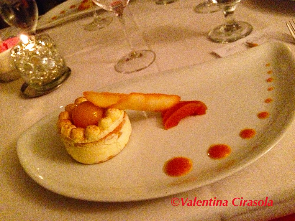
Apricot Dessert

Human beings attach meaning to colors in 3 particular ways: nature, culture, and personal feelings.
In Nature – Red represents fire. Green is associated with plants, forest, and vegetation. Blue is associated with the ocean, seas, and lakes. Yellow is the sun which energizes us, a little daily exposure to the sun gives us a healthy life, bones and good vitamins; without a yellow sun, we would not exist.
In various cultures, colors pick up many meanings: white is a mourning color in India, black is either a mourning color in western civilization or the elegant color for parties and galas. Red in China is a fortune color, often used in weddings. Earthy colors define a South-Western civilization, bright and bold colors are for tropical areas.
On personal feelings – Often, we speak in colors and we don’t even notice it. Colors are abstract, they are electromagnetic waves, but one color expression can in an instant show our character. By using certain expressions related to colors, we vibrate the same way colors do, emanating sensations of temperature, feelings of love and anger, fear and joy, attention and caution, mood, state of mind and much more. Here are some fun expressions: “green with envy” –  “bolt from the blue” – “red carpet treatment” – “yellow fever” – “green belt” – “yellow press” – “as brown as a berry” – “golden opportunity” – “silver screen” – “grey matter” (…) Except from my book:
© Red-A Voyage Into Colors – http://goo.gl/q7dQ3w

Ceramic Eggs

Ceramic Eggs

There you have it, number 3 seems to be the perfect number in any situation. Ciao,
Valentina
http://www.valentinadesigns.com

Copyright © 2019 Valentina Cirasola, All Rights Reserved
Valentina with short hairValentina Cirasola is an Italian Interior Designer working in the USA and Europe since 1990, specializing in interior and exterior, color analysis, kitchen, bath, wine cellar, and outdoor kitchen designs. Often people describe her as “the colorist” as she loves to color her clients’ world and loves to create the unusual. “Vogue” magazine and many prominent publications in California featured Valentina’s work.  RAI–Italian National TV invited her to appear in “Cara Francesca Show” and she has made four appearances on T.V. Comcast Channel 15. Author of four published books, one of which is on the subject of colors ©RED – A Voyage Into Colors. Barnes&Nobles: http://goo.gl/q7dQ3w
The newly published book ©The Road to Top Of The World
is available in paperback and kindle. https://tinyurl.com/y7tuyfh8

A Conversation On Black Color | Valentina Cirasola | Interior Designer

Recently I dealt with a client, a young bride whose husband likes a monochromatic color tone of black, grey, little white and no other colors. He is a high-tech engineer, apparently sees his world in greyish tones from his clothes to home décor. She writes:
“Dear Valentina, it is a common belief among youngsters that if we do not dress in black, we are not trendy, therefore those people like me who don’t overdo with black are considered outsiders. Furthermore, another common belief is that colors are a bit precarious and those who wear colors are unstable and insecure.”
I really don’t know where this one comes from. colors are LIFE and that’s a fact!!!

I told her:  “Think about the blue of the sky and the sea, the yellow of the sun, the green of the woods … the color of every single flower…. colors are the nature that surrounds us. I believe that adopting the “all black effect” will make us move away from nature and wean us from all-natural things.”
In her note, my young client seems unhappy about not being able to express herself in her new home with the colors she likes.

The secret to creating harmony in a home depends on a few elements:
1. adapt the colors for interiors and accessories to reflect the characters of the people living in the house;
2. understand how people will use and live that space;
3. know how to compromise by mixing each desire for items or colors both people like. A pink bedroom with ducks, doilies, and ruffles is out of the question when a man who likes streamlines. modern and graphic colors sleeps in the same bedroom. The same way it is not appropriate to eat in black dishes, just because only one likes it.

Canvas Home

Canvas Home.com

Following trends to the letter, as trends dictate, is not that good of thing either. For a while it has been fashionable to design black kitchens, to have a table set with black dishes, black cutlery, and black glasses. Youngster under thirty, are going nuts for this trend, my young client’s husband is one of them. Yes, it might be chic to see it in a shop’s window, however, serving food in a black dish….
Just imagine this picture:
you are sitting in a restaurant in Positano waiting for your plate of spaghetti and seafood to arrive. You are already anticipating tasting the sea. The plate arrives with an incredible aroma in a riot of colors that bombards you. There is the black of mussels’ shells against the orange of the mussels’ flesh, then shades of ochre and red in the clams, the red of the shrimps, finally a handful of green parsley all over. Imagining this specialty being served on a white porcelain plate is one thing, imagining the same specialty being served on a black plate is a totally different thing!!!
I already know which of the two my young client would prefer: the white plate and I would too.

(Click on each photo to view it larger).

Impepata

Impepata Cozze

How can these trendy people drink a glass of red wine in a black glass? It is a crime, I am thinking to myself, and yet her husband does.
Drinking red wine in a crystal glass will confuse me just by looking at all the rays of colors reflected in the light. A crystal glass will also emphasize the jewel tones of the red wine and enhance the pleasure of tasting.

A goblet of red wine

A goblet of red wine

I do not know if this obvious and simple example of the spaghetti with seafood in Positano or drinking red wine out of crystal glass and not in a black glass amazed my young client, but since she is on my same colorful wavelength, I suggested to describe this scene to her husband and watch his reaction. Eating colorful food in the right colored dishes is healthy for the brain/eye activity and it is a thankful celebration of each time we eat.

She tells me: “I know you love your food to be presented on the right plate, with the right shape, with the right colors and the right tablecloth. I don’t blame you for being so fussy, but precise. In the end, your way adds beauty and pleasure to the table”.

It was easy for me to interpret her thoughts and doubts about being in black all day long. Sincerely, I have the impression people surrounded by black clothes and black interiors mourn their lives. With all my heart, I hope to have converted my client’s husband to a bit of color.
This is a part of a short excerpt from a conversation that took place online between myself and my young client in Europe, a lover of colors and architecture, who lives in Switzerland and I have only met through Skype, never in person. Our professional exchange of ideas brought a beautiful friendship, one that doesn’t feel the distance, nor the oceans. Ciao.
Valentina
http://www.valentinadesigns.com

Copyright © 2019 Valentina Cirasola, All Rights Reserved

Valentina Cirasola is an Italian Interior Designer working in the USA and Europe since 1990, specializing in interior and exterior, color analysis, kitchen, bath, wine cellar, and outdoor kitchen designs. Often people describe her as “the colorist” as she loves to color her clients’ world and loves to create the unusual. “Vogue” magazine and many prominent publications in California featured Valentina’s work. RAI–Italian National TV invited her to appear in “Cara Francesca Show” and she has made four appearances on T.V. Comcast Channel 15. Author of four published books, one of which is on the subject of colors ©RED – A Voyage Into Colors.
Barnes&Nobles: http://goo.gl/q7dQ3w
The newly published book ©The Road to Top Of The World
paperback – https://tinyurl.com/y7tuyfh8
Kindle – https://amzn.to/2H7ipGE

Garden For The Soul | Valentina Cirasola | Interior Designer

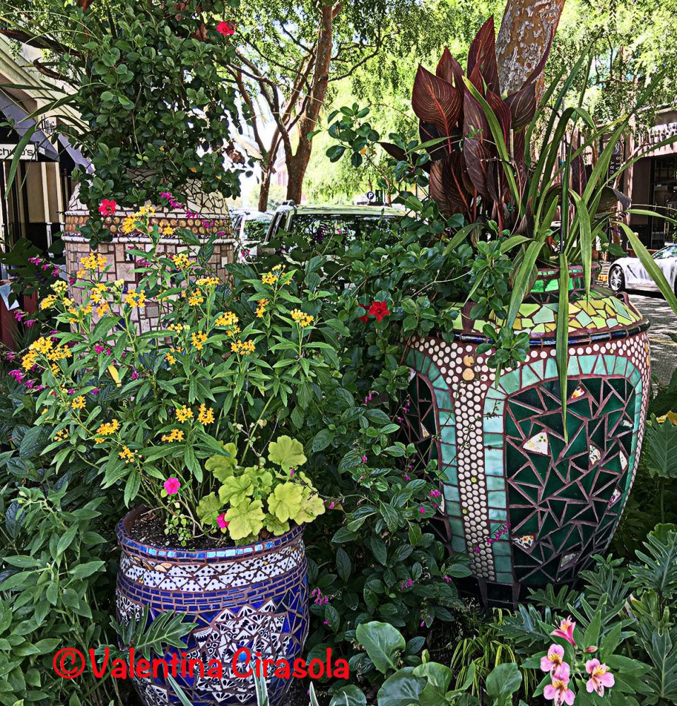
In most American homes, usually one must enter the home through the garden. Some people like it beautiful, manicured and structured, some like it a bit natural, low maintenance and some like it made into vignettes (me). I adore going through gardens and find many elements of surprise and various sceneries. A well-designed garden is based on elements of designs or elements of architecture, then textures, forms, colors and clearly marked pathway.

Plants variety enhance the garden and make beautiful sceneries. Follow the rule of sizes for the best look, tall plants go in the back (wall, fence or island), they are the sentinels of the garden,  short plants go in the front and then ground cover to finish.
It’s important to study the rotation of the sun around the house. The area with the most sun during the day takes plants that can stand full sun.
Use container planters and potted plants to move around and change the scene. Today, conserving water is of the utmost importance. Consider an easy maintenance xeriscape made of plants that are not temperamental and don’t need much of anything, only water, and seldom nutrients. I sing at my plants.

(Click on each photo to view it larger).

Corner Vegetation

Corner Vegetation

Colors. Can we ever do anything without thinking of colors? Absolutely not. Have you ever noticed when driving on highways, traveling miles after miles, that the colors of trees change from light to dark, and from monochromatic to complementary colors? The change of colors assures a harmonious drive to avoids boredom and to keep the drivers attentive. Color schemes in the garden are just as important for a great composition of light and dark, soft and bold, cool and warm, they just add pleasure in our eyes.

Succulent making pink flowers when in bloom

Succulent making pink flowers when in bloom

Style of the garden – classic with symmetry or free form?
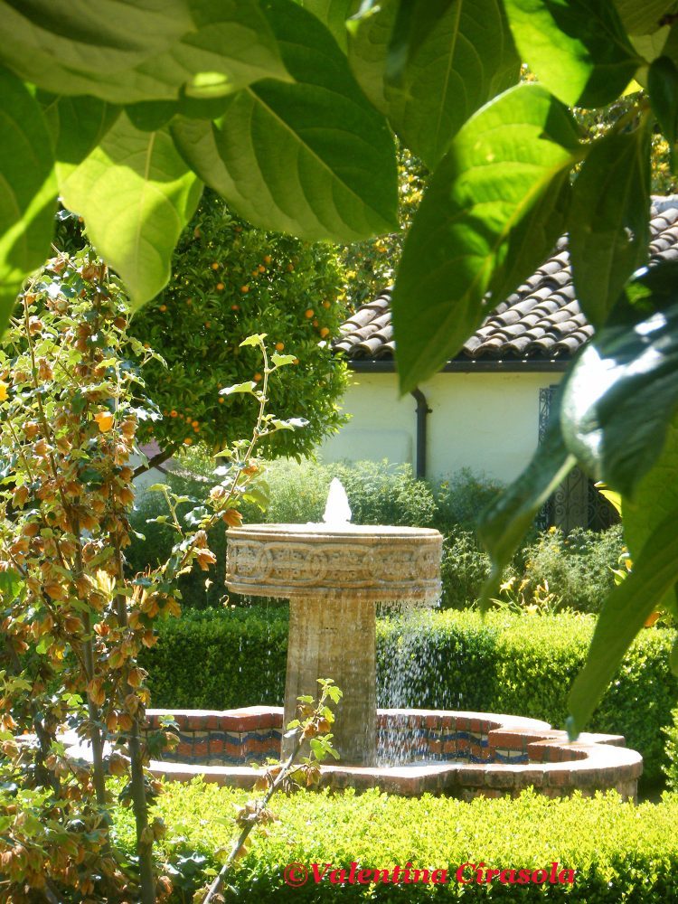
In a classic garden, it’s important to create symmetry. If you look at buildings in Italy, you will see a row of windows with a triangle pediment, and a row with arched windows. Then look down and will see two columns of the same size framing the entry of the building. In classic architecture, details are symmetrical to infuse peace in the eyes of the viewers. It is the same when creating a classic garden. The position and the cut of plants must be symmetrical. Curves are the details of a classically designed garden, which is usually an area with flower beds all around the curves to make us feel embraced. Most often in the center of a curvy area, there is a water source, a fountain, a pond with colorful fish, or a small pool.

Allied Art Round Area Garden

Allied Art Round Area Garden

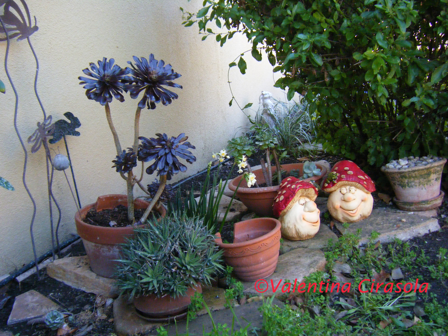
A free form garden is made of whatever you want, just don’t mix the styles. For example, in a Japanese style garden, there will be a small bridge, stone lanterns, maybe a Buddha, stones of different shapes, and some sandy area. In a fantasy garden, there might be fairies and gnomes, whimsical metal sculptures, funky statues and everything that strikes your fancy.

Garden Fairies

Plant an orchard. If space allows it, in between flowers, you might want to cultivate some of the food you eat. We know how effective color blocking is in fashion and in interiors, use the same method to create a color blocking for products in the same family, for instance, red and green romaine lettuce, purple and green cauliflowers, green and purple cabbage, yellow and multicolor corn. You get the idea.

My orchard with funky characters

My orchard with funky characters

Lighting – I can’t stress enough how important lighting is for the garden, mainly for security purpose and to beautify. The entry landing should be always well illuminated, that’s where we greet people, the light should feel welcoming. The light around bushes under windows will keep unwanted people away and pathways must be clearly defined. Led lights are the best solutions today – https://bit.ly/2LDa4zU.

Led Solar Light

Led Solar Light


Following these simple criteria will help to conceive a beautiful garden. Ciao,
Valentina
http://www.valentinadesigns.com

Copyright © 2019 Valentina Cirasola, All Rights Reserved


Valentina is an Italian Interior Designer since 1990 designing for the USA and Europe’s markets. She loves to remodel homes and gardens. With her many years of experience, she is able to cover a wide range of design solutions. Often her clients ask to design the landscape concept complete with lighting to complement the interiors she restyles. She creates “exterior rooms” as she calls them and limits the garden design only to vignettes, no structural work. She offers design consultations online anywhere in the world through Skype and Zoom. Valentina is the author of four books available on
Barnes&Nobles: http://goo.gl/q7dQ3w

Sculpting With The Light | Valentina Cirasola | Interior Designer

Is the sparkle of a chandelier the only light you imagine yourself being enveloped in?
Fortunately, a central light mounted in the middle of the ceiling as the only fixture that illuminates the entire room is passé and so are all the track light systems. These fixtures attract attention to themselves and detract attention from people, often-casting shadows on people’s faces.

Modern lighting is a visual phenomenon, it’s made inviting and creates a mood. Light is life and people congregate in rooms well-lit. In fact, the eyes need highlights and shadows to rest. A bright blasting light only blinds people, gives headache and leaves everything flat with no dimension.

In planning an efficient lighting system, we must first think of people and how good they will feel in our home when the light is right. We don’t want our family members or guests to look sick with bags under their eyes.
We should think of the type of tasks we do daily. These areas will receive a brighter light to fulfill our tasks.
We must create ambient light, which is perfect for conversing, for the comfort of the soul and to relax the mind.
Finally, we must accent everything of value, artworks, sculptures, glass art, photographs and interesting piece of furniture.

(Click on each photo to view it larger).

Sculpting with lights

Sculpting with lights

I see a good lighting system as a “layering effect”, sort of like painting and sculpting with lighting. The fixtures come in the second order and the light plays the main role. Don’t get me wrong, fixtures add style to a room, and we can admire their beauty during the day when the lights are turned off. However, lighting is one of the elements of design that must agree with human eyes, colors and shapes and the one element that visually enlarges or shrinks spaces. As in a theatre performance we never see the light source, we see highlighted only people and the important details of the plays, the same principle applies to home lighting.

A light effect from a lamp

A light effect from a lamp

Have a corner you can call yours, a place just for you and layer lights for harmony and coziness.

Cozy light ambiance for a private corner

Cozy light ambiance for a private corner

I like to create silhouettes, contrasts of shadows and light for different areas of the same space. I will never leave a corner in the dark and often I put lights behind furniture to create a glow on the wall. If I have an empty vase, most likely I will fill it with a light and if I decorate with flowers, artificial or not, somehow I will illuminate that arrangement indirectly.

I hope these small examples help you to look at your spaces in a different “light”. I do offer online consultations via Skype or Zoom. The world has become smaller and distances do not exist anymore. Ciao,
Valentina
http://www.valentinadesigns.com


Copyright © 2019 Valentina Cirasola, All Rights Reserved


It’s my hope that through my writing and my stories I am enriching your aesthetic sensibility towards design, style and inspiring you to live in beauty. I love to encourage my clients to show their personality through their home décor, or the clothes they wear. I have loved my profession as an interior-fashion designer since 1990. I am here ready to offer consultations on-line if you need. Check out one of my books on the subject of colors, ©RED-A Voyage Into Colors, the third in line of my book collection
Barnes&Nobles: https://bit.ly/2FLyp0q

Some Like It Grey | Valentina Cirasola | Interior Designer

I see a grey color and immediately feel down and sad. I could not live in an area without sunshine, where most of the year is grey, foggy or rainy, my soul would cry. I can honestly say to have never liked grey, or couche’ (dormant) colors in homes, thus I would never propose something I don’t like for my clients’ homes unless they absolutely demand it. I want my client to live in cheerful homes with vibrant colors and not necessarily bold. I want all the colors to suit their personality which produce a smile when they come home.

However, I admit, in fashion grey is an elegant, classy, sexy and very neutral color. I use it often in the winter with brown, red, yellow, pink, purple and green. In home décor, grey becomes muddy, and dull if it is not paired with the right colors. Here I list a few things one should know when playing with grey.

Playing with light – Grey becomes interesting with a great amount of natural light in the daytime and with a lot of layered light effects sculpting walls and furniture at night.

Playing with furniture – Grey is not a pure chroma, it is the result of black and white mixed. It reacts differently near white or black. A white cabinet next to a grey wall will add vibrancy to the wall, and a black piece of furniture will turn the grey lifeless. That’s the reason we see white wood trims around windows and doors with grey walls. Take a hint from the horse white skin and dark hair.

(Click on each photo to view it larger)

Annie Spratt

Annie Spratt-unsplash

I love interesting contrasts; with grey walls, I would like all trims in warm brown with a red or golden undertone, as in the photo of the leaves.

Annie-Spratt-unsplash

Annie-Spratt-unsplash

Playing with mood. The mood is not that thing we feel when we get up in the morning, it has a lot to do with the location we live in the world.
In Northern countries, the natural light has a bluish tone and unless you purposely want a blue tone in the room, avoid all the greys turning blue and avoid all the blue colors. In the Southern countries, natural light has a warm golden tone. These rooms are a delight to decorate because they can take both warm and cool tone colors.
In Eastern countries, natural light has a warm tone at sunrise and in the Western countries, natural light is very warm at sunset. Where in the world are you?  If you know your geographical position, selecting colors will never be a problem.
Those color palettes we get at a paint store, are laid out to help customers selecting the mood. Vertically, the darkest or warmest hues are on the bottom and the lighter or coolest hues are at the top. Horizontally, every hue shows a different value until it changes and becomes another color.

In this photo below, the light blue of the ice gives almost the feeling of a coastal color palette, fresh and cool.

Marquardt-unsplash

Playing with combinations – Many are the colors that look good with grey:
Lavender for a feminine look.
White for a crispy look (best for corridor, entry, study rooms, bedrooms).
Brown is the best combination, especially if brown has a red undertone.
Green, light and dark for a neutral look. In the photo below, the sky is grey, the green hills make the sky look a lot less sad.


Stephen Arnold

Stephen Arnold-unsplash

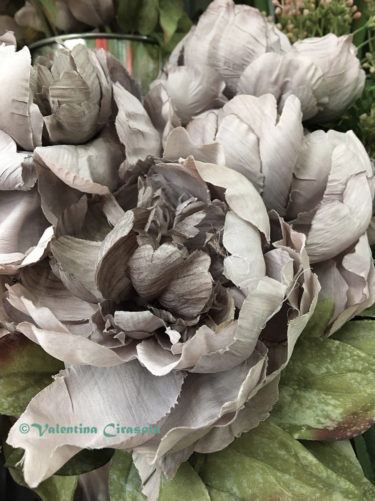
In my photo, the grey silky flowers look so beautiful next to the green silk leaves. They give light to each other. The pale green or yellow-green is best combined with grey.
Keep in mind that dark green at night looks muddy.

Grey Silk Flower

Grey Silk Flower

Grey and warm yellow, or ochre are spectacular.

Mike Scaturo - Unsplash

Mike Scaturo – Unsplash

Introduce pink, purple, magenta and orange to give any grey beautiful energy.

Annie Spratt-unsplash

Annie Spratt-unsplash

Playing with the home exterior – Most people seem to favor grey color for the exterior of the home and that’s fine. To make an attractive exterior color combination, I suggest a trio of grey, high, medium and low value. Use the low grey on the side of the house not exposed to the sun. To make it even more interesting, add the color of surprise, grey and yellow, grey and green, just to name a few. The accent color will substitute the light missing in the darker part of the exterior. I am here if you need to discuss grey. Ciao.
Valentina
http://www.valentinadesigns.com

Copyright © 2019 Valentina Cirasola, All Rights Reserved

Valentina Cirasola is an Italian Interior Designer working in the USA and Europe since 1990, specializing in interior and exterior, color analysis, kitchen, bath, wine cellar, and outdoor kitchen designs. Often people describe her as “the colorist” as she loves to color her clients’ world and loves to create the unusual. “Vogue” magazine and many prominent publications in California featured Valentina’s work. RAI–Italian National TV invited her to appear in “Cara Francesca Show” and she has made many appearances on T.V. Comcast Channel 15. Author of four published books, one of which is on the subject of colors ©RED – A Voyage Into Colors.
Barnes&Nobles: http://goo.gl/q7dQ3w
The newly published book – ©The Road to Top Of The World – is on
Amazon: https://tinyurl.com/y7tuyfh8
Absurd Living | Valentina Cirasola | Interior Designer

Last week, I had three tasks to do for clients: find an original solution for bathroom fixtures, find a modern, colorful rug and find a few table lamps of different shapes. I went to my usual stores, where I am a customer and have a designer/merchant relationship, also where, for a long time, I had found a world of originality. With my great disappointment, all three stores had closed down. Irritated enough, I started to swear up and down and I don’t really know to whom I was directing my invectives.

(Click on each photo to view it larger).

New Buildings Cupertino

New Buildings Cupertino


I didn’t have much choice but shopping online. I hate shopping online for my clients and for myself for that matter, everybody gets to own the same things and even though the selections are infinite, it is not possible to touch, feel and experience anything. How do you buy a sofa online without sitting on it and feel how comfortable it is? How do you buy a dress online without trying it on and see how suitable it is to your body? I remember a Persian store, where the owners greeted me by my first name, they knew my likings and why I visited them. There, I used to buy particular cooking spices and other food the commercial supermarkets don’t carry. Now, they are gone, just as the small family cafe’ with stuffed chairs and home-made pastry is gone, just as the living room store with fireplaces is gone, as all my favorite fashion boutiques are gone and all the stores I visited for my designer needs. We are losing the sense of community and the personal relationship with merchants.

New Buildings SC

New Buildings SC

In place of all the stores with original merchandise, huge and unattractive “box revival” buildings are growing, they are the future offices and living accommodations for all those people coming to work in the Silicon Valley and becoming a “game piece” for the young ultra-millionaires who can manipulate their subjects as they wish and like.

Meanwhile, what are we all going to eat? What are we going to put on our bodies, and what are our houses going to look like if there are only buildings and no stores to support our living? Why must we be forced to buy everything online and buy the same as everybody has? We are losing the sense of touch, smell, feel, along with the chance to go into a store and in a friendly manner, say to someone familiar: “How the fuck are you today?”. Oops, I am speaking in French again.
We have been flattened down like pancakes made with a mold, in a boring uniformity, all looking the same, all using the same expressions, we drive around a jungle of ugly buildings painted in sordid colors, looking for nothing and eating science projects for food.

Redwood City

New Buildings RWC

I do yawn when I see the “Beige Box Revival” a new boring architecture growing like mushrooms with no particular interest and no fun details, we will remember nothing of these constructions two years from now. The towns look the same everywhere, no squares, no landmarks, no monuments, nothing that speaks of the past or even an immediate past, no parks for kids, no fountains, nothing.

Today, builders are erecting expensive box revival buildings in the most uncharacteristic corners, over gas stations, at intersections of a four-way street, near overpasses, or overlooking the garbage area of a supermarket. Often these buildings have a huge monstrous parking garage next to them to host huge cars of those same people disguised as “game pieces” who drive alone on large freeways. Earth tones are the only colors builders know, occasionally they come up with a hint of color. The revival box buildings are made for people who spend their entire days at work and only go to sleep in their expensive shoe boxes at night. No stores to serve them, no community, nothing….but we must cheer the prosperous economy (I go for that, don’t get me wrong), the online shopping, and the solitude. Ciao.
Valentina
http://www.valentinadesigns.com

Copyright © 2019 Valentina Cirasola, All Rights Reserved


Valentina Cirasola is a storyteller by nature. Stories are very important to her design career to convey ideas because making someone’s home or personal images is not only about building around shapes, lines, forms, and colors. It is about the story one can create around their spaces and how they want to appear to others.
She extends her stories in the TV shows she produces with artistic and inspirational people.

She is the author of four books, all available on
Barnes&Nobles: http://goo.gl/q7dQ3w
The latest book just published is ©The Road To Top Of The World – https://tinyurl.com/y7tuyfh8
 

February In Purple | Valentina Cirasola | Interior Designer

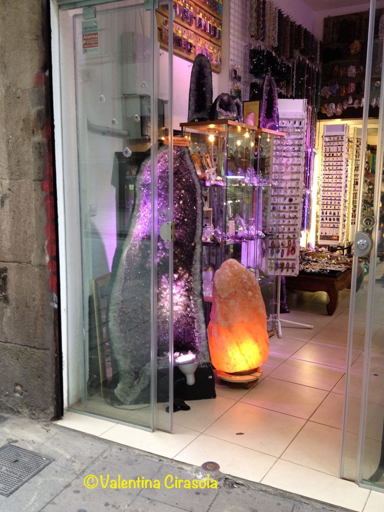
I found this purple large amethyst in the Barrio Gotico, the old part of Barcelona, in Spain and I regret not having shipped one home. All the minerals in this store were lit up to show the true colors of the stones and the atmospheres they can create. I would have liked to have in my home a large piece of amethyst as an energizer of the crown chakra, the only chakra that is a connector to the higher dimension, the universe, and divine guidance.

(Click on each photo to view it larger).

Wearing colors related to the month of our birth and the colors of the planets that were turning above our head at the moment we “came to the light” is ideal to be aligned with the cosmos. If you were born in February, purple and amethyst are your colors of harmony, but purple is the color of the crown chakra as well. This chakra is located at the top of our head, it helps us to trust our ability to go out there in life to find our way even when we don’t know all the answers. The crown chakra is about wisdom, when this purple chakra is open we are open to receive guidance from above, and we are willing to be part of a greater plan.

Amethyst is a form of rare quartz used through the centuries to alleviate pain, sleep disorder, and even mental dysfunction. It has to do with the small magnetic field amethyst crystals produce, which exchange energy with the body in a friendly way, not like the electromagnetism electronic devices produce that is dangerous for our body.

During the centuries, amethyst has been the color for royalty, church’s functions, spiritual and political leaders, all the people supposedly connected to the universe with a higher sense of purpose. The leaders wearing purple stand with grace, pride, and elegance, it is a color which demands attention and respect. Perhaps because it is a sophisticated color more than others?

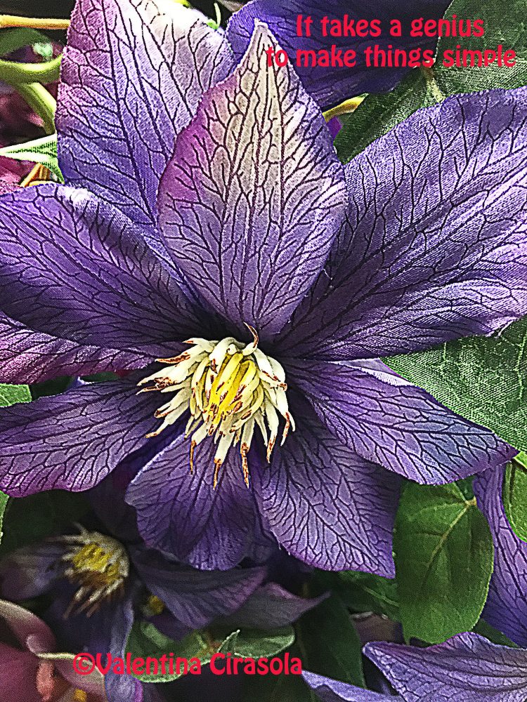
To activate the purple chakra is not necessary to paint the walls or buy new purple furniture. A few purple accessories around the home, purple flowers and a bowl with amethyst crystals are sufficient. This amethyst color flower is silk, made to look so real, it would do the trick to activate the crown purple chakra.

Amethyst crystals from UFEELBulk Rough Amethyst Crystals


Violet/purple is an excellent color for meditation, it works well in rooms where you want to think introspectively, like bedrooms, studies or libraries.
Balance violet/purple with pale yellow or sky blue in these rooms and you will feel the harmony.

If you are doing a presentation or speaking in public, wear purple jewelry or some purple in your clothes. The energy of purple will help set things in motion, you will feel like a leader, and you get the audience’s attention.

Ciao.
Valentina
http://www.valentinadesigns.com

Copyright © 2019 Valentina Cirasola, All Rights Reserved


Valentina Cirasola is an Italian Interior Designer working in the USA and Europe since 1990, specializing in interior and exterior, color analysis, kitchen, bath, wine cellar, and outdoor kitchen designs. Often people describe her as “the colorist” as she loves to color her clients’ world and loves to create the unusual. “Vogue” magazine and many prominent publications in California featured Valentina’s work.  RAI–Italian National TV invited her to appear in Cara Francesca Show and she has made four appearances on T.V. Comcast Channel 15. Author of four published books, one of which is on the subject of colors ©RED – A Voyage Into Colors.

Amazon: http://goo.gl/qNxXrB
Barnes&Nobles: http://goo.gl/q7dQ3w
The newly published book is ©The Road to Top Of The World
https://tinyurl.com/y7tuyfh8
 

Sexy Wood | Valentina Cirasola | Interior Designer

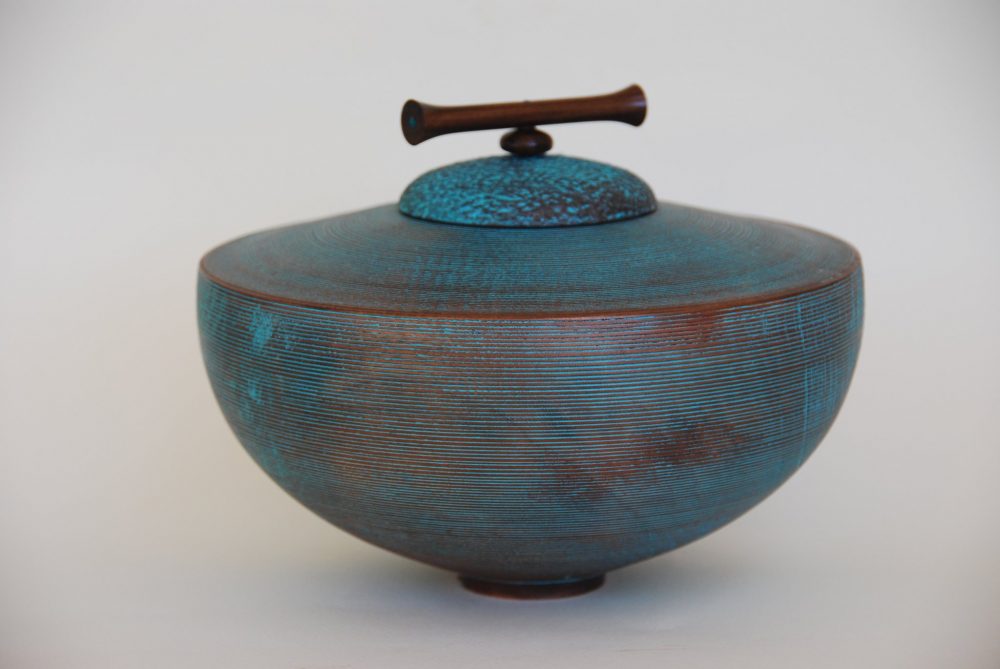
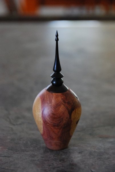
Did you not think wood is a sexy material? To hug a tree and to get the energy of the Earth is a holistic experience, beneficial to our health and soul, so we hear it often. I believe it is true, I have had that experience myself and felt good. After a piece of wood acclimatize to a new environment, then worked to the best shape for its grain, levigated, and clear varnished, all its beauty reveals. These pieces of artwork Chris Smith made are very sexy, warm in colors, versatile for a male or female décor and caressing them brings nature to the touch, just like hugging a tree.


Lace Sheoak - Australian Timber

Lace Sheoak-Australian Timber by Chris Smith


Jacaranda Wood with bronze and patina

Jacaranda Wood with bronze and patina by Chris Smith


Acacia body with Ebony finial

Acacia body with Ebony finial by Chris Smith


Red Morrel Burl Box

Red Morrel Burl Box by Chris Smith

Most of the time people don’t see behind what the market offers as furniture choice. These so-called “designer woods” might be a little more expensive than regular oak or maple, the effect, however, when making furniture out of these woods is stunning.
I can tell you by my experience, that every time I designed furniture, such as built-ins, in various non-common wood, the value of the house increased. Those are features that sell the house faster. The feeling of owning original wood pieces is satisfying and rewarding.

At times, when I have worked for clients receptive to new ideas, I always used exotic but not extinct woods to make special furniture, it takes a special person to understand the sexiness of a piece of wood.

This special bath cabinet is made of harewood. It still stands in my client’s bath and remains a conversation piece with their guests. (Click on the pictures to view them larger).


A house is not a container of stuff, a house contains our dreams and our lives. It’s better to have quality objects than a jumble of meaningless stuff, I think. Why not surround ourselves with objects possessing qualities that give great pleasure to see, to hear, or to think about? Remember the only designer who made these woods in nature is our Supreme Being, he made them for us to enjoy and to last more than a few lifetimes. This cabinet will outlive my client. Humans, on the contrary, create cheap disposable items. Ciao,
Valentina
http://www.valentinadesigns.com

Copyright © 2019 Valentina Cirasola, All Rights Reserved

Valentina In StudioValentina Cirasola has been a lifetime designer in interiors and fashion. Her extensive training and knowledge in both fields led her in both directions successfully. She is well-known for designing custom furniture. She cares to make spacious and functional pieces, but she doesn’t forget to introduce the element of surprise, sinuous lines, attractive shapes and colors in the style fit for each of her special clients. She also focuses on color theory and color psychology to transform people’s life. She is the author of four books, one of which is on the subject of colors ©RED – A Voyage Into Colors.Barnes&Nobles http://goo.gl/q7dQ3w
Check out her newly published book ©
The Road to Top Of The World – https://tinyurl.com/y7tuyfh8
Texture Italian Style | Valentina Cirasola | Interior Designer

What is texture? It is the characteristic visual and tactile quality of the surface of a work of art resulting from the way in which the materials arused. It is an essential characteristic and combination or interrelation of parts or elements (from Dictionary.com).

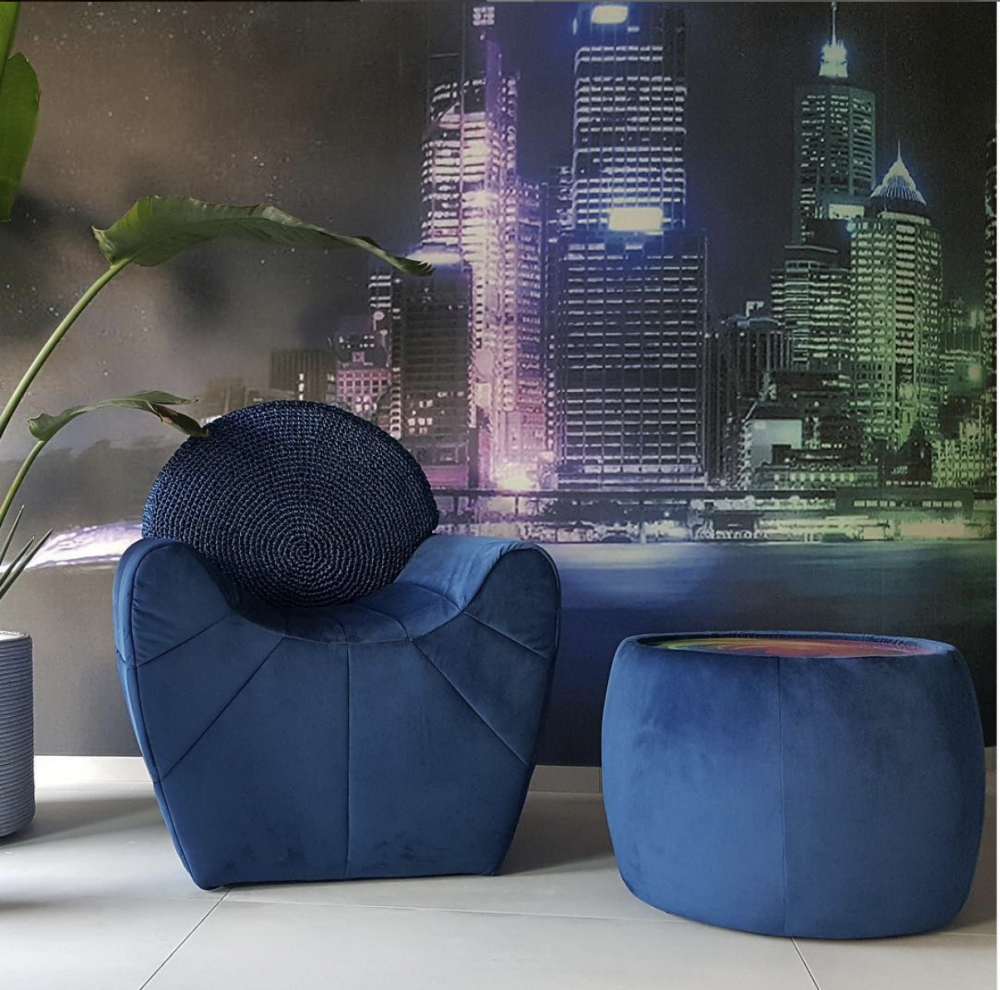
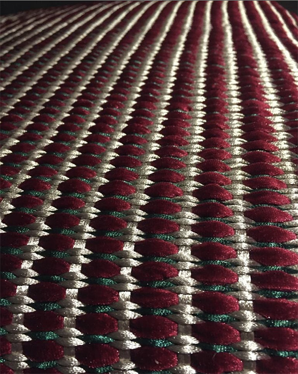
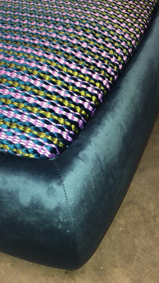
I had the chance to virtually meet Italian architect Antonella Surico, who does exactly that. She designs and produces textured furniture, using various material that she transforms in a tubular or flat coil as ropes, then with warp and weft handmade technique she turns them into furniture. “The leather texture, just to mention one material, fits perfectly with a demand of pure minimalism that never neglects the idea of ​​refinement. Velvet, which is a trend at the moment, manages to convey the idea of ​​elegance and warm hospitality”, says architect Surico.

(Click on each photo to view it larger)


Her creative thinking translates into furnishing objects that embellish any space in a unique way. Each object comes from an idea of lines first jotted on a sheet of paper then transformed using colors and materials to become the harmonious essence of an environment.


In Italy people still like the “handmade” concept, as a distinctive feature and personal treatment. Handmade originality is a way to stay out of massification.
“Spaces in a home represent the most intimate places of emotions and life experiences, in there, it is a concentration of fragments of our existence. Each space is unique and deserves to embody the spirit of those who live in it” says architect Surico.  I totally agree with her on this one.


However, and this is not a criticism of her beautiful work, it is just how I prefer it, I am not a minimalist, to me more is more and less is boring. I don’t feel comfortable living between four empty walls with nothing to look at or play with. A minimalist house to me feels much like a prison. These beautiful textures would go very nice in my maximalist concept, for both modern and traditional styles. Putting a room together, it is all about knowing how to do it tastefully, how to combine textures with colors, lines with styles and knowing when to stop.

In my opinion, the interior of a home must have a warmth character and must not look like commercial space, or have the look of a utilitarian, sterile, often cold place of work.

I wonder if architect Antonella Surico has thought of different applications for her nice textures other than using it in minimal interiors. I would be interestest in her opinion. Ciao,
Valentina
http://www.valentinadesigns.com

ValValentina Cirasola is an Italian Interior Designer working in the USA and Europe since 1990, specializing in interior and exterior, color analysis, kitchen, bath, wine cellar, and outdoor kitchen designs. Often people describe her as “the colorist” as she loves to color her clients’ world and loves to create the unusual. “Vogue” magazine and many prominent publications in California featured Valentina’s work.  RAI–Italian National TV invited her to appear in Cara Francesca Show and she has made four appearances on T.V. Comcast Channel 15. Author of four published books, one of which is on the subject of colors ©RED – A Voyage Into Colors.
Amazon: http://goo.gl/qNxXrB
Barnes&Nobles: http://goo.gl/q7dQ3w
The newly published book is ©The Road to Top Of The World
https://tinyurl.com/y7tuyfh8

Settling In Your Colors | Valentina Cirasola | Interior Designer

I am so very pleased to see colorful home interiors circulating on my social platform pages these days. For a long time, I have wondered why people want to live in mortally boring beige homes when we live under a blue sky filled with the light of a yellow sun, surrounded by brown mountain, green grass, thousands of colorful flowers and food available everywhere (so I said in my book: ©RED-A Voyage Into Colors).

Listening to realtors who want your home in a beige or white tone is deleterious to your spirit.  A few times I have been indirectly involved in the selling process of homes. One time a client passed away and I had to take care of all her stuff. She surrounded herself in colors and not for one minute I thought it was going to be difficult to sell all those colors. Another time a client moved quickly to a new work in a faraway city leaving me and the realtor in the selling seat. The realtor preoccupied herself with the notion next buyer wouldn’t accept all her colors and she was so wrong. The third time I added colors in a totally white home I staged for sale. In all three cases, the houses sold in a week time.

(Click on each photo to view it larger)

My new-found Facebook friend posted this colorful, vibrant, imaginative set of her homes, and I jolted for joy. This is a person with courage, I thought. The feel is Bohemian style, it is a playful style, not a matchy-matchy style, and difficult for some people to live in. Bohemian style is a mixture of textures, colors, shapes, and style. It is the style hippies of the ’60s adopted for their free-living concept and before them, it was the style of poor gypsies roaming around in the Bohemian area of today Czechoslovakian Republic. The chair, in particular, struck me. I remember reading her post, this is a chair remade from upcycled fabric, trims and decorative pieces found in vintage or second-hand shops.

Photo: Robbie Coole

Photo: Robbie Coole

Why does the Bohemian style still attracts many people today, including me? It’s a free-form style, it has no boundaries, no rules, and no constrictions. Most of all, it is a very personal style, a reflection of creative people who like to express themselves through colors. So, well done Robbie! I know the rest of your home is as colorful as this room.

Photo: Robbie Coole

Photo: Robbie Coole

Another true shocker this week was this stunning mosaic floor. Although many people commented positively and added so many likes on this post, I doubt many of them would do it in their homes. It takes a lot of courage to cover in mosaic the entire floor and three walls of a room, in this case, a bathroom. I can already hear someone says: “I don’t want to clean all that grout!”.

Decorating a home is fun, but then comes the challenge of cleanliness.
Who will dust all the items in a Bohemian style? Can you keep the Bohemian style orderly and organized in its “designed chaos”?
Who will clean this beautiful mosaic floor? Can you live carefully enough not to break this delicate work?

If you want to be yourself these questions should not discourage you from pursuing your dream home. Hire a cleaning person to help you or be diligent to do it yourself. This style will make it easier to accumulate items and will put you out of control in no time. Ciao,
Valentina
http://www.valentinadesigns.com

Copyright © 2019 Valentina Cirasola, All Rights Reserved

Valentina Cirasola is an Italian Interior Designer working in the USA and Europe since 1990, specializing in interior and exterior, color analysis, kitchen, bath, wine cellar, and outdoor kitchen designs. Often people describe her as “the colorist” as she loves to color her clients’ world and loves to create the unusual. “Vogue” magazine and many prominent publications in California featured Valentina’s work.  RAI–Italian National TV invited her to appear in Cara Francesca Show and she has made four appearances on T.V. Comcast Channel 15. Author of four published books, one of which is on the subject of colors ©RED – A Voyage Into Colors.
Amazon: http://goo.gl/qNxXrB
Barnes&Nobles: http://goo.gl/q7dQ3w
The newly published book is ©The Road to Top Of The World –

https://tinyurl.com/y7tuyfh8

Previous Older Entries Next Newer Entries

No Facilities

Random thoughts, life lessons, hopes and dreams

Graffiti Lux Art & More

Luxuriating in the Arts - Art Remembers Us

AI Automation & Business Solutions - AI Trends | AI Insights

AI News & Insights - Artificial Intelligence Trends | Technology

Before Sundown

remember what made you smile

James J. Cudney

Best Selling Author of Family Drama & Mystery Fiction

Robbie's inspiration

Ideas on writing and baking

The Write Stuff

"Writers Helping Writers" with Marcia Meara & Friends

Jacquie Biggar-USA Today Best-selling author

Read. Write. Love. 💕💕💕

Banter Republic

It's just banter

Stevie Turner

Author of Realistic Fiction

Warning:Curves Ahead

reasonably photogenic and relatively stylish

Sue Vincent's Daily Echo

Echoes of Life, Love and Laughter

London Life With Liz

A lifestyle blog with a little bit of everything.

Janaline's world journey

My sometimes Strange, but usually Wonderful Experiences and Adventures as I Travel through this amazing World we live in.

Dancer Attitude

"Shoot for the top"

Smorgasbord Blog Magazine

Blog magazine for lovers of health, food, books, music, humour and life in general

Jean's Writing

Jean M. Cogdell, Author-Writing something worth reading, one word at a time in easy to swallow bite size portions.

Sisi Hidupku

My Mobile Diary

Valentina Expressions

Luxury for Comfortable Living and Good Life Through Designs, Style, Travel, Food

Cindy Knoke

Photography, Birds and Travel