
I see a grey color and immediately feel down and sad. I could not live in an area without sunshine, where most of the year is grey, foggy or rainy, my soul would cry. I can honestly say to have never liked grey, or couche’ (dormant) colors in homes, thus I would never propose something I don’t like for my clients’ homes unless they absolutely demand it. I want my client to live in cheerful homes with vibrant colors and not necessarily bold. I want all the colors to suit their personality which produce a smile when they come home.
However, I admit, in fashion grey is an elegant, classy, sexy and very neutral color. I use it often in the winter with brown, red, yellow, pink, purple and green. In home décor, grey becomes muddy, and dull if it is not paired with the right colors. Here I list a few things one should know when playing with grey.
Playing with light – Grey becomes interesting with a great amount of natural light in the daytime and with a lot of layered light effects sculpting walls and furniture at night.
Playing with furniture – Grey is not a pure chroma, it is the result of black and white mixed. It reacts differently near white or black. A white cabinet next to a grey wall will add vibrancy to the wall, and a black piece of furniture will turn the grey lifeless. That’s the reason we see white wood trims around windows and doors with grey walls. Take a hint from the horse white skin and dark hair.
(Click on each photo to view it larger)

Annie Spratt-unsplash
I love interesting contrasts; with grey walls, I would like all trims in warm brown with a red or golden undertone, as in the photo of the leaves.

Annie-Spratt-unsplash
Playing with mood. The mood is not that thing we feel when we get up in the morning, it has a lot to do with the location we live in the world.
In Northern countries, the natural light has a bluish tone and unless you purposely want a blue tone in the room, avoid all the greys turning blue and avoid all the blue colors. In the Southern countries, natural light has a warm golden tone. These rooms are a delight to decorate because they can take both warm and cool tone colors.
In Eastern countries, natural light has a warm tone at sunrise and in the Western countries, natural light is very warm at sunset. Where in the world are you? If you know your geographical position, selecting colors will never be a problem.
Those color palettes we get at a paint store, are laid out to help customers selecting the mood. Vertically, the darkest or warmest hues are on the bottom and the lighter or coolest hues are at the top. Horizontally, every hue shows a different value until it changes and becomes another color.
In this photo below, the light blue of the ice gives almost the feeling of a coastal color palette, fresh and cool.

Marquardt-unsplash
Playing with combinations – Many are the colors that look good with grey:
Lavender for a feminine look.
White for a crispy look (best for corridor, entry, study rooms, bedrooms).
Brown is the best combination, especially if brown has a red undertone.
Green, light and dark for a neutral look. In the photo below, the sky is grey, the green hills make the sky look a lot less sad.

Stephen Arnold-unsplash
In my photo, the grey silky flowers look so beautiful next to the green silk leaves. They give light to each other. The pale green or yellow-green is best combined with grey.
Keep in mind that dark green at night looks muddy.
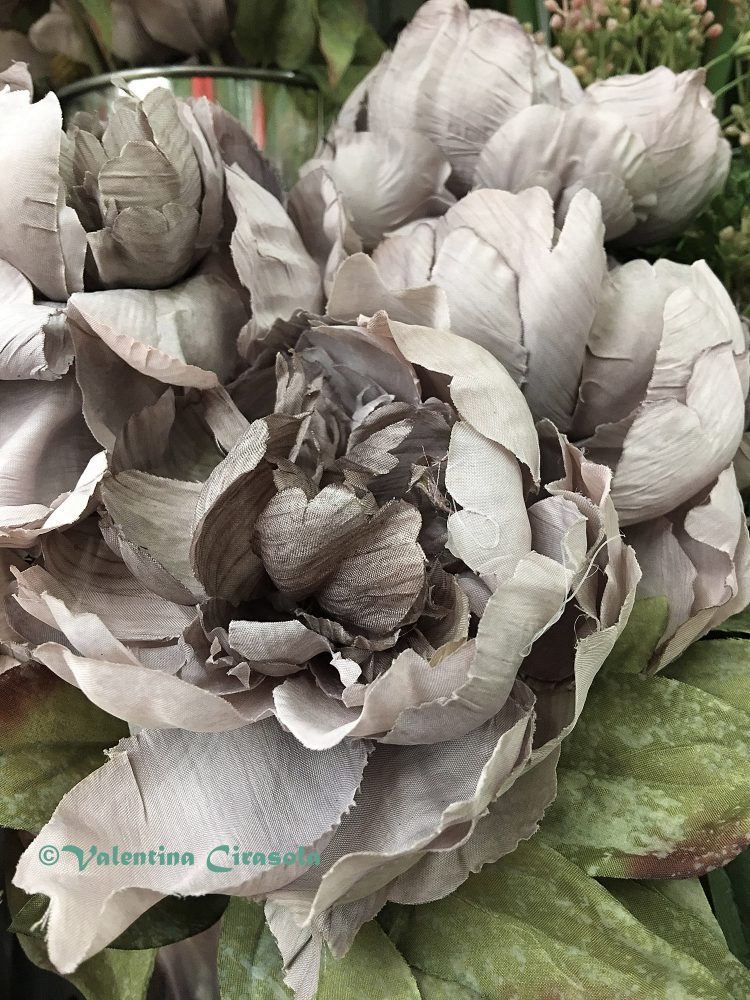
Grey Silk Flower
Grey and warm yellow, or ochre are spectacular.

Mike Scaturo – Unsplash
Introduce pink, purple, magenta and orange to give any grey beautiful energy.

Annie Spratt-unsplash
Playing with the home exterior – Most people seem to favor grey color for the exterior of the home and that’s fine. To make an attractive exterior color combination, I suggest a trio of grey, high, medium and low value. Use the low grey on the side of the house not exposed to the sun. To make it even more interesting, add the color of surprise, grey and yellow, grey and green, just to name a few. The accent color will substitute the light missing in the darker part of the exterior. I am here if you need to discuss grey. Ciao.
Valentina
http://www.valentinadesigns.com
Copyright © 2019 Valentina Cirasola, All Rights Reserved
 Valentina Cirasola is an Italian Interior Designer working in the USA and Europe since 1990, specializing in interior and exterior, color analysis, kitchen, bath, wine cellar, and outdoor kitchen designs. Often people describe her as “the colorist” as she loves to color her clients’ world and loves to create the unusual. “Vogue” magazine and many prominent publications in California featured Valentina’s work. RAI–Italian National TV invited her to appear in “Cara Francesca Show” and she has made many appearances on T.V. Comcast Channel 15. Author of four published books, one of which is on the subject of colors ©RED – A Voyage Into Colors.
Barnes&Nobles: http://goo.gl/q7dQ3w
The newly published book – ©The Road to Top Of The World – is on
Amazon: https://tinyurl.com/y7tuyfh8


