
 Welcome to my personal A to Z Challenge on the subject of Home. The goal, in a year time, is to elaborate and dissect topics regarding the Home not as containers of stuff, but as a cocoon for the soul, mind and heart. I will touch on decorations, style, trends, history of the home and sometimes technical information. On Jan. 14, 2014, my challenge will be over, I am almost ready to reach my finishing line.
This year 2014 is based on balance. We must balance work and play, soul and emotions, body and mind, food and drink, sleep and time we spend awake. This is a year to spend in colors, balancing hues, tints and tones, pastels and bright colors. It will be a playful game. The spirit of this year is to be refreshed and revived, but not everyone will look good in pastel colors. Not to worry there is a choice for everyone, pastels will give you light, the bright colors will give you energy and the neutrals will bridge them all. The colors of this year can be mixed or they can stand on their own.
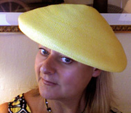
Yellow Freesia is part of the energy palette of this 2014 year, it is tropical, flowery, warm, and spicy, it has illumination like the sun. Yellow is the “make you feel good” color because around yellow the brain releases more serotonin, which is the chemical that makes us feel good. Rooms exposed to North benefit from yellow on the walls. It will appear as sunshine has parked in the room day and night. Yellow is not a provoking color, but it stimulates the nervous system, thus around people who suffer hypertension can provoke anger (from my book ©RED- A Voyage Into Colors).
To tone down yellow freesia, whether you will be wearing it this coming spring or redecorating your home, look at the Pantone palette and choose the nearby cool colors:
Yellow Freesia with Grey Paloma, or Yellow Freesia with Green Hemlock. Sand will keep Yellow Freesia balanced.
If your skin has a pinkish tone don’t wear Freesia around the face, wear it from the waist down. The bluish and greenish colors will be better on the upper part of the body, especially if you have blue or green eyes.

If you are getting married this spring, what better color to decorate your wedding reception and start your new life in a luminous color than Yellow Freesia?
(Photo credits are given to Pantone and respective owners)

This sticker with a number 20 marks my 20th post of my A To Z Blogging Challenge. I have six more letters to cover with the subjects of Home. Thank you WordPress for being such a good blog host. Ciao,
Valentina
http://www.valentinadesigns.com
Copyright © 2014 Valentina Cirasola, All Rights Reserved
 Valentina Cirasola is an Italian Interior Designer working in the USA and Europe since 1990, specializing in kitchen, bath, wine cellar, and outdoor kitchen designs. Often people describe her as “the colorist” as she loves to color her clients’ world and loves to create the unusual. “Vogue” magazine and many prominent publications in California featured Valentina’s work. She also has made four appearances on T.V. Comcast Channel 15. Author of three published books, the latest ©RED – A Voyage Into Colors is on the subject of colors.
Amazon: http://goo.gl/xUZfk0
Barnes&Nobles: http://goo.gl/q7dQ3w


