

The word “Emerald” was first used in the 14th Century to indicate a bright green stone consisting of chromium-rich variety of beryl, a precious blue-green color of seawater stone priced as precious gemstone.
Emerald color in nothing new in the home fashion front. In 1800, emerald-green heavy velvet or damask curtains embellished English interiors and again all through the ‘50s emerald-green was the color in vogue for modern home interiors and modern appliances. More than sixty years later, emerald-green is emerging strong as the spring/summer color of this year.
(Photo left Tourmaline with Lepidolite – found on http://www.themineralgallery.com/tourroom.htm)
Selecting colors is a process of emotion’s discovery, how they make you feel, what memory they evoke, what sensory perception they trigger. I like to think of the most common colors as precious value: citrine yellow, ruby-red, emerald-green, royal purple, pink quartz, brown topaz, pearl white, iridescent moonstone, blue aquamarine, orange coral, platinum silver, antique gold, bronze, satin copper and so on. Once I give value to colors they immediately feel rich, elegant, abundant, sophisticated or flavorful.
Emerald green is very rich, very dark and not much light transpires from it. The secret of a successful dark designed interior rests in the illumination; show the light without showing the light fixture. Illumination can be achieved also by accenting with light colors, such as white doors or glass doors as in the photograph of the interior by Studio CSL in Milan. I absolutely love the transparency of the blue glass wall partition and white sheer curtains with the dark blue seating in the corner grounding the room. It’s very simple and minimalist, but very effective.
Note in the photo below how the Chartreuse mixes well with white and silver colors mixed, together with the emerald-green pillows. Here the light comes from the texture of the satin grey fabric of the sofa, which makes games of light and dark. The color of the wall behind matches to perfection the color of some pillows, but the light source coming from the right side (we see it, but we don’t really) makes this picture modern and pleasant. Remember, the wall colors is one item easy to match to anything, thus it might just be the last item to select even from a 1″x1″ sample.

(Photo: http://www.maxwellfabrics.com)
Most people think interior doors must be white, natural or brown. I find interior green door very attractive, especially if the interior spaces and furniture are mostly white, antique white, distressed or beige. Emerald green doors will bring a touch of class and grandeur.
In my Pinterest board http://pinterest.com/vcvalentina there is a picture of an iPhone cover I love. Just take a look of all the color combinations possible with emerald-green. It is a real inspiration for those who don’t really want a dark room in green, but want to be trendy only with accessories. Later when they get tired of emerald-green, it will be easier to change the accessories than the entire room furniture. On this iPhone cover the color combinations to go with emerald-green are exciting and very livable.
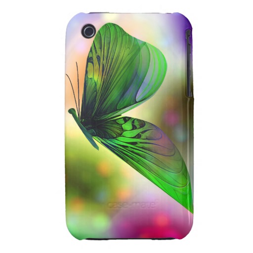
(iPhone Cover – https://www.zazzle.com/emerald_green_butterfly_3_3gs_iphone_case-179935016138807845)
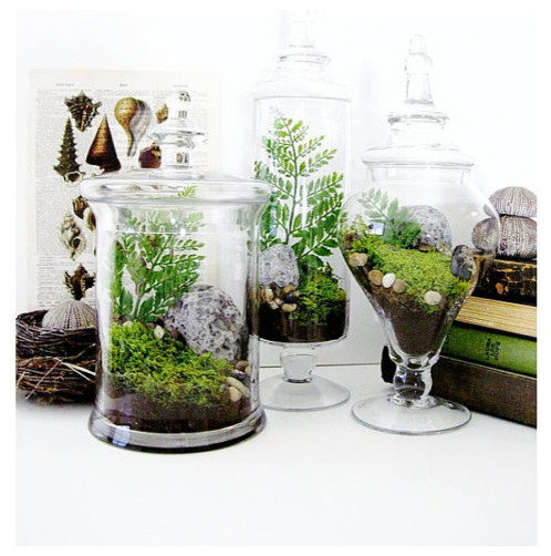
Think of greenery for interiors to add natural colors. Terrariums are full of wonder. Like little worlds of their own, they are an excellent way to study life. This set of 3 by Doodle Birdie is sold on Etsy.
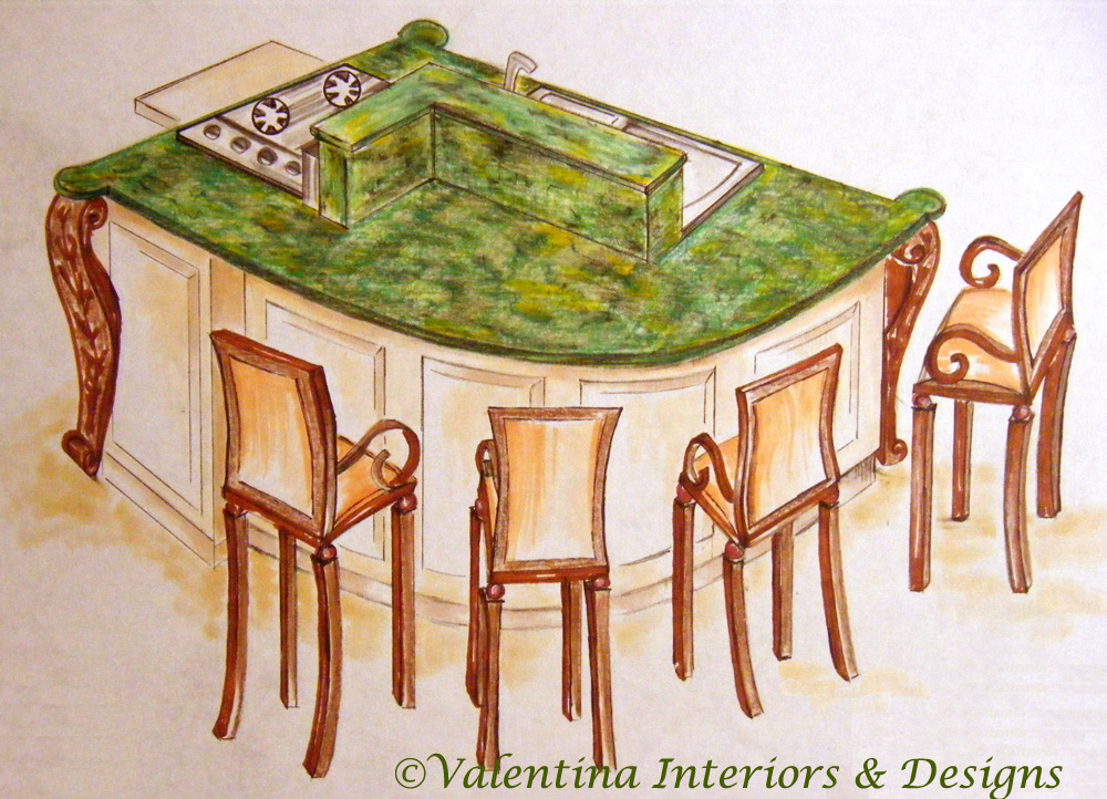
I am designing a kitchen in a classical style, all antique white cabinetry, with some glass cabinet doors, pewter doorknobs, green rain marble countertop and blonde distressed hickory hardwood floor. Functionality was a requirement, elegance not so much, but it will be when completed.

Island in Colombian Emerald Granite

If you want to purchase a real emerald stone, I would suggest the Colombian emerald, it is the most prized due to transparency and fire. Ciao,
Valentina
http://www.Valentinadesigns.com
Copyright © 2013 Valentina Cirasola, All Rights Reserved
 Valentina Cirasola is an Italian Interior Designer and former Fashion Designer, working in the USA and Europe since 1990. She blends well fashion with interior and colors the world of her clients. She has been described as “the colorist” and loves to create the unusual.
Valentina was featured in Italy on “Vogue” magazine and many prominent publications in California. She also has made four appearances on T.V. Comcast Channel 15. She is the author of three books all available on
Amazon: http://goo.gl/xUZfk0
Barnes&Nobles: http://goo.gl/q7dQ3w


Mar 07, 2013 @ 07:41:13
I always think green is a dull colour, but you’ve made it anything but! I love that room with the peacock green door. Moving in right now.
LikeLike
Mar 07, 2013 @ 07:47:56
Then if you are moving into a new location, it might be time for some new colors for a new life and new vibrations.
LikeLike
Mar 06, 2013 @ 23:59:19
Everything is gorgeous! I love the kitchen design!!
LikeLike
Mar 07, 2013 @ 00:09:47
Thank you Judy for stopping by. Emerald green is quite dark, but workable.
LikeLike
Mar 04, 2013 @ 23:50:24
Beautiful post Valentina ,Thanks for sharing my firend .
LikeLike
Mar 04, 2013 @ 23:53:08
Thank you Jake for stopping by.
LikeLike
Mar 04, 2013 @ 21:22:50
Check my post! You are nominated!! Thank YOU, and KEEP INSPIRING!!! Your page is always so beautifully colorful and motivates me to do something to improve my living space! It feels good to be looking at loveliness!!
LikeLike
Mar 04, 2013 @ 21:55:08
Hi Katrina,
what a nice surprise to start the week. Thank you so much for thinking of me, I feel so honored and humbly accept your award.
Thanks again and create a great week.
Valentina
LikeLike
Mar 04, 2013 @ 21:59:20
INDEED! “Create a great week” you make me smile! Thank YOU.
Pure Happiness,
Katrina Perkins
LikeLike
Mar 04, 2013 @ 22:10:30
Then, I did something good. 🙂
Valentina
LikeLike
Mar 04, 2013 @ 16:11:14
beautiful site dear and the blending of clolours is awesome.loved your work
LikeLike
Mar 04, 2013 @ 16:31:49
Soumyav, my life is a colorful voyage and I hope to transfer it to the people around me. Thank you for stopping by and taking the time to comment.
LikeLike
Mar 03, 2013 @ 02:45:33
Especially love the gray sofa with the emerald and yellow-green pillows and green wall behind it! Love the IPhone cover, too, gorgeous! And that saturated green and blue living room is so modern and fresh. Good tips about lighting, too.
LikeLike
Mar 03, 2013 @ 16:38:00
Amy,
I think, the iPhone cover provides the best representation of how many colors can be paired with Emerald-Green and all together too. Thank you for stopping by and taking the time to comment.
LikeLike
Mar 01, 2013 @ 16:06:50
♥°*”˜ƸӜƷ˜”*°♥
Back to read and comment later.
Sindy
LikeLike
Mar 03, 2013 @ 16:34:58
Hi Sindy, thank you for stopping by, create a great Sunday.
LikeLike
Feb 28, 2013 @ 18:32:38
I love the mixture of colors. The kitchen design makes me feel like there is modern mixed in with antiquities……..you have a lot of talent. good post!!!
LikeLike
Feb 28, 2013 @ 19:13:19
Yes, you have the correct feeling, Terry. Thank you for taking the time to comment.
LikeLike