![]()
Here we are already approaching Saint Patrick’s Day!
Saint Patrick, in Latin Patricius, is the patron saint of Ireland. It is traditionally celebrated as a religious event in Ireland, America, Canada and Australia by Irish and non-Irish alike.
Up until the 1970s, Irish laws mandated that pubs be closed on March 17. Beginning in 1995, the Irish government began a national campaign to use St. Patrick’s Day as an opportunity to drive tourism and showcase Ireland to the rest of the world.
 A note of history: At age fourteen Patrick was captured from Britain by Irish raiders and taken as a slave to Ireland, where he lived for six years before escaping and returning to his family. After entering the Church, he returned to Ireland as an ordained bishop. One traditional icon of Saint Patrick’s day is the shamrock. An Irish tale tells how Patrick used the three-leafed shamrock to explain the Trinity. Shamrock represents the Father, the Son, and the Holy Spirit existing as separate elements of the same entity.
Today, people of all background celebrate the day with parades, wearing something green, drinking beer and eating traditional Irish food. Tradition says that people who don’t wear green will be “pinched”…. in an affectionate way.
One reason St. Patrick’s Day might have become so popular is that it takes place just a few days before the first day of spring. Spring is time to renew, refresh and upgrade any space in the home.
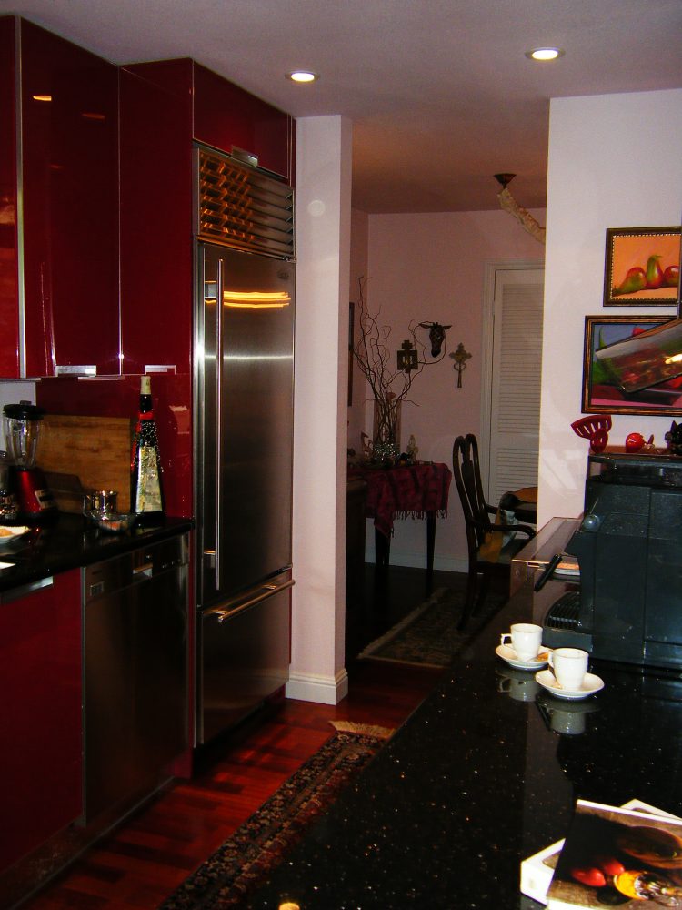
I love surrounding myself with bold colors, but not everybody thinks that way. Calm, no need to paint an entire room in bold colors to brighten it up. Use bold and colorful accessories such as rugs, throw pillows, and window treatments to add punch to a room painted in a neutral shade. This way, bold colors can be contained in small areas, making it easy to change or eliminate if later you decide to go with something else, or go with the change of seasons.
Using a bold color in a small room, will add a feeling of coziness. Some people think it will shrink the room, I think it is only how you perceive your space and how you intend to make it work for you. With a bold color in a small room, it is a must to use a spectacular light effect to avoid that shrinking feeling.
Depending on the mood you like to create, green combines well with purple and grey for a modern high tech hipster décor. Soft pink and green tones if you want to create a feminine environment, or yellow and golds if you like your home to have a summer feel all year round. Use cool green and turquoise hues for tranquility.

(Source: Color Palettes)

If you want to use a darker color in any size room, consider painting one accent wall in that color, then paint the remaining walls with a lighter tone of the same shade, or with a different neutral color to set off the bold color.
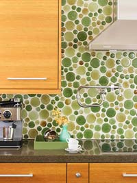
In the kitchen get creative with your backsplash in contrasting colors. Using a contrasting grout draws attention to the tile. In this example, a light-color grout lets the round green tiles pop.
(photo below: BH&G)
In home décor all the different elements can co-exist in the same space to create rhythm and a dynamic space. Green often is the right color to repaint a repurposed piece of furniture that can be used for beauty and functionality.
I am always available to resolve any design challenges and yes, I am the colorist who brings happiness in any décor. Ciao,
Valentina
www.Valentinadesigns.com
Copyright © 2016 Valentina Cirasola, All Rights Reserved
![]()
 Valentina Cirasola is an Italian Interior Designer working in the USA and Europe since 1990, specializing in kitchen, bath, wine cellar, and outdoor kitchen designs. Often people describe her as “the colorist” as she loves to color her clients’ world and loves to create the unusual. “Vogue” magazine and many prominent publications in California featured Valentina’s work. She also has made four appearances on T.V. Comcast Channel 15 and on RAI – Italian National TV. Author of three published books, the latest ©RED – A Voyage Into Colors is on the subject of colors.
Amazon: http://goo.gl/xUZfk0
Barnes&Nobles: http://goo.gl/q7dQ3w