Neutral Meets Texture | Valentina Cirasola | Interior Designer

What to do when a client has sturdy furniture, well maintained, traditional in style but showing signs of tiredness, in the sense of age? In some cases, one can tell if the date of furniture is 1970 or 2007. The kind of furniture I suggest when restyling a room, always follow the client’s style and taste, must be timeless, not necessarily too modern, too antique, too old, or too shabby unless that is exactly the client’s preference.
(Click on each photo to view it larger).

livingroomtextures

Let’s go back to the tired looking furniture. If I am hired to revamp rooms and not remodeling, that’s the moment Valentina dances around client’s possessions.
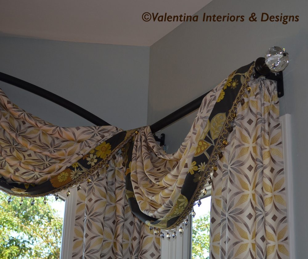
A recent client who heard me speaking about colors during an event, thought the moment had arrived to upgrade her décor. She wanted to keep only the best pieces of furniture and accessories she owned, along with the gray wall-to-wall carpet. My goal was to make the gray wall-to-wall carpet disappearing in the colors she never used in her life, exactly the vibrant colors she was afraid to use. It is a challenging task to convince someone that vibrant colors are perfect for a new home energy.

livingdining

curvedwindowtreat

The searching in local stores and online was long, meetings with clients and emails poured like a rain, preparation of many presentation boards and price talks was a daily task.
At the arrival of the first order, she was a bit reluctant to open the first packages she received at her home.
Do I open it? What if I don’t like it? Questions of this sort crossed my client’s mind. I had heard of designers who pushed their ideas on clients and had to send back to manufactures or stores all the items they had ordered, because when they arrived, didn’t meet the client’s taste. However, after she opened the first package, she was so surprisingly happy of my choices and when all the other packages followed created a Christmas type of atmosphere, that moment we can’t wait to be surprised. Placing all the items in the right rooms produced a new excitement and pleased her.
Those vibrant colors she resisted for so long are not harmful after all and worked well together with her existing furniture.

tiffany-mirror-a

livingview

From there it was a descending road to complete the project, every choice was easy and there was no discussion. I had gained her trust. Needless to say, when spaces are open and adjacent to each other it’s hard not to spill in other areas of the home and so we did.

familentry_after
master_bedroom

To get a client’s trust, it takes a lot of designer skills. We are psychologists, we must ask a load of questions at the start of the project, we must pay attention to things said between the lines and even know zodiac signs to understand the character and the planets which dominates the clients we are dealing from time to time. To some people it might seem a bit of a jumble of beliefs, but it has worked for me since the beginning of my design career.

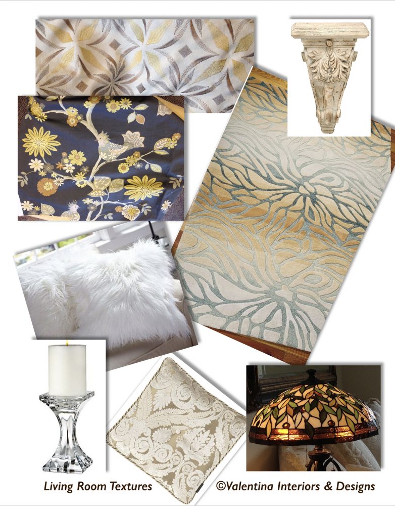
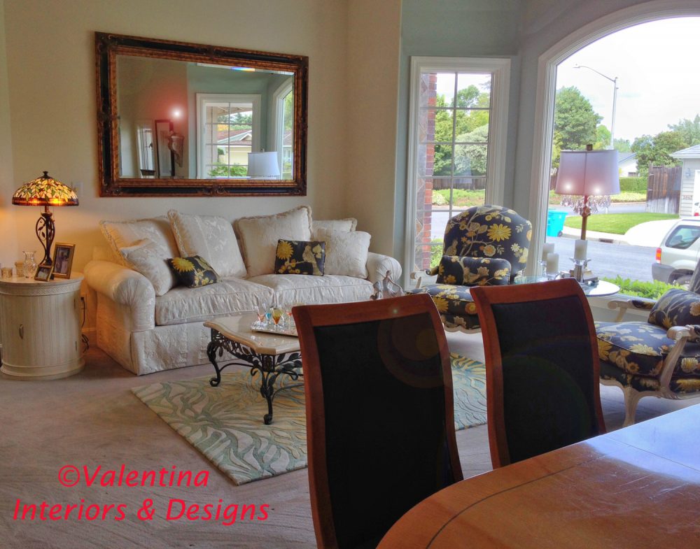
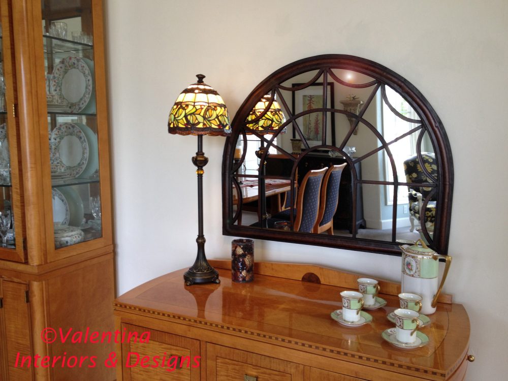
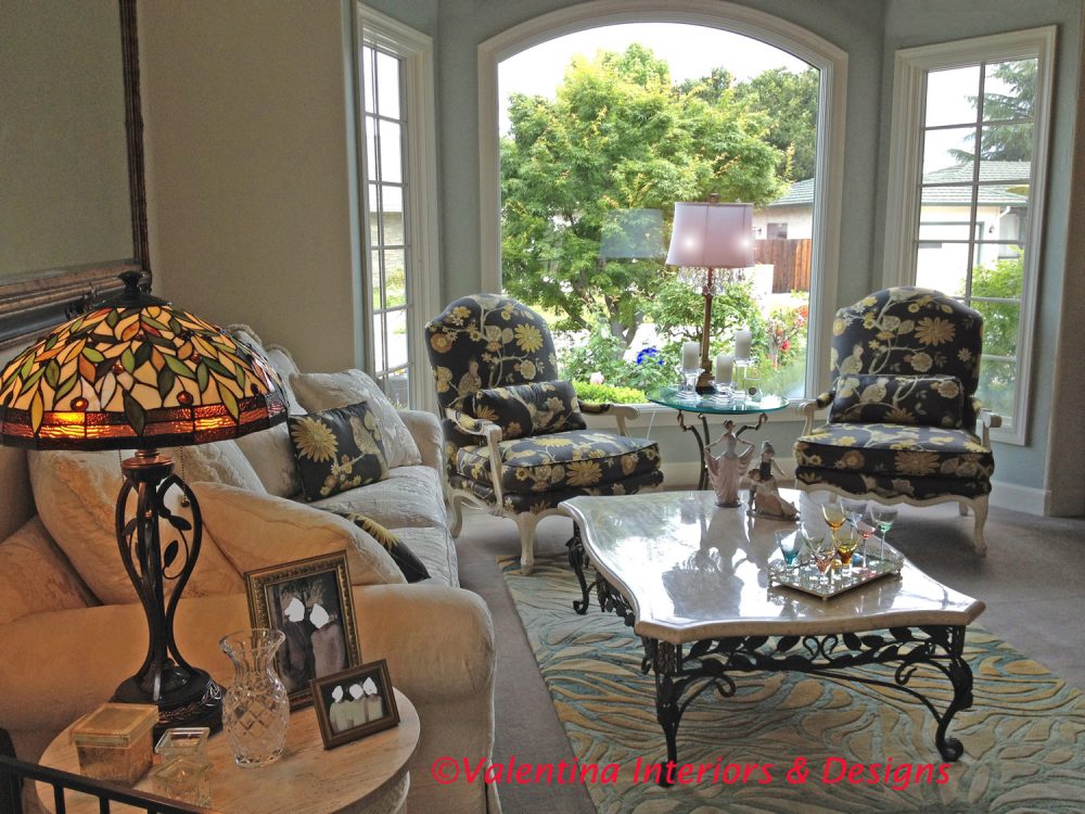
With her white and beige furniture, two colors I particularly don’t care for, the only thing to do was to sculpt the décor with texture, colors, and a more modern details. The dining room chandelier now has golden-yellow shades and doesn’t match the black upholstered dining chairs anymore. Many Tiffany style lamps now bring an array of colors in the room when the lamps are turned on. A lot of crystal accessories shimmer in the light. The newly upholstered chairs with the bird fabric mix a bit of folk style in the classic décor, the rug doesn’t match the sofa anymore and adds movement to the surrounding. The gray carpet is no longer noticeable. I succeed in my goal, I tried not to match and the client is in heaven. She thinks in colors now and especially in contrasting colors. Ciao,
Valentina
http://www.valentinadesigns.com


Copyright © 2016 Valentina Cirasola, All Rights Reserved

valentinadivaglassesIt’s my hope that through my writing and my stories I am enriching your aesthetic sensibility towards design, style and inspiring you to live in beauty. I have loved my profession as an interior-fashion designer since 1990. I am here ready to offer consultations on-line if you need. Check out my latest book on colors ©RED-A Voyage Into Colors, available on
Amazon: http://goo.gl/xUZfk0
Barnes&Nobles: http://goo.gl/q7dQ3w

Advertisement

Hot Fireplace | Valentina Cirasola | Interior Designer

Share

©Valentina-Interiors & Designs

©Valentina-Interiors & Designs

I am so happy to start my Monday with the news that one of my project is featured on Ava until next Monday, a site where designers can interact and connect with potential clients anywhere in the world without having to travel. Ava’s site is a place where anyone looking for home solutions can find it there and learn from the experts. Every week AvaLiving has a theme and based on that it features the best submitted designs.
This week theme is: Hot Fireplaces.

I presented my project in Foster City, California of an interested fireplace in the living room with attached built-in unit.
This room was part of the entire home remodeling. Clients had no preconceived idea of any style, or decor. They were open to any suggestions. The only request was that the T.V. would not be on top of the mantel, as it is usually seen in most homes. A fireplace is for enjoying fire, while reading a good book, or sipping wines in company of friends. A crackling fire should be a cozy background for watching T.V.

©Valentina-Interiors & Designs

©Valentina-Interiors & Designs

In designing this fireplace I had a few challenges: two windows on both sides of the fireplace and not enough clean walls to place a larger plasma T.V. as the client requested.
The result of my studies of the room was to design a built-in unit attached to the mantel to make it visually looking as one continuous wall. The built-in unit would include a short bookcase, a smaller plasma T.V., storage for DVD/CDs and the fireplace itself.
The fireplace’s stones came from the work done in other areas of the house. Being budget conscious I make sure no material goes to waste, as usual in all my projects. The iron stone was very expensive, it was a good thinking to use the left over for the hearth application. As the professional who is always ready, I shall be prompt and ready to help you with any of your design needs, whether it will be decorating, designing, or remodeling.

I am honored to be featured on AvaLiving, thank you Ava for your support. Life is good at Valentina Interiors & Designs. Ciao,
Valentina
http://www.valentinadesigns.com


Copyright © 2010 Valentina Cirasola, All Rights Reserved

Share

Valentina Cirasola has been in business as a designer since 1990. She has helped a variegated group of fun people realizing their dreams with homes, offices, interiors and exteriors. She is a designer well-known to bring originality to people’s homes. As an Italian designer and true to her origins, she provides only the best workmanship and design solutions. Check out her books on
Amazon: http://goo.gl/xUZfk0
Barnes&Nobles: http://goo.gl/q7dQ3w


To Each His Own | Valentina Cirasola | Interior Designer

Share

Choosing a picture frame is not that complicated, the selection must follow a simple kind of dialogue between the picture subject and the décor of the space where the picture will be placed.
Pictures dress the house and just like the dresses we wear they do not have to be expensive to look good. One can choose to display collectible art and valuable art, prints and posters, vintage images and photography, or even display one’s own work of art. What really dresses the house with class and elegance is the selection of picture frames, the particular way they are positioned on the walls and how they are illuminated.

©Valentina Cirasola

©Valentina Cirasola

It is a common habit to select picture frames to chromatically echoing some pieces around in the décor such as the colors of pillows, walls or rugs, but that’s not the end of the story. Few elements play a high role in the beauty of picture displaying, the first is the subject of the picture itself.
Is there a perspective point in the picture? In this case it is best to choose a concave frame to envelop the eyes and bring them inside the picture. The opposite effect is obtained with a convex frame for a picture which does not have a perspective point. The eyes will go to the frame and will be distracted by the flatness of a picture without a perspective.

The dominant color and tone inside of the picture is important for the coloration of the frame. Generally warm colors inside the picture – red, yellow, brown, purple – are suitable for golden tone frames and cold colors in the image – blue, green, grey, white – go well with silver tone frames.

Modern art, abstracts or geometric representations require a light frame with a linear structure; traditional, classic and valuable art almost always require an important, massive and convoluted frame as shown in one of my client’s home who likes antiques mixed with some contemporary art. I designed for her a variety of gallery walls with different picture frames which live together very harmoniously.

To maintain the quality of classicism, a traditional frame always need a passepartout, which is an interior band, generally made of canvas or velvet, wraps around the frame and balances the luminosity of a picture, the chromatic tones and keep the picture away from the glass.

There is much to say about shaping a wall with pictures. Your eyes will determine the rule, the only thing you must remember is to design in scale. If dealing with botanical prints, photographs, magazine covers, or vintage images, their frames look great if they are all the same size, shape and colors, then you can produce a gallery wall, just like an art exhibition. Examples of places for a gallery wall are a long staircase, a large, or long wall, a study room, a corridor, just to name a few.

Add life to both pictures and frames with grazing lights, wall washers or small directional spotlights. Light is life, as I always say, the least unpretentious picture will feel interesting on stage with the right light shining on, but be careful with neon or fluorescent lights, they will change the feel of the picture. Also direct sun light on the picture and frame will damage and change colors and life of both. To avoid the mirror effect which will hide the image in the frame, it is suggestible to have a non-glare glass.

©Valentina Cirasola

©Valentina Cirasola

Selecting picture frames is a fun activity, indulge in your creativity and make it personal, the choices are endless and so is your fantasy.
So, OK the top and bottom pictures are the views of some corners in my studio, not exactly falling into the common decorating rules, but I can afford to be different.
I am ready to help and offer you my services if you like to be different.

Valentina
http://www.valentinadesigns.com

Copyright © 2010 Valentina Cirasola, All Rights Reserved

Share

Valentina Cirasola, is the principal designer and owner of Valentina Interiors & Designs. She is a trained designer and has been in business since 1990. She works on consultation and produces design concepts for remodeling, upgrading, new home design, décor restyling and home fashion. She also offers consultations on-line. Check out her books on
Amazon: http://goo.gl/xUZfk0
Barnes&Nobles: http://goo.gl/q7dQ3w

No Facilities

Random thoughts, life lessons, hopes and dreams

Graffiti Lux Art & More

Luxuriating in the Arts

Inspiration you need

Inspiration is our vision as it is the key to success. This page is about Personality Development, SEO, Amazon Affiliate Marketing, Blog ideas, and photography.

Electric Eclectic's Blog

All Things Bookish and more...

Before Sundown

remember what made you smile

James J. Cudney

Best Selling Author of Family Drama & Mystery Fiction

Robbie's inspiration

Ideas on writing and baking

The Write Stuff

"Writers Helping Writers" with Marcia Meara & Friends

Jacquie Biggar-USA Today Best-selling author

Read. Write. Love. 💕💕💕

Banter Republic

It's just banter

Watching the Daisies

Life Lessons on the Importance of Slow

Stevie Turner

Realist, writer, reader, reviewer and rocker.

This Is My Truth Now

Author, Inspirational Blogger, Book Reviewer & Promoter (James J. Cudney)

Warning:Curves Ahead

reasonably photogenic and relatively stylish

Sue Vincent's Daily Echo

Echoes of Life, Love and Laughter

London Life With Liz

A lifestyle blog with a little bit of everything.

Inspired Motivation

Get your daily motivation fix right here!

Janaline's world journey

My sometimes Strange, but usually Wonderful Experiences and Adventures as I Travel through this amazing World we live in.

From my guardaviñas / Desde mi guardaviñas

Sharing ideas. Photos, travels, music, History, stories, feelings, thoughts,...

Dancer Attitude

"Shoot for the top"

Modern Tropical

Art + Decor by Kristian Gallagher

For The Love Of Ligh

APK Photography Blog

A Dash of Words with Loleta Abi Romance Author

Love, Family, and the Journey Home

Smorgasbord Blog Magazine

Blog magazine for lovers of health, food, books, music, humour and life in general

Jean's Writing

Jean M. Cogdell, Author-Writing something worth reading, one word at a time in easy to swallow bite size portions.

Valentina Expressions

Luxury for Comfortable Living and Good Life Through Designs, Style, Travel, Food

%d bloggers like this: