
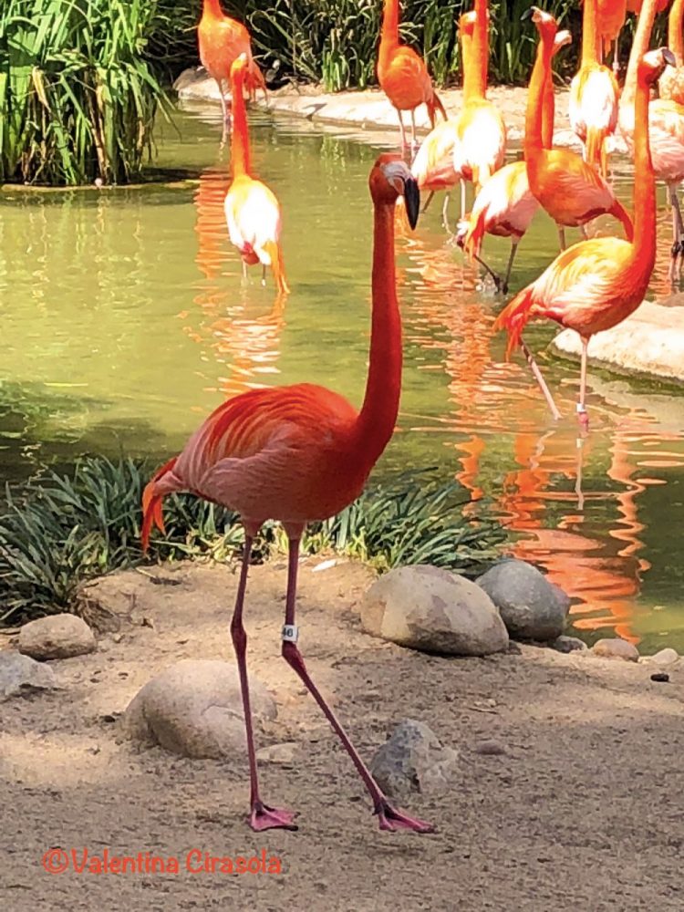
Finally, I got the chance to know the flamingos in person, I waited my entire life for this opportunity. I had seen them in photographs and documentaries, until my recent trip to San Diego last week put me face to face with these tall and gracious birds living in San Diego zoo. Immediately, I felt innamorate of their elegance and their color. They are not pink, as I imagined them, they are orange color, kind of a salmon orange and I was pleasantly surprised. Their voice sounds as if they laugh constantly and I laughed right along with them. I can’t stop thinking about them. I want to have their photograph everywhere in my home, maybe I will have the best picture stretched and printed digitally as a wallpaper, or perhaps I will paint one flamingo on one of my interior doors with a nice scene surrounding it.
(Click on each photo to view it larger).
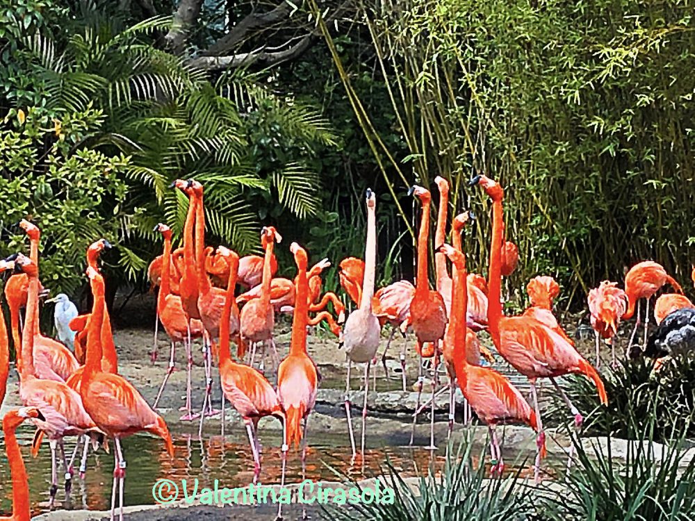
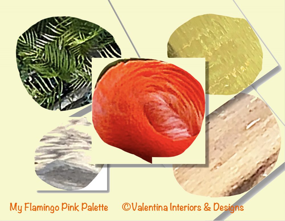
The brilliant color of their feathers made me think of how fun it would be to have this bright salmon orange in a home. Looking at the pictures I took, I see all the other colors that I can combine easily with that salmon orange. There are all the possible shades of the green vegetation, the yellowish color of the water they play in, or the sandy color of the ground they stand on to sunbathe.
On my facebook wall my friends were debating what color is flamingo pink. Is it like pink and orange together, or is it a type of red that didn’t turned out quite red, or is it salmon-with a rose hue? It is a color with an uncertain personality, like periwinkle is for blue and lavender. One woman suggested that Crayola should have one color in their collection, one stick which encompasses pink, fuchsia, orange swirled meld, that would changed as used.
One of those friends took the time to check that Crayola didn’t already have a color called Flamingo Pink and good enough there is. Looking at the chart below, one has a clear idea how many colors possibilities we can have with Famingo Pink and the list goes forever, it’s insane, but makes me very happy. http://www.crayola.com/explore-colors/flamingo-pink.aspx

In past few years we had a few bold colors to pair freely with other bold colors or any color we liked, for instance, in 2013 Tangerine Tango was made the color of that year, in 2014 we had Celosia Orange and Cayenne, in the 2016 Peach Echo was the color of the year. (Below: Pantone Colors)

I would be happy to use Flamingo Pink as an accent colors and have all the neutral colors around as a calming and buffering colors. I found this Victorian chaise long, at Laurel Crown, I know it is an old classic style, but I see it as the only antique piece in a modern décor. The fabric with golden designs on this chair is exquisite. The company calls it Batavia Salmon, but it is very close to flaming pink.

(Sofa and Fabric from: https://www.laurelcrown.com/victorian-single-end-show-frame-sofa)
Life is a play and I like mine to be a colorful stage. Ciao,
Valentina
http://www.valentinadesigns.com
Copyright © 2018 Valentina Cirasola, All Rights Reserved
 Valentina Cirasola is an Italian Interior Designer working in the USA and Europe since 1990, specializing in interior and exterior, color analysis, kitchen, bath, wine cellar, and outdoor kitchen designs. Often people describe her as “the colorist” as she loves to color her clients’ world and loves to create the unusual. “Vogue” magazine and many prominent publications in California featured Valentina’s work. She also was seen on RAI – Italian National TV and has made four appearances on T.V. Comcast Channel 15. Author of three published books, the latest ©RED – A Voyage Into Colors is on the subject of colors.
Barnes&Nobles: http://goo.gl/q7dQ3w
Amazon: http://goo.gl/qNxXrB


