
Say It With Colors, is the TV show I conducted last week by myself in front of a live audience. The show is about presenting the fresh, unusual color combinations we can do this year with Ultra Violet color, one of the bold and very powerful colors of 2018.
(Click on each photo to view it larger)

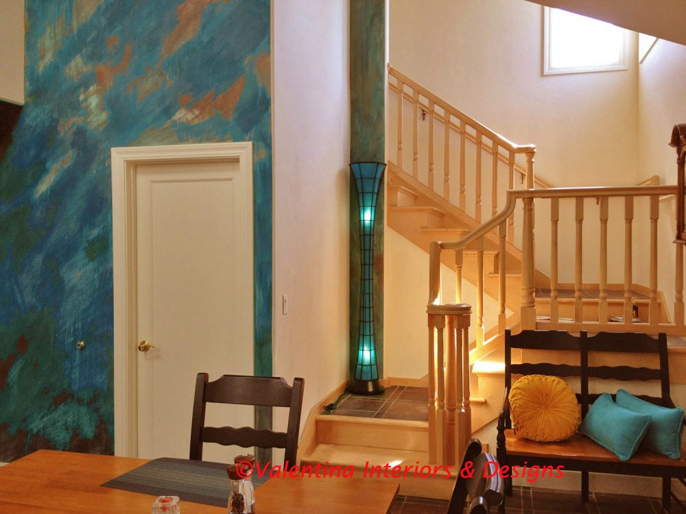
Entry Scene: “Say It With Colors” TV Show – Valentina Design Universe
(Above: Photo was taken in the studio by Tyler Wiest)
Questions from the audience were interesting. Time always feels very short, in only 30 minutes show, I could not answer all the questions, but I will elaborate on them here:
What is the most attractive color to the human eye?
I would say that red, green, yellow and gold are attractive to the human eye.
Red is the color of the heart pumping red blood. It is the color of passion and love. Products on sale always have a red tag and we feel the urge to buy them while the discount lasts. It’s the color of impulse buying and the color of those who take action. In fact, when selling a house, an entry door painted red and some red accessories scattered around the rooms will help to sell the house faster.
Green is a peaceful color of nature and everyone feel at ease.
Yellow is the powerful energy of the sun and gold is the powerful energy of wealth.

Modelo Paint Finish
(Above: accent wall Red Modelo paint finish by Douglas Greenberg)

Ceramic balls
What color is the sexiest?
It is hard to answer this question without thinking of a nation and its culture. Not all colors have the same meaning in all the cultures. For example, in European countries black is associated with death and funerals, white in China is used for death and funerals, but in Brazil purple is the color for death and funerals. Funny, how three different colors mean the same thing in three different continents.
What color looks best with cream?
Cream color alone, to me, is a very boring color, for some people is a calming color. The eyes need light and shadow to feel rested. If a room or the entire home is cream color without any other accent colors, the eyes will wonder constantly and soon will feel tired. The vibe from a cream color is very feeble, to create an interesting monochromatic cream color scheme, the option is to pair cream with a few earth tones, such as brown, olive, rust, coral, or to pair it with a few dark accents as navy blue, purple, or even black. With warm and hot colors, such as red, orange, red and rust, cream becomes the color which dilutes the others and calms them down.

Beige Color and Texture Concept Board
How to spice up a personal space with colors?
Answering this question is like having a clean canvas and splash any colors on it. Rhythm is what you want to create to spice up any room. Look for something that will attract the viewer, such as an accent wall painted as an art piece or painted in a bold color; mix furniture changing style and colors; add textures in the accessories or mix floor textures; paint kitchen/bath cabinetry or add whimsical doorknobs/hardware; mix antique and modern lighting fixtures.

A mix of textures and colors for a sitting room
(Above: Mixed furniture)
Painted Verdigris Patina – Laundry wall
(Above: Accent wall painted as an abstract art piece by Gyorgy Sofalvi)

(Above: Mixed ceramic hand painted kitchen cabinet doorknobs)
Whatever you do, it’s your home and if you like to have one polka dots wall with an animal print sofa or a red kitchen with Salvador Dali hardware who is to say it’s wrong? Ciao,
Valentina
http://www.valentinadesigns.com
Copyright © 2018 Valentina Cirasola, All Rights Reserved
 Valentina Cirasola is an interior-fashion designer, author, who became a TV producer/host. She is currently producing her shows at KMVT15 in Mountain View, Los Altos & Cupertino TV station, under her label Valentina Design Universe. The goals of her shows are to entertain, inspire and inform, while she is living her passion. She never gives up trying new things. She found new energy conducting shows by herself and interviewing guests on the stage of her shows. Find Valentina Design Universe TV here: https://goo.gl/2tbN3N
Get a copy of her books here:
Barnes&Nobles: http://goo.gl/q7dQ3w
Amazon: http://goo.gl/qNxXrB


Jan 24, 2018 @ 12:24:04
I loved this, especially when you say you can’t pin down one color since it depends on the cultures involved. People are afraid of color. In our then-new house, I decided I should go for a “white” kitchen. After it was done, I felt I was living with primer on my walls. I immediately went out and bought tomato red paint and my love affair with my kitchen began!
LikeLike
Jan 25, 2018 @ 04:30:49
Oh, Helen that’s music for my ears. Yes, people are afraid of colors. I have had similar experience with some of my clients who decided on white colors for any given room just to be safe and immediately changed it to a bold color after it was done.
Thanks for taking the time to comment. 😀
LikeLike
Jan 23, 2018 @ 18:55:47
Kudos, Valentina. Well done. Hugs.
LikeLike
Jan 23, 2018 @ 19:52:11
Thank you Teagan. Create a wonderful day.
LikeLike