
Working with a monochromatic color scheme seems easy for those who know how to do it. In decorating with one color only it is important not to keep it boring, to put the accent on details and to play with light effects in a large way.
The house showing in my photos dates 1987.


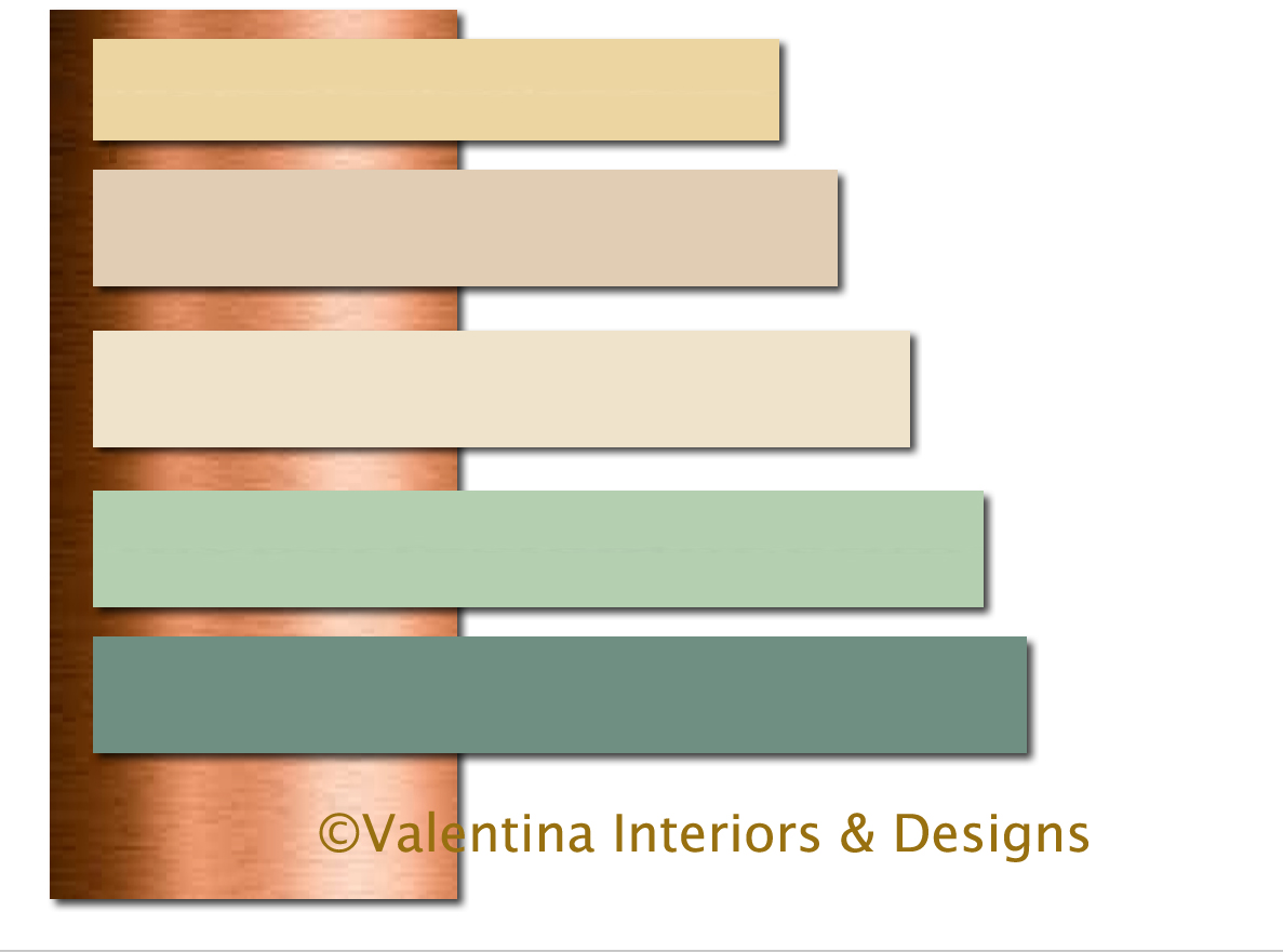
The interior of every room was made entirely out of oak wood inside and out, wall panels, windows and shutters, floor, kitchen and bath cabinets, interior doors and beams. It was a very dingy, dark and not practical home for today’s needs. The only firm demand was to turn it into a very bright, airy, contemporary and functional home. The Clients liked subtle colors such as golden beige and were open to other color suggestions as long as they were not bold. After studying various tints and tones of subtle colors, this was the last scheme chosen. Clients envisioned a very white home, but this color scheme for the interiors and exteriors really got them excited.
All the walls in every room, including kitchen and baths cabinets have been faux finished with an elegant metallic effect that is only noticeable by getting closer to the walls.


Earlier, I talked about putting the accent on details when working with monochromatic colors. The existing beams overhead were overwhelming and felt like a heavy lid. I put LED lights inside of them and the ceiling came alive when illuminated at night or grey days. Each pillar of this home had a brass band at the bottom. I left it there and with the new cream color those bands created an elegant accent. It looks done on purpose to break the verticality of the pillars.
Getting rid of all the oak obstacles and details, making each space open and livable was a real pleasure for the clients and me.
What really made this large space was the floor. I selected a large planks chestnut hardwood floor to run continuously all over the house. The very dark brown of the floor grounded the décor and helped this 10,000 square feet home covered in cream colors not to look aloof and floating in the air.
Dark wood furniture mixed with a few satin metals, glass tables, and a few antique pieces satisfied the needs of both husband and wife in different age group. They said “Now we can breathe! ”. The intercommunication system between rooms was a necessity.
As you can see there is no need to live in dull colors, even mortally boring beige can be attractive, sophisticated and exclusive. Ciao,
Valentina
http://www.valentinadesigns.com
Copyright © 2016 Valentina Cirasola, All Rights Reserved
 Valentina Cirasola is an Italian Interior-Fashion Designer working in the USA and Europe since 1990. Often people describe her as “the colorist” as she loves to color her clients’ world and loves to create the unusual. “Vogue” magazine and many prominent publications in California featured Valentina’s work. She also has made four appearances on T.V. Comcast Channel 15 and on RAI – Italian National TV. Author of three published books, the latest ©RED – A Voyage Into Colors is on the subject of colors.
Amazon: http://goo.gl/xUZfk0
Barnes&Nobles: http://goo.gl/q7dQ3w


Jan 21, 2016 @ 04:46:12
Incredible changes, love you vision
LikeLike
Jan 21, 2016 @ 17:13:43
Thank you so much for the visit and the comment Gioia.
LikeLike